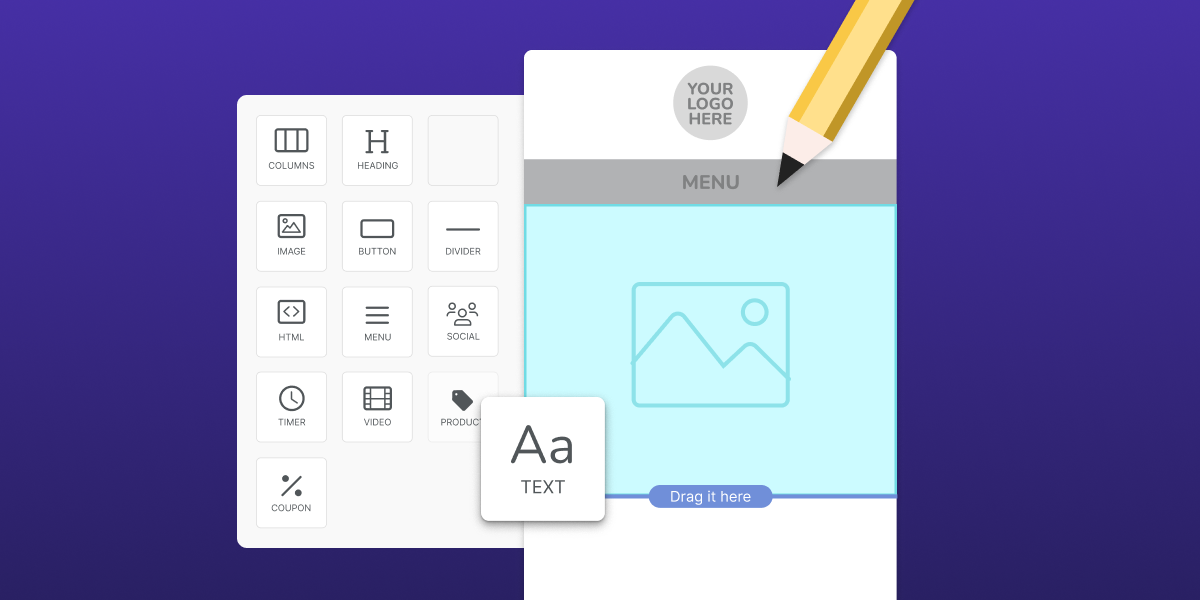
Whiteboard Wednesday: Choosing Your Display Format
3 min read time
Published on Jan 11, 2018
Written by Meg Johnson
On this edition of Whiteboard Wednesday, we’re going through different display formats for your on site campaigns and how to choose between them. Watch the video below or keep reading for a full transcript:
Transcript:
We’re going over 6 different popular display types:
-
Pop Ups
-
Bars
-
Banners
-
Flyouts
-
Embedded Forms
-
Spin to Win
Pop Ups
Pop ups, also known as lightboxes, display in the center of your site. These provide offers, discounts, or email subscription boxes to people visiting your site. They also give you a ton of flexibility in your design and sizing.
Flyouts
Flyouts—or slide ins—appear in the bottom right or left of a screen. They are a bit more subtle than a pop up because they allow your visitor to continue what they’re doing but grab the visitors attention using movement. These are great for suggested products or content based on someone spending a lot of time on one page.
Bars
Bars provide a full-width message that typically sits at the top or bottom of your site. They’re super mobile friendly and are often used for site-wide announcements like free shipping.
Banners
Like bars, banners sit at the top or bottom of a site and work great on mobile. Like the flyout, they start in a "hidden" state until triggered and grab your visitors attention with motion. Taking up only part of the page, they are also less invasive than a pop up but harder to ignore than a bar.
Spin to Win
Spin to Win is probably our most fun display type, and our highest converting! It creates a competition that allows your visitors to play for awesome discounts and prizes. It’s a really engaging way to get your visitors involved right away.
Embedded Forms
Embedded forms place a static sign up form on your website to capture email addresses. These complement your other campaigns and provide a space for someone to sign up anytime. These are most often used on a contact page or in the footer of your site.
So, how do you choose? As you design your campaigns, you’ll need to think about your campaign goals. Ask yourself:
-
What do I want to achieve?
-
How aggressively do I want to push my message?
-
Are more of my visitors on mobile or desktop?
Here’s an example. Imagine I’m the owner of a shop that sells pug-themed t-shirts and accessories and I want to announce a welcome discount to people coming to my site for the first time.
I also want to gather email addresses in exchange for the discount and know that most of my visitors are on a mobile device.
In this case, I’d probably go with a scroll-based flyout. Flyouts are very mobile friendly and draw the eye of the visitor because they include movement. But they also don’t completely block the screen. Frankly, they are a pugtastic way to grow your list.
We’ll talk about more campaign combinations in upcoming Whiteboard Wednesdays. See ya next time!
Follow along behind-the-scenes at Privy on social media:
Subscribe for Updates
Get our best content on ecommerce marketing in your inbox 2 times a week.

Written by Meg Johnson
Armed with a degree from MassArt, a passion for avocados, and a "I'm going to crush this attitude," Meg elevates Privy's approach to brand, design, video and most importantly, fun.
Subscribe for Updates
Get our best content on ecommerce marketing in your inbox 2 times a week.


.jpg)
