
The Ecommerce Brands To Copy For SMS, Email, Social And Site Design (That We Stole From Nik Sharma)
Nik Sharma shared tons of brands he loves for SMS, email, social, and overall site design. And we did a deep dive on all of them so you can steal their ideas.

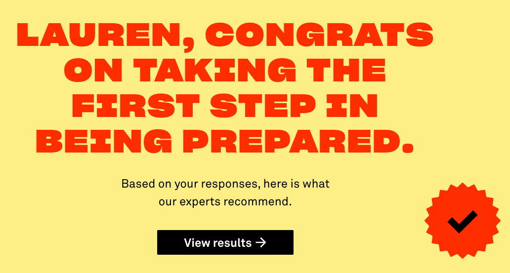
Written by Lauren Hall
On a recent episode of The Ecommerce Marketing Show, DTC legend Nik Sharma shared some of the ecommerce brands he admires most for SMS, email, social, and site design.
He’s worked with some major ecommerce brands like Haus, Brightland, and many of the brands you’re about to learn a ton about.
And he’s an ecommerce savant. So I wanted to dive into what exactly makes the brands he loves so good.
But before we get too far in, let’s just get this out in the open. You don’t have to be a huge brand to steal ideas from these ecommerce wizards.
As you’ll see, the tiniest details add up to create a killer experience.
Oh, and this post is long. It’s meant to be a deep dive and give you tons of examples to pull from.
But if you click on the links in the bulleted list below, you’ll go right to the section you care most about.
Now, let’s get to the good stuff. Here are Nik’s favorite brands for:
- SMS (JUDY, Empathy Wines, Verb Energy)
- Email (Hydrant, Feals)
- Social (Not Pot, Magic Spoon, Recess)
- Site design (Magic Spoon, JUDY, Cha Cha Matcha)
With some additions from yours truly.
Get our best content on ecommerce marketing in your inbox 2 times a week
Brands with amazing SMS strategies
JUDY
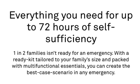
JUDY's mission is to help families get prepared for emergency situations like natural disasters. So they have kits designed to help you ‘prepare for what you can’t predict.’
The kits include things like, batteries, first aid kits, phone chargers, hand warmers, gloves, emergency drinking water, etc.
And I’m not kidding, as I’m sitting here writing this, I got a message from them. How’s that for timing?
It’s for a product that just launched. They tell you exactly what their newest kit contains: masks, hand sanitizer, gloves, etc., you see the price, $45, and they make it super easy to get to the page.
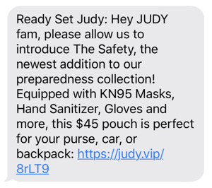
And with everything happening with COVID right now, it’s perfectly timed. All these items are so top of mind for everyone. And they’re offering a product that fits easily into many people’s lifestyles. Who doesn’t use a purse, car, or backpack regularly?
And they actually encourage you to text them:
But if people don’t really know what they’re getting, it’s harder to get them on board. That’s why this video on their site is super helpful.
You know exactly what you’re signing up for. Updates about your order, an unboxing video, helpful reminders about changing the batteries in your smoke detectors. Pretty cool, right?
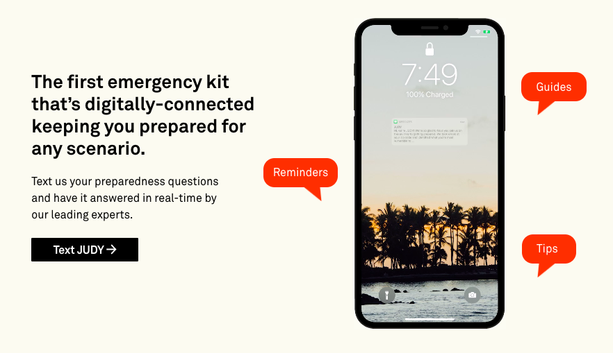
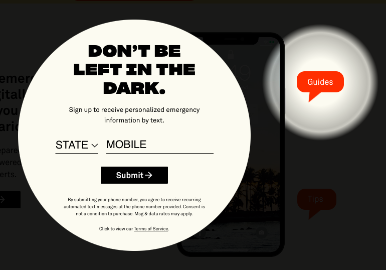
And if you click on the ‘Text JUDY’ button, you see this pop up:
Not only does it say ‘Don’t be left in the dark,’ there’s also a flashlight feature (the light around the orange Guides message in the image above) that responds to the movement of your cursor. It’s one of the coolest features on the site.
If you’re looking for some SMS inspiration, I would definitely recommend signing up for theirs. It’ll give you a ton of awesome ideas.
Empathy Wines
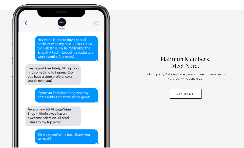
Empathy Wines is another brand using SMS. But their strategy is a little different. Their highest tier customers get exclusive access to Nora, their wine concierge.
Similar to what JUDY did with their video, you see exactly what you’re going to get – access to incredible service. Need help choosing wine? Nora’s got you covered. I know I’m intrigued.
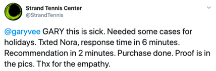
I mean, just take a look at what this happy customer had to say:
[Source]
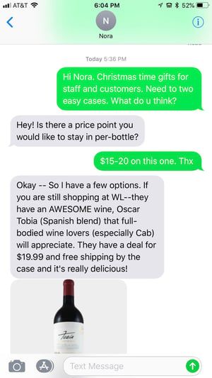
And here's his actual conversation with Nora:
[Source]
Imagine if one of your favorite brands made shopping that easy.
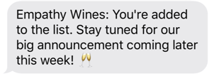
But they also know how to use SMS to build hype around launches, too...
[Source]
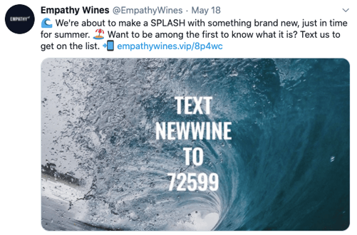
And when you text them, they immediately deliver on their promise by reiterating what you came for. You’ll be the first to know when they announce their newest product.
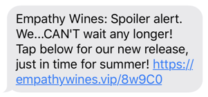
And this was the announcement I got just a few hours later:
So they leverage text messaging both as an exclusive concept for their best customers AND a way to engage with prospective customers. Pretty amazing approach, isn’t it?
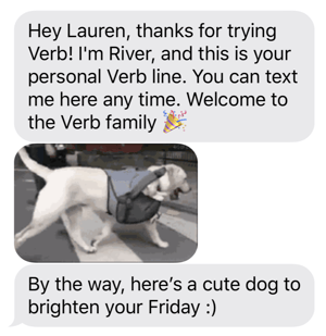
Verb Energy
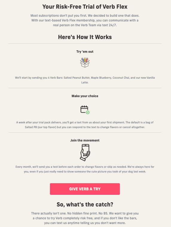
This one is my addition. I recently ordered Verb's sampler pack (highly recommend, by the way) and was really impressed with their strategy.
When I ordered and gave my number, I knew exactly what I was signing up for.
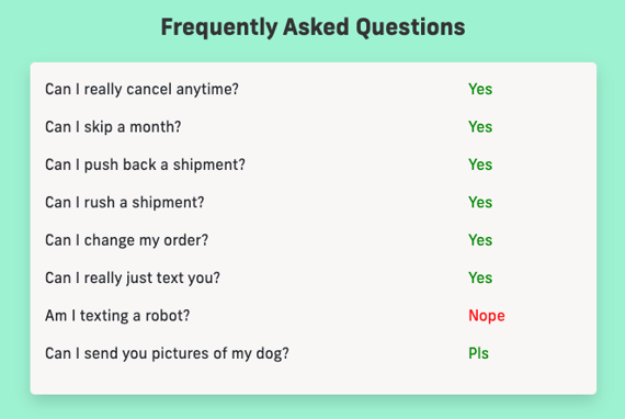
And they lay out these FAQs in a really easy to consume format that answers the objections they get most often:
Full disclosure, though. I can’t actually take the credit on this one. Casey Armstrong mentioned how awesome Verb’s texts are on this episode of The Ecommerce Marketing Show.
“I've seen some of the coolest stuff. Like Verb Energy...they have these caffeine nutrition bars, which I'm hooked on. I love it, because you just order over text. I text them and then they send me a funny GIF and tell me it's on the way.”
But before that, I got a dog GIF. Which automatically gave them serious brownie points.
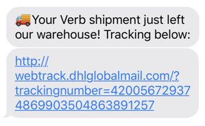
You’re welcomed and even encouraged to reach out whenever. Then once my order shipped, they let me know and made tracking info easily accessible. Is there anything better than getting shipping notifications? I think not.
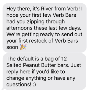
And once I had plenty of time to enjoy the samples, I got another text letting me know it was time to choose a flavor for my next order. The fact that they didn’t text me the day after receiving my order made a huge difference. There’s nothing worse than getting a notification from a brand before you’ve had a chance to try their product. We’ve all gotten those notifications to review a product you haven’t even received yet. It’s not a great experience.
They even tell me what the most popular pick is which made my life really easy. Especially because the peanut butter was my favorite. So I didn’t have to lift a finger. They removed all the friction from the process for me, which makes for an amazing experience.
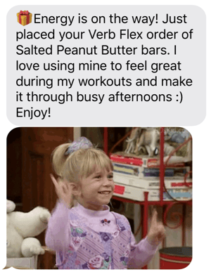
Then, like Casey said, I got a fun GIF of Michelle Tanner with the next shipping confirmation.
Now I can’t wait for the next shipment to arrive. They keep customers engaged and entertained every step of the way. 👏
Brands Killing Email
Hydrant
Hydrant has been coming up a lot recently. They just raised a $5.7M Series A (more on that in this episode of Ecomm Noms with Kristen LaFrance). And Val Geisler also brought up their killer email strategy in this Masterclass on welcome emails. So they’re definitely doing something right.
And this was Nik’s rave review:
“They just have just the most beautiful emails, and actually, their email team was so good, I ended up hiring them for a ton of brands myself. They're extremely on point with design and brand. They're extremely contextually relevant, whether it's a content newsletter or an offer, and there's just never a problem with their emails. Their GIFS are always working. Their button sizes are always right. There's just a lot of little things I notice, I guess. Their screen formatting is always right. They just nail it every time.”
I actually just made my first purchase with them recently (huge fan of them, too), so I was able to pull these examples right from my inbox.
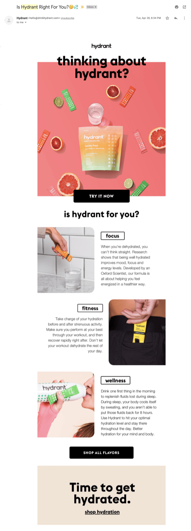
One of the first emails I received after subscribing was this:
They know I’m interested because I just gave them my email, but hadn’t made a purchase yet. So they wanted to educate me. And I really was curious about whether or not it was right for me. So the content in this email was really valuable.
Then, I eventually placed an order. And when it was delivered, this was the message I got:
By the way, that package dropping on the welcome mat is a GIF, so the second you open it you’re interested.
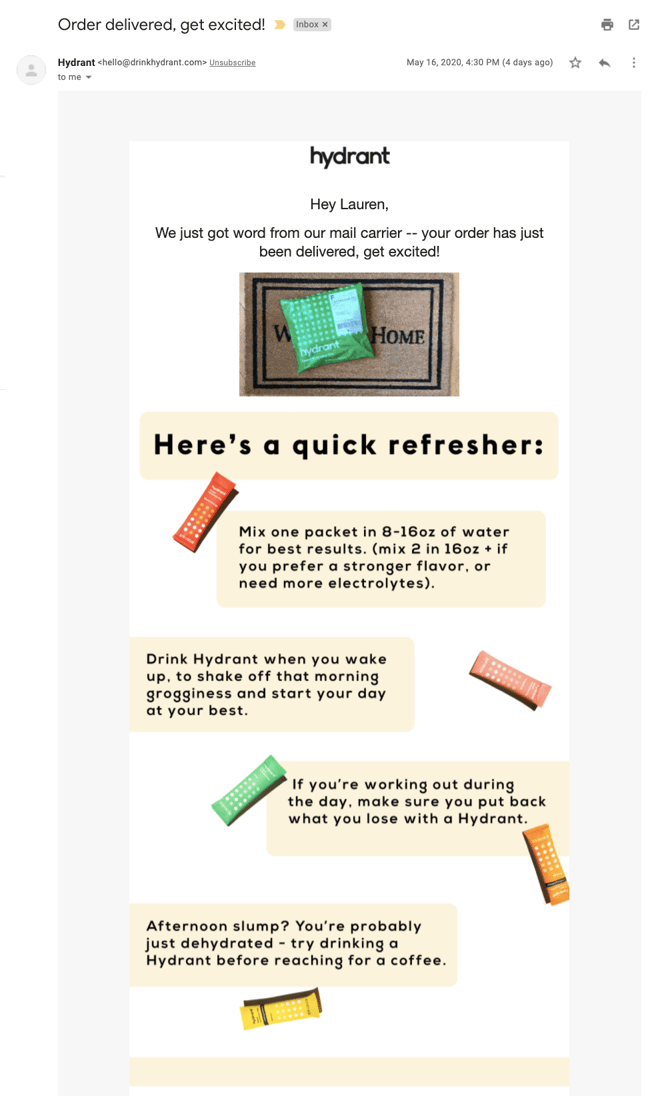
I love this one because it’s super easy to read. The spacing and coloring of the boxes break the content up really nicely. And the information is timely – OK so I just got this package, but what do I have to do with the product again? This email perfectly sums that up. More brands should be doing this.
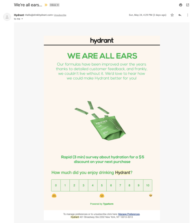
They also did an awesome job asking for reviews and filling out a survey. Both were sent on the same day (just over a week after my order was delivered). And you know what? I never respond to those kinds of things, but I submitted both because they made it so easy (and incentivized me to make another purchase).
Here’s what their survey looks like:
Before I commit to filling anything out, I know how long it’s going to take (3 mins) and what I’m getting ($5 off my next purchase). How many times have you received surveys that have 57 questions but the only way to know that is to click on the link. But 3 mins for $5? Sign me up.
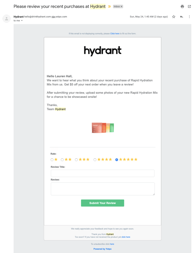
And here’s what they did for reviews. (FYI they use Yotpo if you’re curious.)
From start to finish, it probably took 30 seconds. And another $5 just like that. BOOM.
If you’re worried about sending email too frequently, don’t be. Hydrant sends emails every 1-2 days. And they don’t get old. That’s how powerful it is to have emails people are excited to read. And we know more emails = more $.
Feals
This is another one I know firsthand. Feals is a CBD brand that has the best packaging ever. Seriously, it’s worth ordering just for the unboxing experience.
But we’re here to talk about email. And their strategy is impressive.
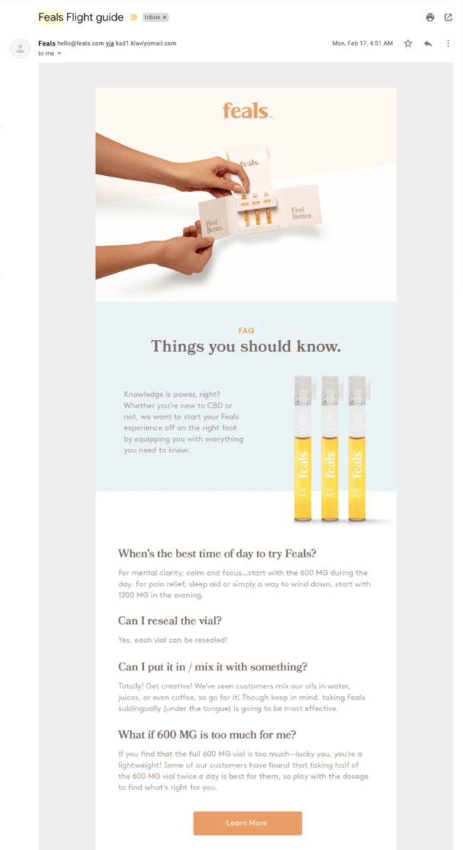
They also did a great job with post-purchase education. A few days after my order shipped, I got this email:
They share FAQs that relate to the specific product I just purchased.
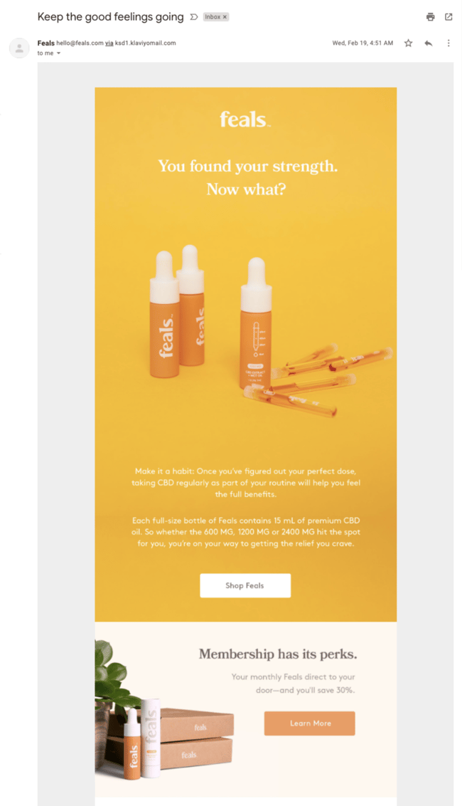
And because they want to encourage a membership, they follow up a couple days later to try to get you to make your next purchase.
But their regular content emails are super helpful, too. Like this one:
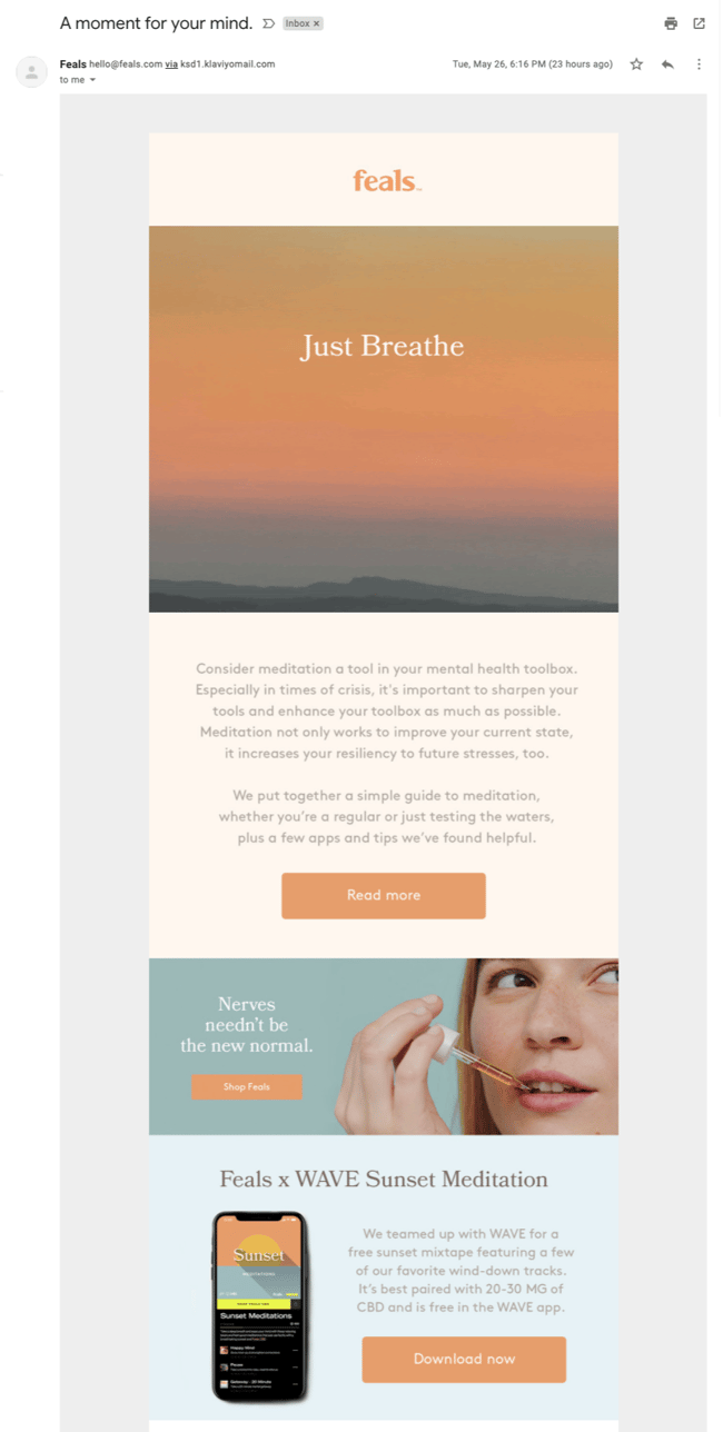
They created a meditation guide to help with the anxiety so many people are feeling right now.
And the main CTA is to check that out, not to shop their products (that’s secondary).
When you’re not constantly trying to sell, people are much more receptive to what you say. And when you do promote your products, the chances they make a purchase are much higher.
Brands Killing Social
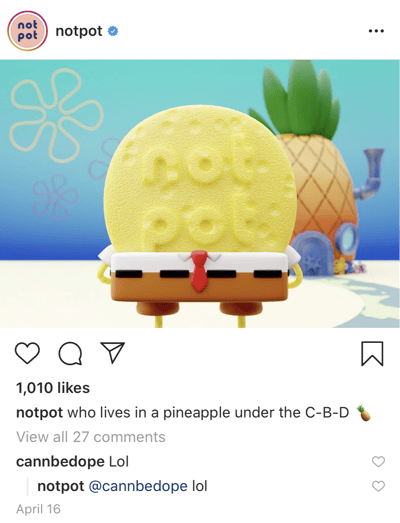
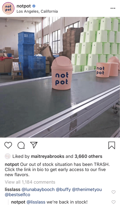
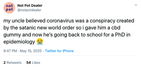
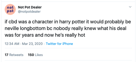
Not Pot
Not Pot sells CBD gummies. And Nik took exactly 0.875 seconds to call them out for having an incredible social media presence when asked for some of his favorite brands:
“100% Not Pot. By far the best organic social I've seen in a long time, and it's because they, for the longest time, were not allowed to advertise anywhere, and so because of that, they were forced to become extremely creative with organic social to essentially drive awareness and then drive conversions.”
Makes total sense right?
And their social game is on point on every channel. They don’t just copy and paste and call it a day. Just take a peek at their Instagram and Twitter accounts.
Here are some of my faves across both channels:
[Source]
If you can read that caption without yelling, “SPONGEBOB SQUAREPANTS!” we can’t be friends.
“I CAN’T HEAR YOU!” Spongeb– (OK, Lauren, that’s enough...and I wonder why these posts take me forever to finish. 😳)
[Source]
[Source]
[Source]
Their posts are entertaining, timely and relatable for their target audience (starting to think that might include me...).
They also have a 🔥 site and SMS strategy. Both are worth checking out. And there’s nowhere to enter your email on their site, but I’m sure after placing an order you’re an insider. Not gonna lie...I want to place an order just to see their emails. That’s the power of an awesome brand.
And not to get too far off track, but when you Google Not Pot and click on the first search result, it actually brings you to a product page rather than their homepage. Intentional? I’m sure. Because the sooner you get prospects to a product page, the better.
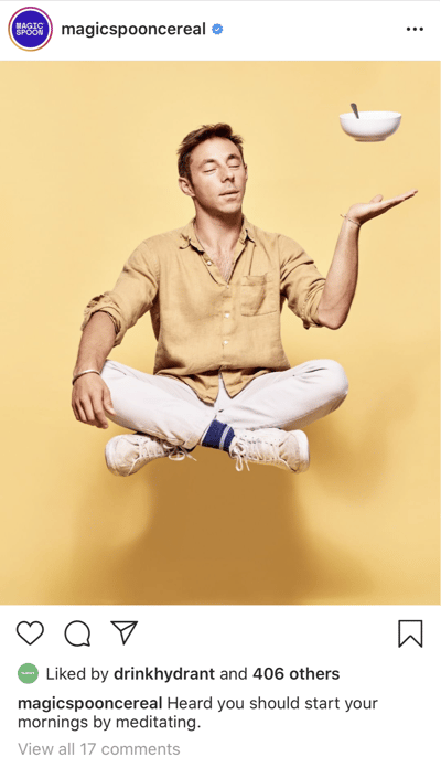
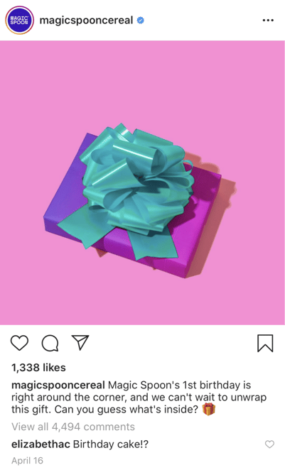
Magic Spoon
Magic Spoon is a ‘childlike cereal for grown ups.’ And their brading is insane. Don’t worry, we’ll talk more about their website in a minute. For now, let’s talk about their Instagram. They have 151k followers.
[Source]
[Source]
Their images are always crisp and really high quality and they do a great job mixing in product photos and people. And something about the bright colors makes them really pop as you’re mindlessly scrolling through your feed.
They also use the platform as a way to build hype and start a conversation with their followers. Like their first birthday post where they asked for guesses and saw almost 5,000 comments. And yes, it was birthday cake flavored cereal. YUM. And it didn’t last long.
And JFYI: their emails are always top notch, too. The most recent one I saw had a subject line that reads, ‘Here's why we're more expensive.’ and started off with “10 Dollars a box? Are you crazy? (Nope.)” Then they went into why they’re more expensive, addressing one of the most common objections they get.
Every aspect of their brand is worth adding to your swipe file. Which, honestly, should be pretty extensive after this. 😉
Recess
Recess actually wasn’t mentioned on Nik’s episode, but they definitely deserve to be called out. Because their social is SO good.
Their drinks are “an antidote to modern times.” Which plays into what’s happening in the world right now pretty perfectly.
And whoever is doing their social deserves a raise. But I think they already know that, because the Instagram callout is pretty prominent on their site.
Rather than just having the tiny social links at the very bottom (which, by the way, should ALWAYS open in a new tab), they have this:
It’s pretty hard to ignore, right? (Even if it is toward the bottom of the homepage.)
Before sharing any examples, here are some of the comments they get:
“For my birthday can you arrange a meet and greet with their creative team?”
“This is turning into my favorite account”
“Whoever does your branding & social media, I applaud them 👏🏻”
“Your social media account is hilarious. Thank you.”
I’m telling you. Raise-worthy stuff.
Now let’s get to the good stuff. Each flavor of their drinks has a personality. Which makes for some seriously good content.
[Source]
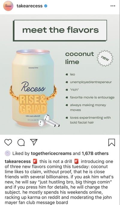
We’ve all met someone like this, which makes it relatable, funny, and entertaining. But this convo between the flavors is probably one of my favorites…
[Source]
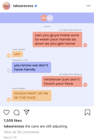
But I love this one too...
[Source]
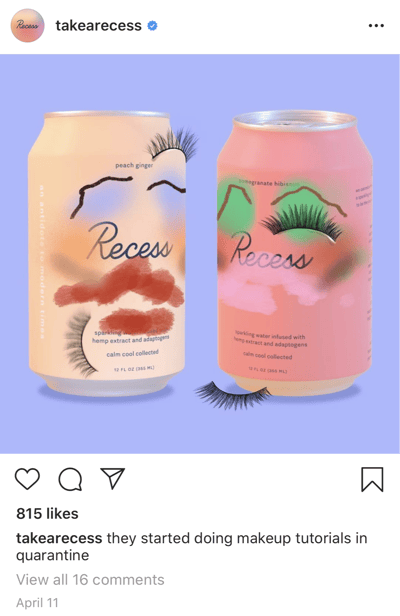
Recess wins social media. That is all.
And in case you were wondering, yes, they have an insane site too...
Ok, and their emails are also awesome…
Brands with the most delicious websites
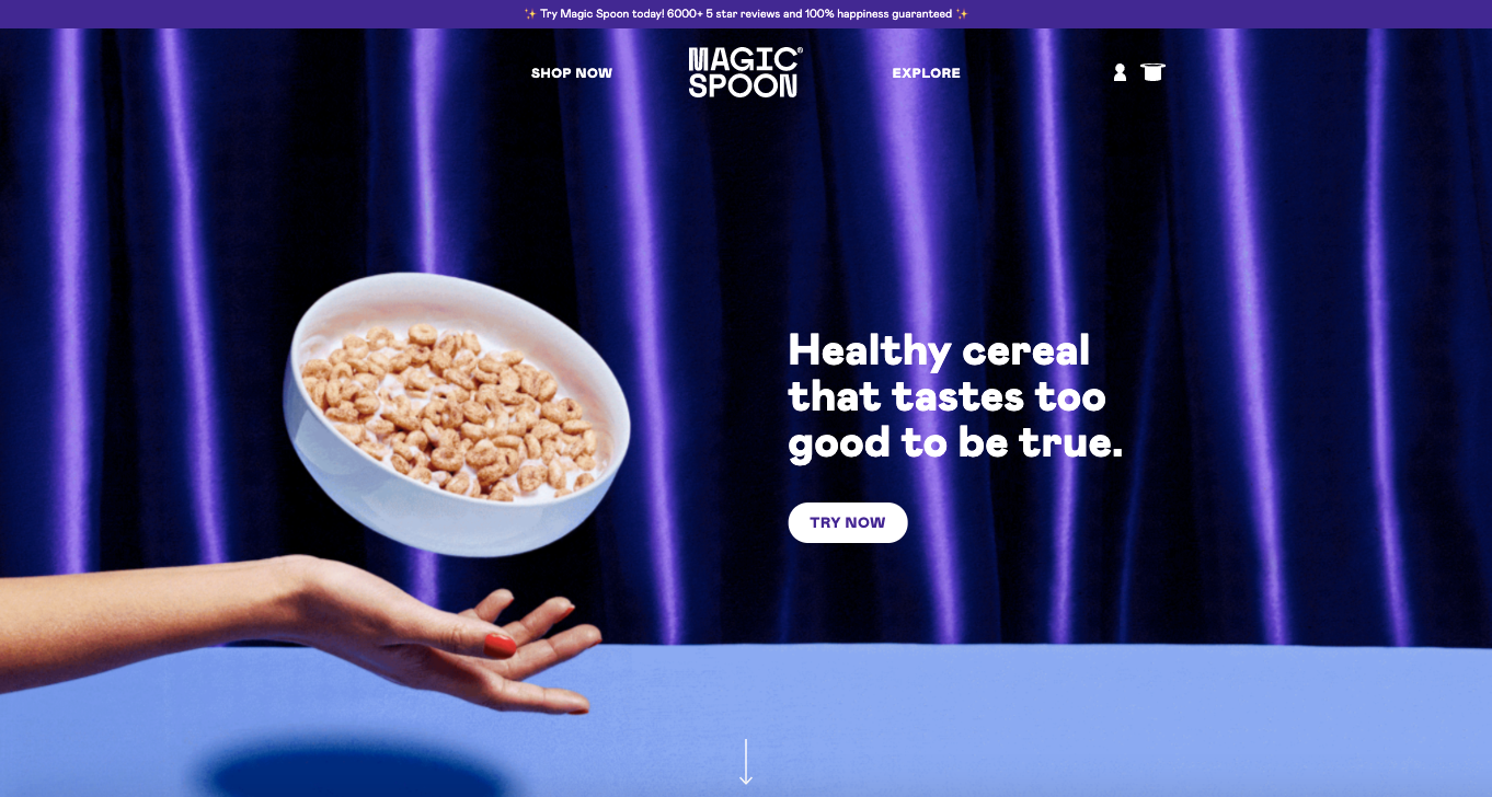
Magic Spoon
Remember: they’re a ‘childlike cereal for grown ups.’
The second you’re on the site, that’s exactly the vibe you get. The levitating bowl, the silky backdrop, bright colors, everything.
There are even floating bits of cereal that look like you could grab them from the page and eat them. And they respond to the movement of your cursor. It’s as magical as it sounds.
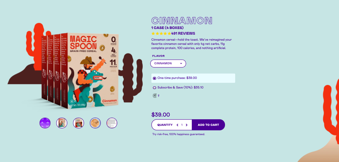
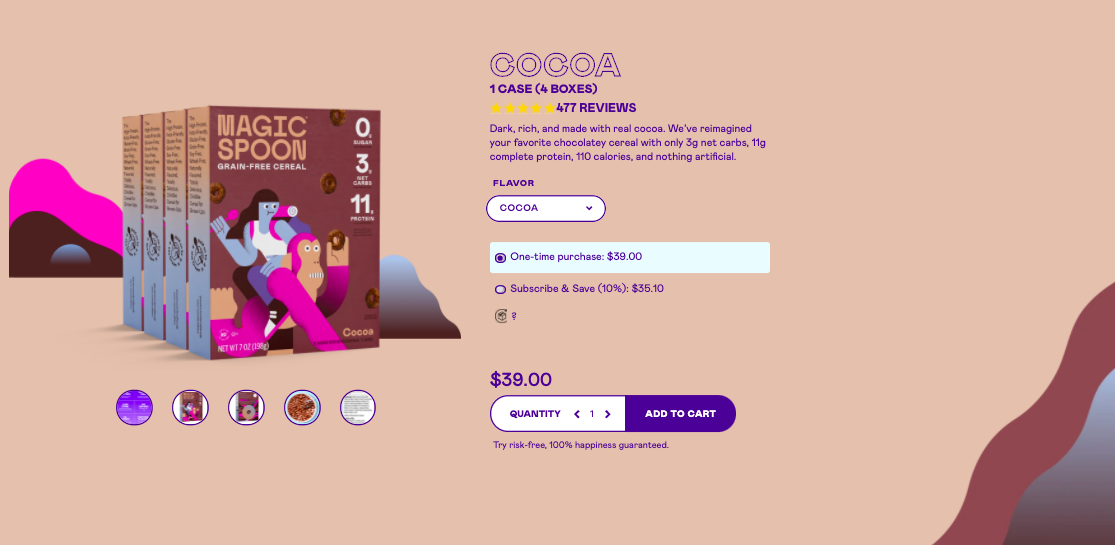
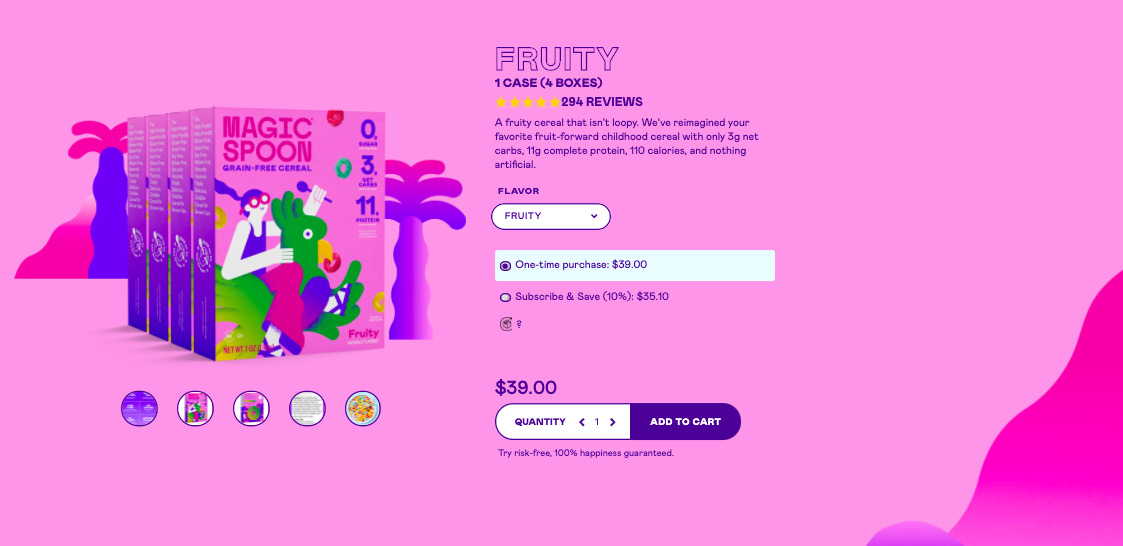
And it only gets better on the product page. They have a variety of different flavors, and when you change your product selection, the theme of the page changes to match whatever you chose.
The cinnamon option has a southwestern theme.
Cocoa, is, unsurprisingly, a cocoa color.
And the fruity flavor is a gorgeous purple-y pink.
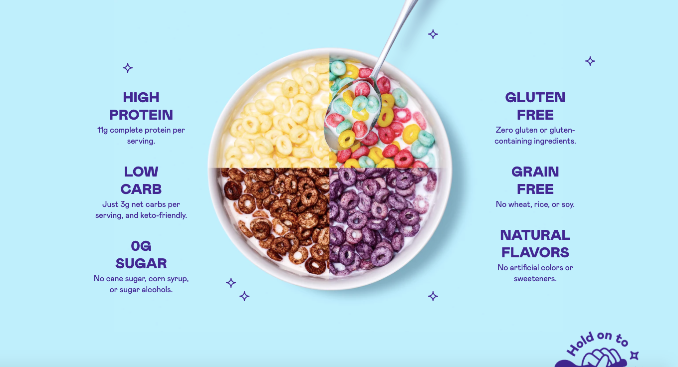
Keep scrolling and you’ll see this image with all the benefits of the cereal. The spoon in the bowl moves as you scroll and the photo is super high quality and lifelike.
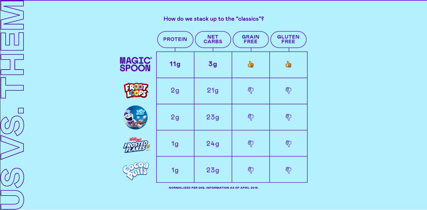
And how easy does this chart make it to compare to other popular cereals? Makes it an easy choice, doesn’t it?
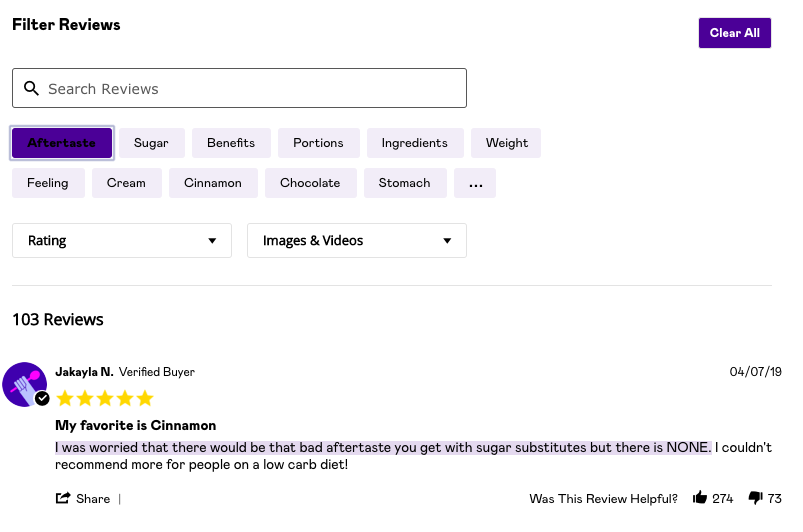
And have you ever seen a review section that makes filtering so easy?
First of all, there are more than 6,000 of them. 😱 And if you’re worried about aftertaste, select that filter and you’ll see every review related to aftertaste. And the sentence that mentions it is highlighted. It’s wow-worthy.
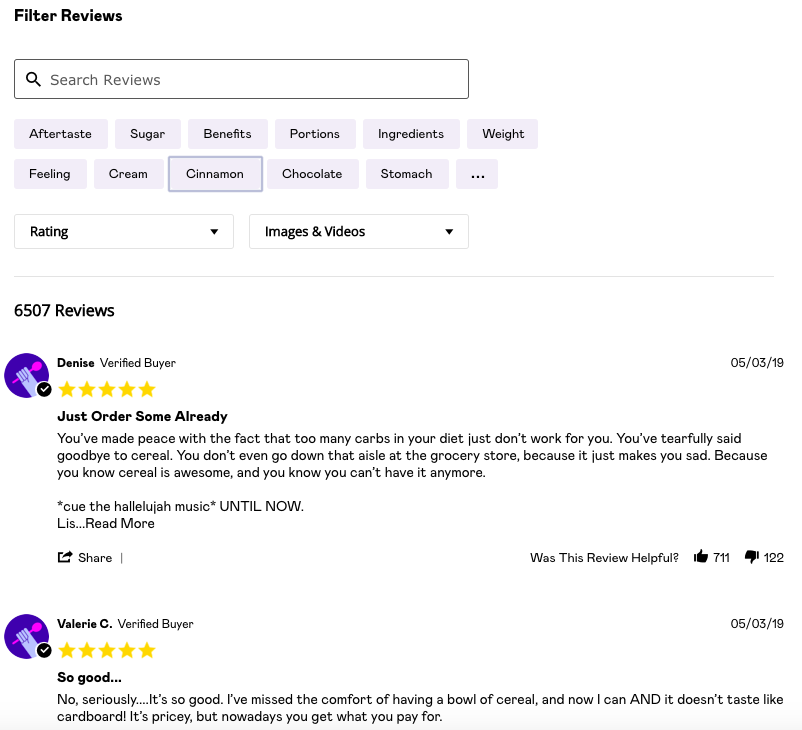
Everything about their site really is delicious. They have one product in different flavors, but nothing about it feels boring. Highly recommend taking a peek if you haven’t seen it before.
JUDY
Yep, the same JUDY with the killer text strategy.
Their homepage is clean, bright, and incredibly easy to navigate.
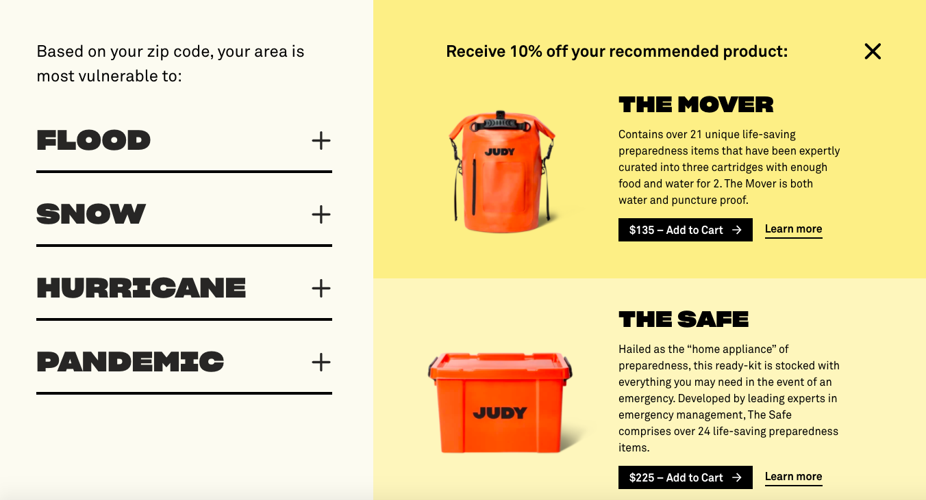
And if you’re not sure which product is best for you, they have a quiz that takes 2 minutes (Seriously, I took it for this post, so I know how easy it is).
They ask for your zip code, the number of people in your home/apartment, if you have pets, etc. Then it brings you to a personalized page that tells you the disasters your area is most vulnerable to and the products that would be best for you.
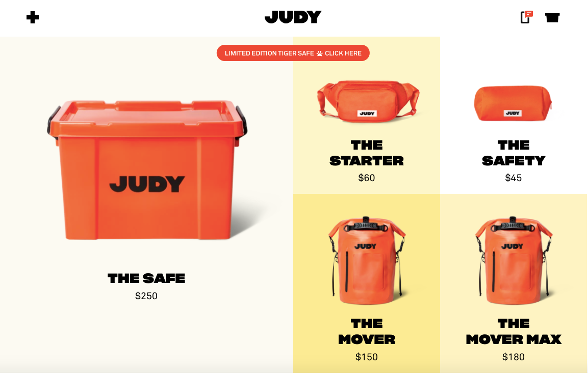
If you’re more of a browse-for-yourself kind of person, there’s a carousel that allows you to see all the options and when you hover over each product, you see a new angle, which feels more interactive and interesting than just a typical carousel.
If you click ‘Compare them all,’ you get to this page:
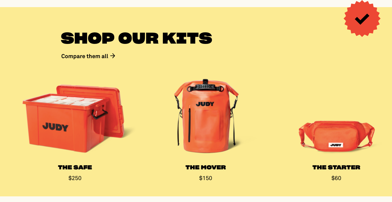
It’s an awesome visual that shows you all the options available.
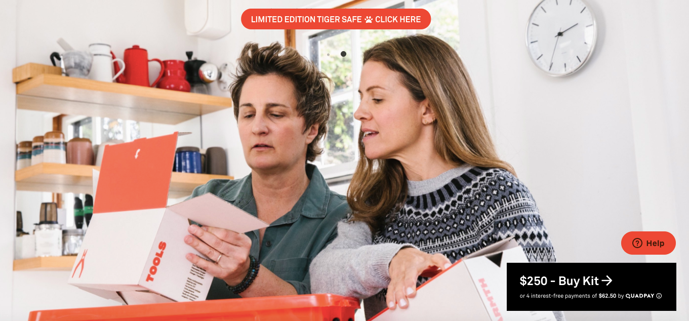
Let’s say I’m interested in The Safe. At the top of the page, there are awesome lifestyle shots – the product in a super clean space and a couple unboxing their new product.
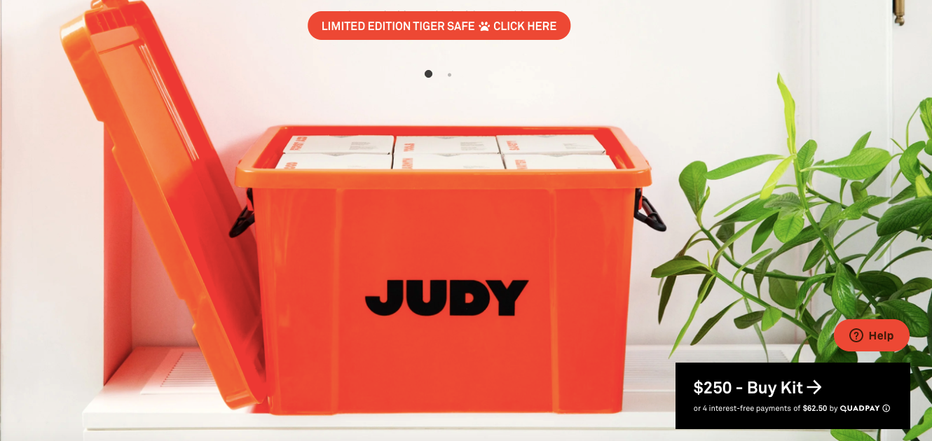
Both make it much easier to envision yourself with the actual product. There’s something about seeing it in someone else’s home that makes it easier to picture it in your own.
And the description is perfect:
Crystal clear, right?
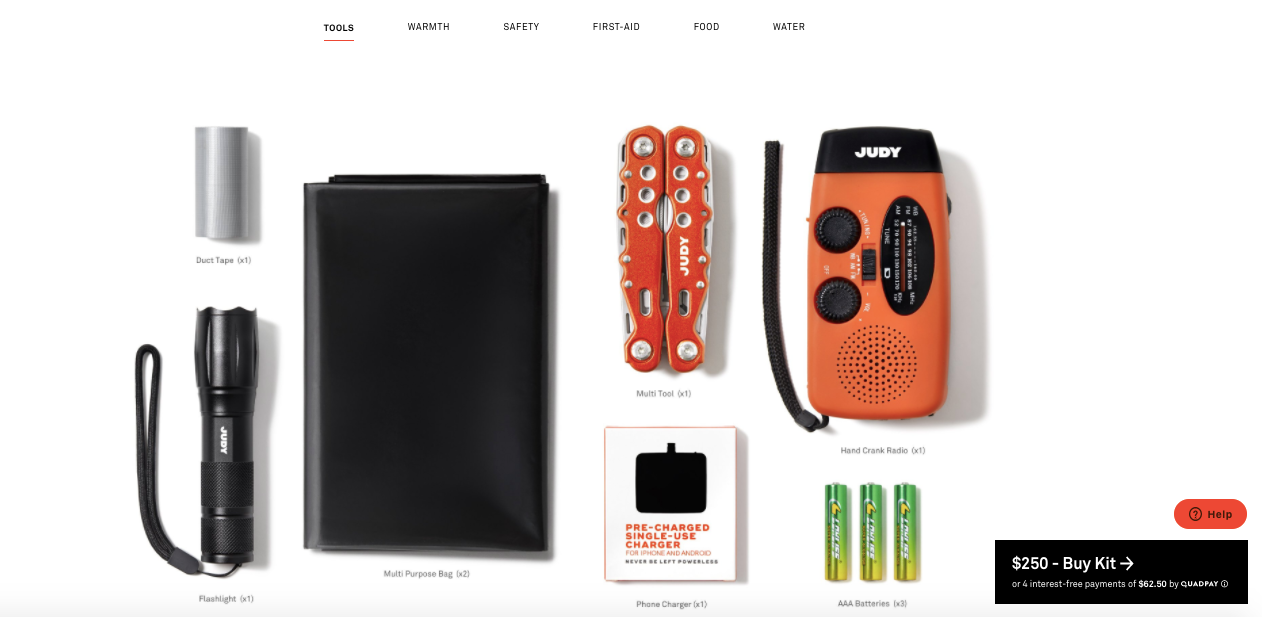
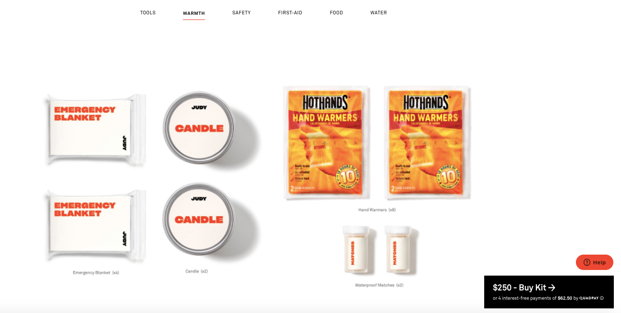
Then you get flat lay photos of exactly what’s included in the kit.
And you can toggle between all the categories of items included so it’s not an overwhelming amount of products all in one image.
And the button to purchase follows as you scroll, which is the ultimate way to remove friction for your site visitors.
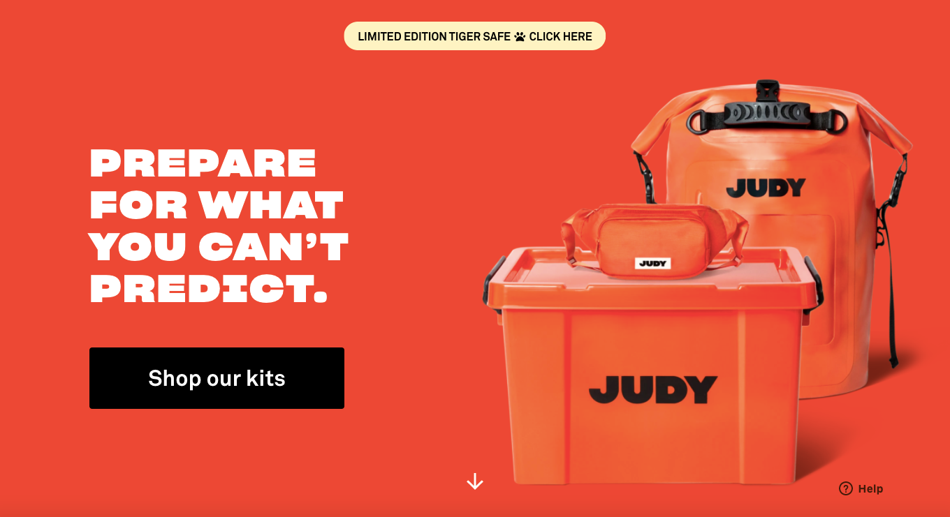
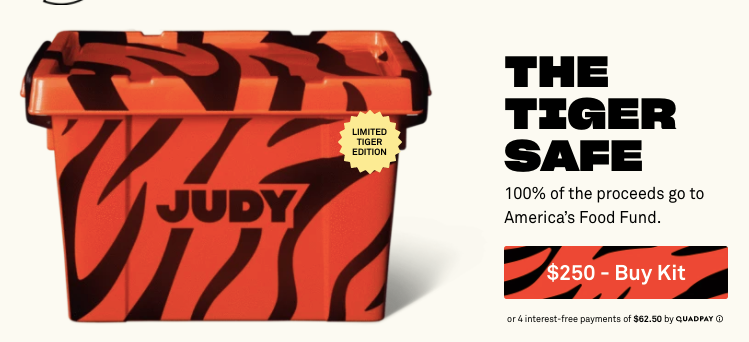
It’s also worth noting that they came out with a limited edition Tiger Safe to draw attention to their brand and mission, while playing off of a pop culture phenomenon.
The CTA to check it out is on every page (except for the actual Tiger Safe product page), so it’s hard to miss.
And once you get to the actual page, it does not disappoint.
The leaves, the limited edition banner, not to mention the fact that when you hover over the button to make a purchase, there’s a roar and it changes to a tiger print. How awesome is that?
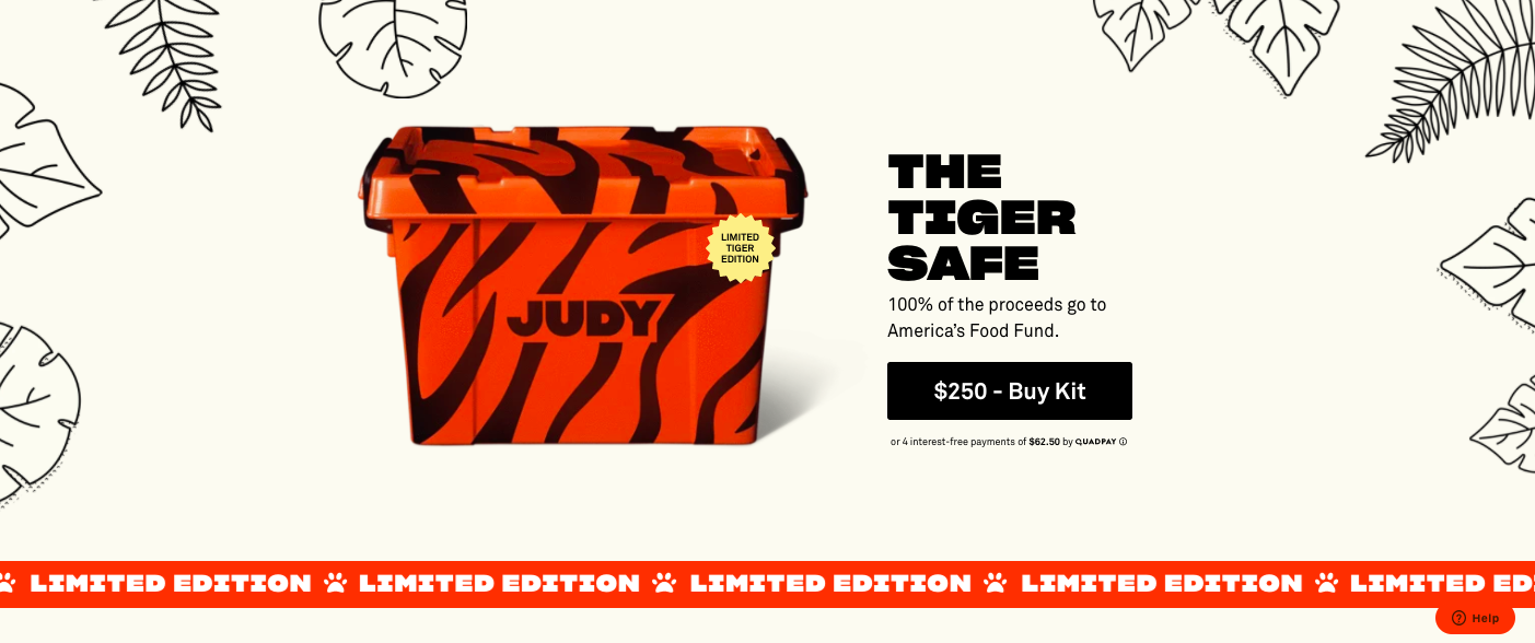
These are the kinds of small details that all add up to an experience your customers will remember. I know I will.
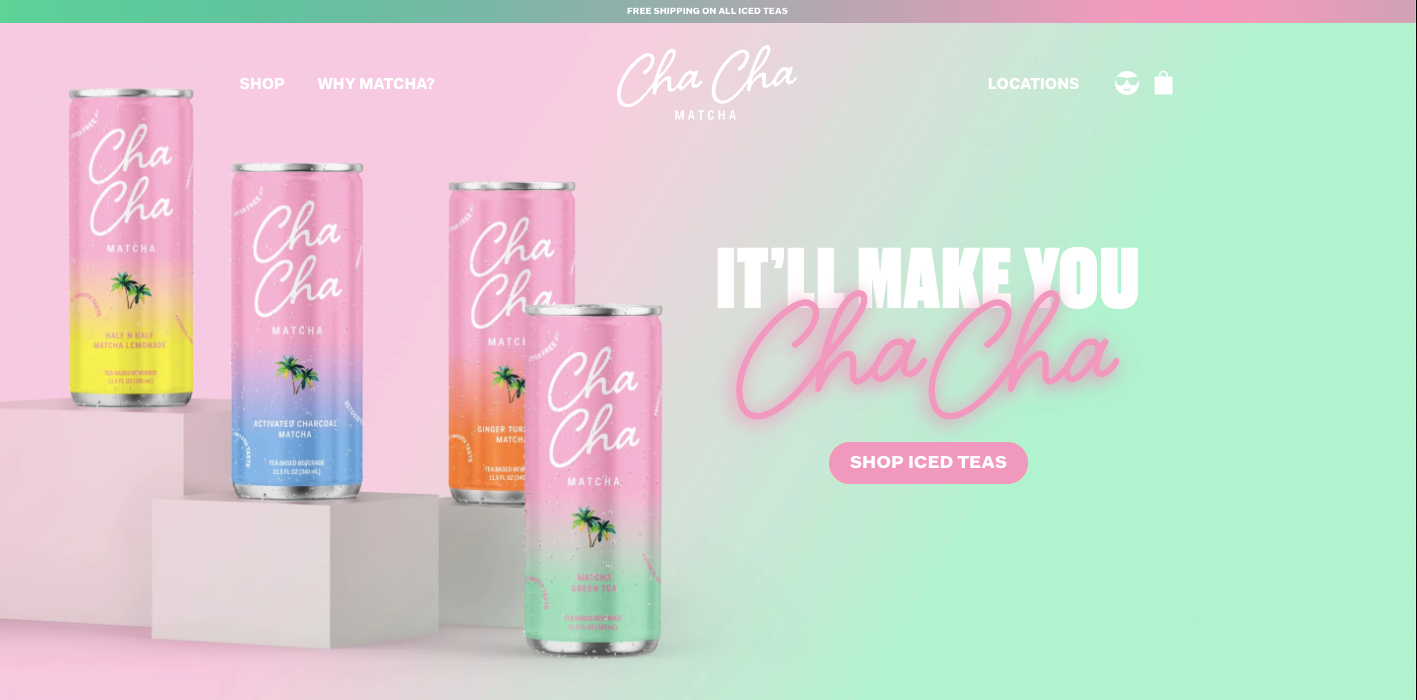
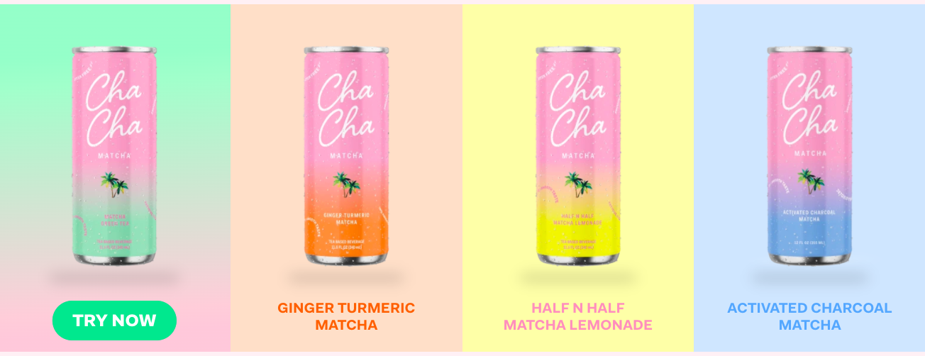
Cha Cha Matcha
First of all, HUGE matcha fan over here. 🙋♀️ Anyone else?
And the Cha Cha Matcha site is truly drool-worthy.
Just look at that gradient. And the Cha Cha cursive lettering looks like it’s being written in as the page loads.
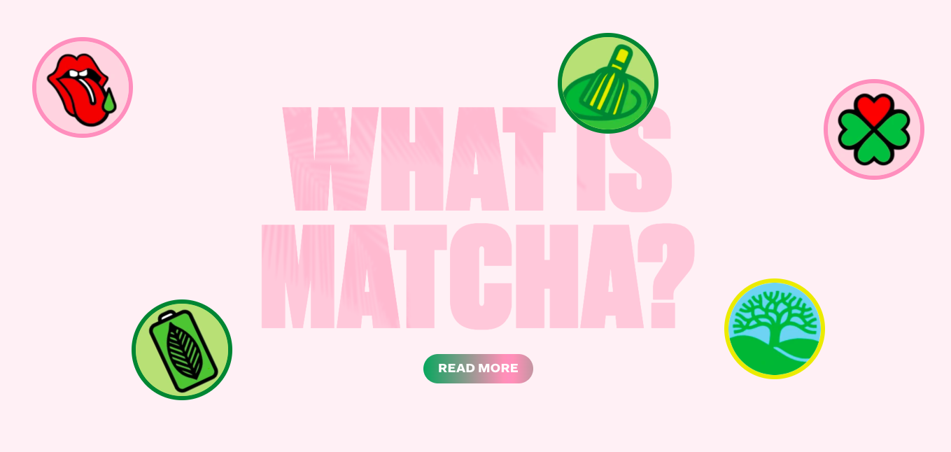
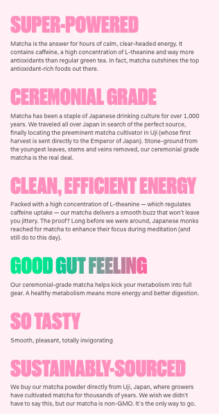
But you might be wondering, “What even is matcha?”
And they clearly get that one a lot. Because right away, you can learn about matcha if you’re curious.
And if you click ‘Read More,’ it brings you to a page that explains exactly what matcha is and the benefits its drinkers can expect.
And do you see that gradient over the ‘Good Gut Feeling’ text? That’s what happens when you hover over any of the headers. 🤤
But let’s get back to the homepage. Just look at how crisp and clean these product photos are. The colors, the gradient again when you hover. Everything is just so good.
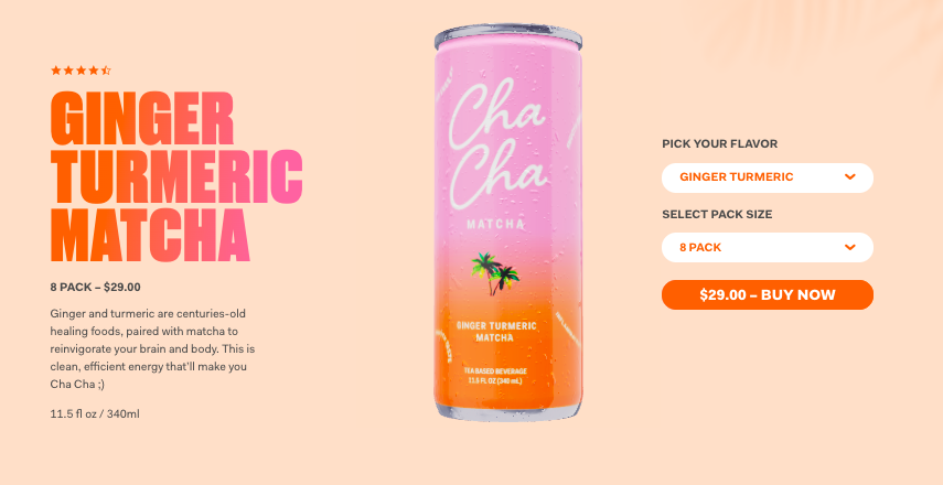
And when you get to the actual product page, WOW.
Do yourself a favor and check it out. You can rotate the can with your cursor to see it from every angle. It’s WAY cooler than it sounds, I promise.
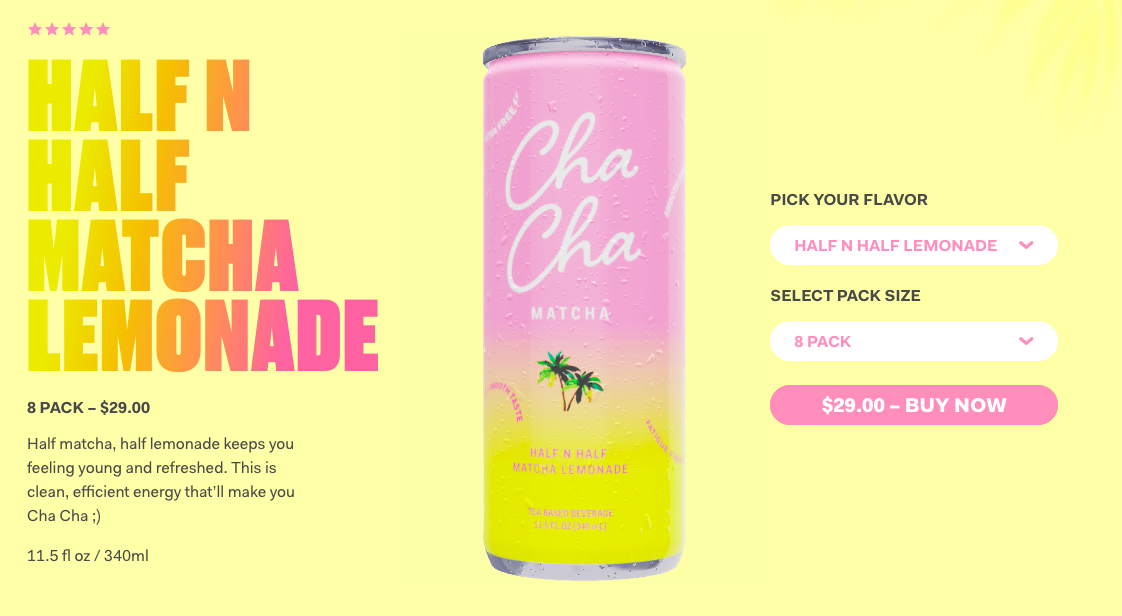
And just like Magic Spoon’s site, the theme changes when you select a different flavor.
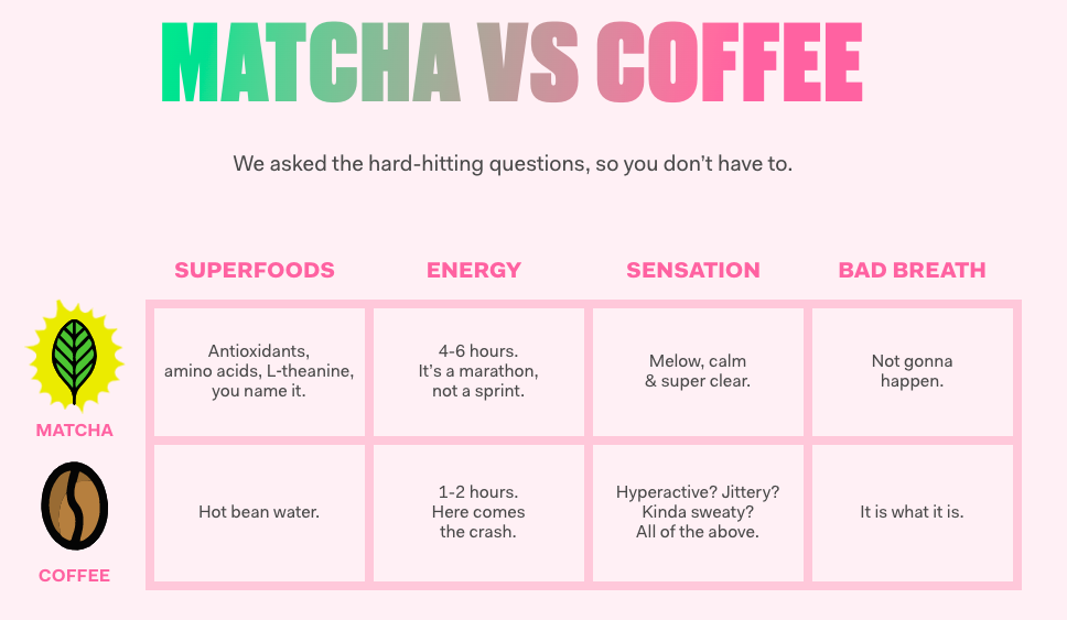
And this matcha vs. coffee chart is pretty awesome, too.
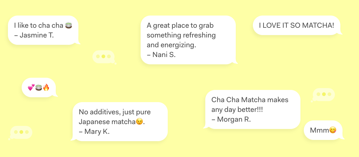
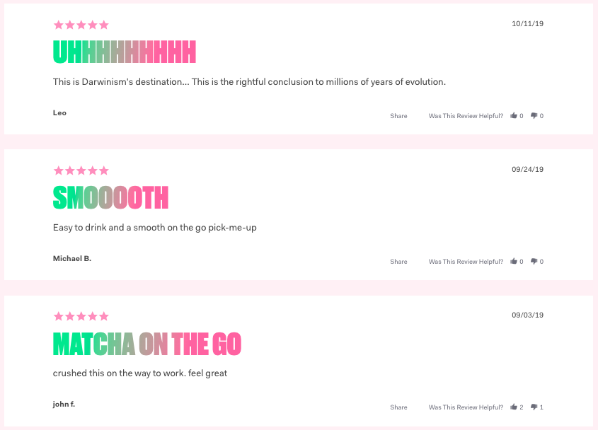
But the social proof and review sections are next level.
Everything about the site is SO good.
What you should do right now...GO
You probably noticed that there’s a lot of overlap across every category. Which makes sense, doesn’t it? These brands just get it.
They know what works for SMS, email, social, and design.
But even if you don’t have an insane budget, there are small details you can pull from each of these brands.
So the next time you’re feeling uninspired, just take a peek at what they’re doing.
In the meantime, I highly recommend subscribing to their text and email lists and following them on social. You’ll get constant inspo that’ll spark new ideas you can use for your brand.
And tweet @lwalkerhall to let me know if you found this post helpful!
Writen by Lauren Hall

Lauren is a Brand Marketing Associate at Privy. She's the brains behind all things content. When she's offline, she's obsessing over her Bernedoodle pup, Monster, and plotting ways to being a full-time Vermonter ASAP.
You may also like to read
Learn how we responsibly build, test, and refine AI models and capabilities to ensure accuracy and domain relevancy.
10 Things To Consider When Evaluating Shopify Apps For Your Shopify Store
With 6,000+ apps in the Shopify App Store, finding the right solutions for your store can be overwhelming. Here are 10 things you need to consider before you download your next Shopify app.
Best DTC Drink Brands Using Shopify and What Makes Their Sites Great
These DTC drink brands will inspire your ecommerce site no matter what kind of products you sell. Here are some of the best Shopify stores to guide you.
The Ecommerce Brands To Copy For SMS, Email, Social And Site Design (That We Stole From Nik Sharma)
Nik Sharma shared tons of brands he loves for SMS, email, social, and overall site design. And we did a deep dive on all of them so you can steal their ideas.