
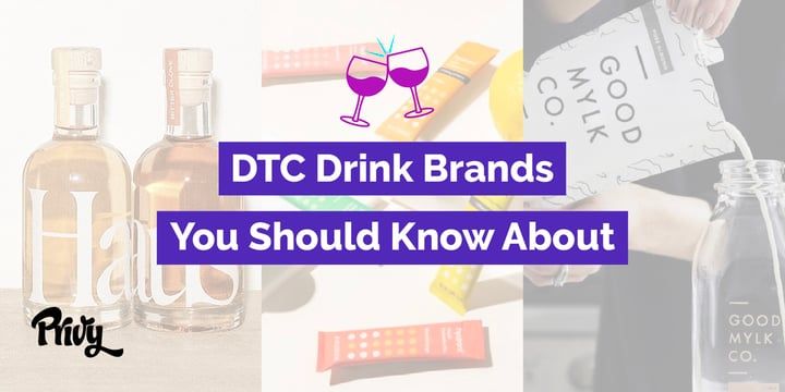
Best DTC Drink Brands Using Shopify and What Makes Their Sites Great
These DTC drink brands will inspire your ecommerce site no matter what kind of products you sell. Here are some of the best Shopify stores to guide you.

Written by Lauren Hall
DTC beverage brands are having a serious moment.
With recent launches of drink brands like Taika (coffee) and Ghia (a non-alcoholic aperitif), they seem to be popping up nonstop.
So there are tons of incredible Shopify stores to pull inspiration from. Not just for other beverage brands, but for any product.
These 6 DTC drink brands are on fire. They're meant to inspire your home page, product photos, and overall design. Because there’s a ton you can learn from what they’re doing right.
So this post is jam-packed with screenshots to show you exactly what you can tweak on your own site to make it wow-worthy.
Just click on any of the brands below and you’ll jump right to the section they’re featured in. And see just what makes them so good.
And if you need another new hobby to take on from home, you might want to try a couple of these. My kitchen has definitely seen a few of these brands in the last couple months. 😳
Get our best content on ecommerce marketing in your inbox 2 times a week
Haus
Like many founders, Haus’ husband and wife duo, Helena and Woody Hambrecht, were looking for something they couldn’t find anywhere on the market. So they decided to make it themselves.
The alcohol industry hasn’t evolved since prohibition, so they decided to change that with aperitifs that are made of only real ingredients and delivered straight to the consumer, without a middleman.
Home Page
The moment you land on Haus’ home page you see how seriously their team takes design, especially product photos.
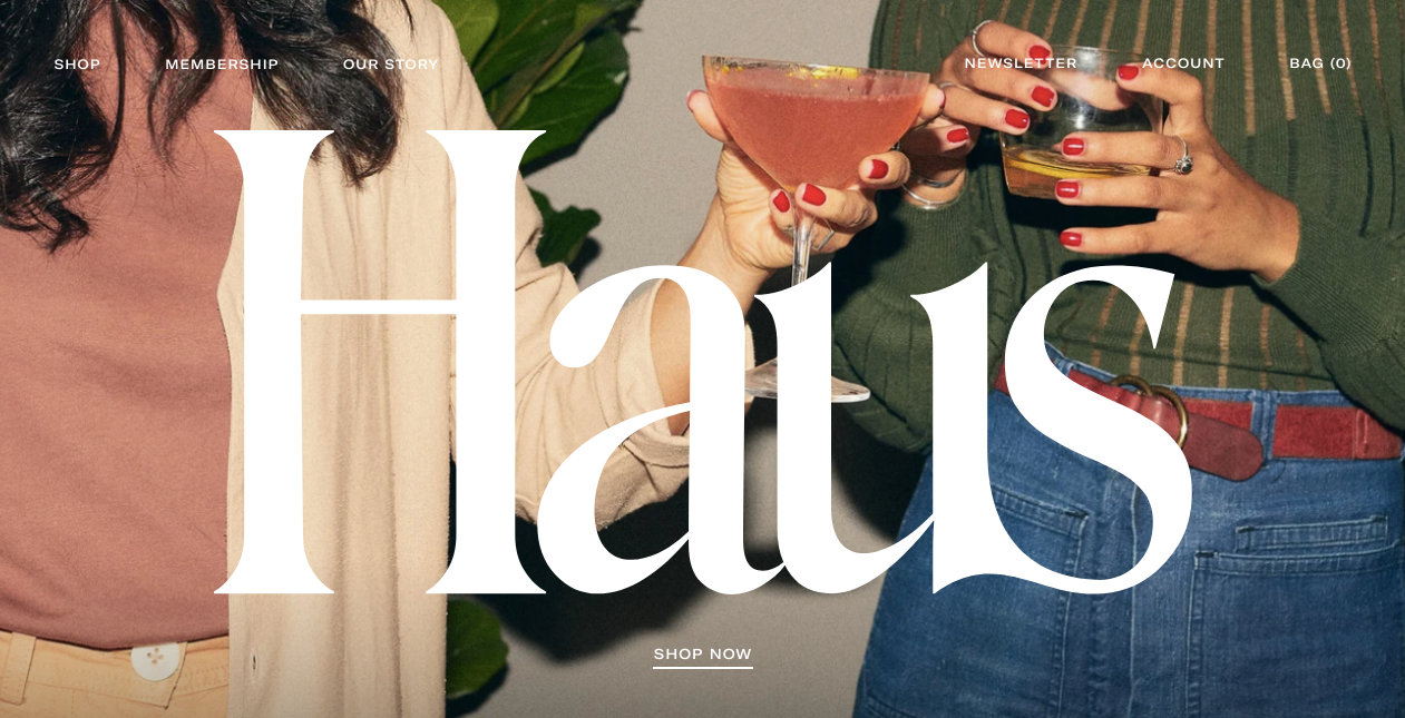
You don’t see faces, but you can picture yourself at this party, can’t you?
And the large, bold lettering really stands out.
As you’ll see, Helena’s background in photography and creative really shines through every aspect of the site.
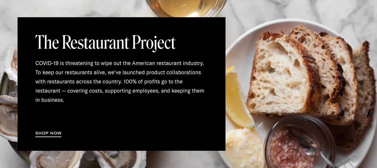
Below the fold, you immediately see, The Restaurant Project, Haus’ effort to help restaurants weather closings due to COVID-19.
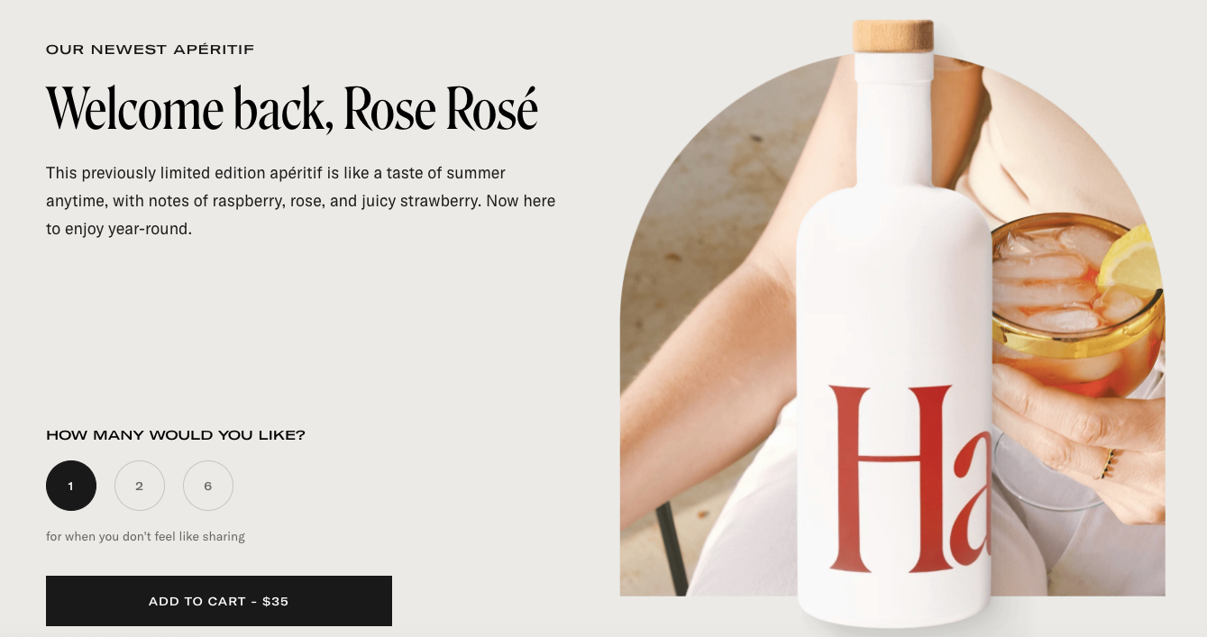
Next up is their newest aperitif, Rose Rosé. You don’t even have to click off the home page to add the product to your cart, making it a really great user experience.
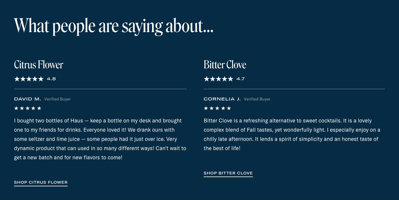
And the home page wouldn’t be complete without a little social proof. But what makes this particular review section so great is that there are reviews for specific products and you can easily shop both right from there.
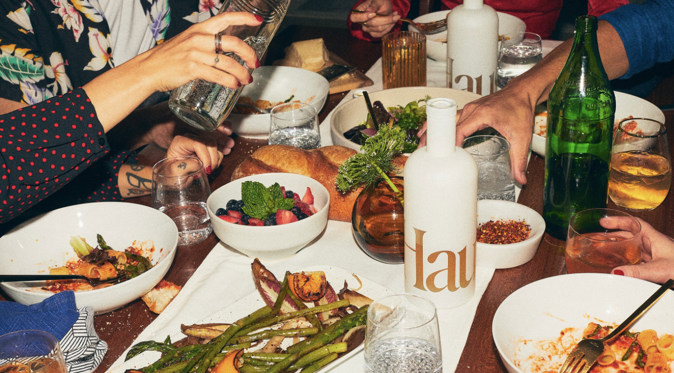
Take a close look at this dinner party shot. Most food photos feature untouched food and silverware and super clean surfaces. Not this one. It’s complete with crumbs on the table, partially-eaten pasta, a napkin on the table. It looks like a real dinner party. You can see yourself at that table with your friends. And if people can envision themselves using your product, they’re more likely to make a purchase.
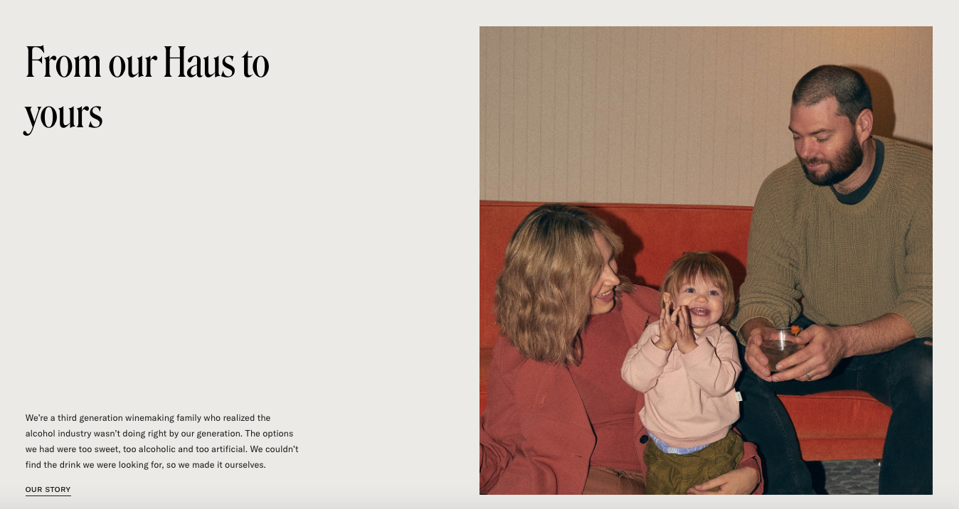
Even the photo of the founders feels more personal than what you see on most sites. Here it’s just a happy family, not a buttoned-up, corporate version of Helena and Woody. It looks like they’re just hanging out in their living room and you get a sense of the laid-back vibe they’re going for.
About Page
Unsurprisingly, this sense of personality and relatability carries right into their ‘About’ page. The first photo is of the whole family in a pumpkin patch in casual outfits, spending time together. It makes you think, “OK, they’re just a regular couple,” rather than a glamorous power couple you can’t necessarily identify with.
Then they get into product education. Why are aperitifs better than the traditional alcohol we’re used to? And, actually, what even are aperitifs? Glad you asked. They get this one a lot.

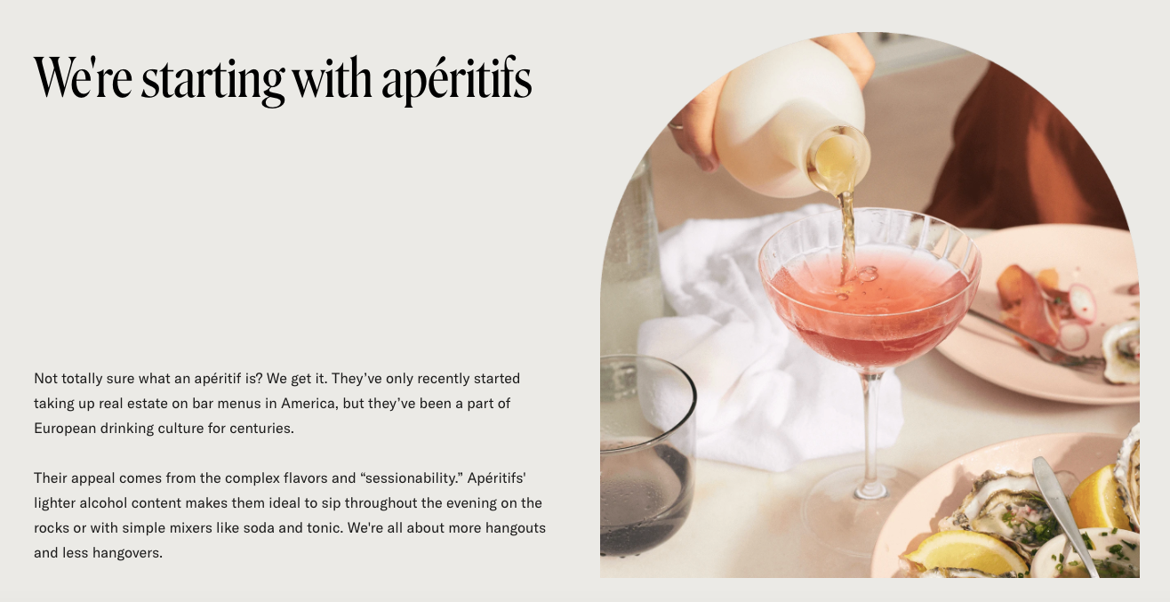
“We're all about more hangouts and less hangovers.” I LOVE that line. It also implies that there might be other products in the future, since they’re “starting with aperitifs.” We’ll see...
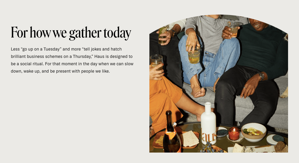
“Less “go up on a Tuesday” and more “tell jokes and hatch brilliant business schemes on a Thursday,” Haus is designed to be a social ritual. For that moment in the day when we can slow down, wake up, and be present with people we like.”
Can’t you tell exactly what their brand is about just based on that description? I especially like the part about being with “people we like.”
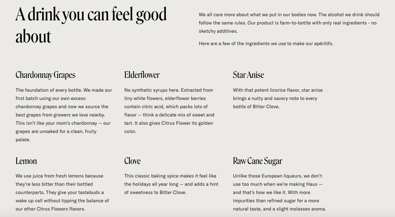
And because Haus is all about making a better drink, of course there’s a section about some of the ingredients they use to create them.
Their ‘About’ page not only does a great job explaining what their product is and why it’s better than the traditional alcohol we’re used to, but also sheds light on the couple behind the brand – a great combination that gives a bigger picture look at what they’re all about.
Product Pages
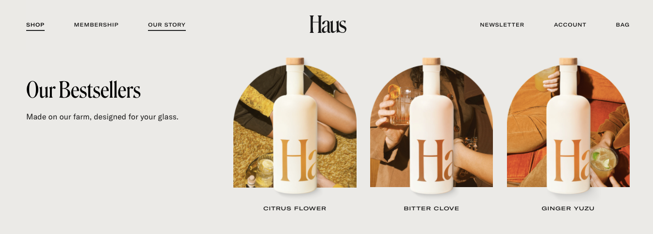
Before you even get to the product page, hovering over ‘Shop’ on the far left side of the navigation displays a few of their bestsellers.
Like the rest of the site, the photos of each product are 👌.
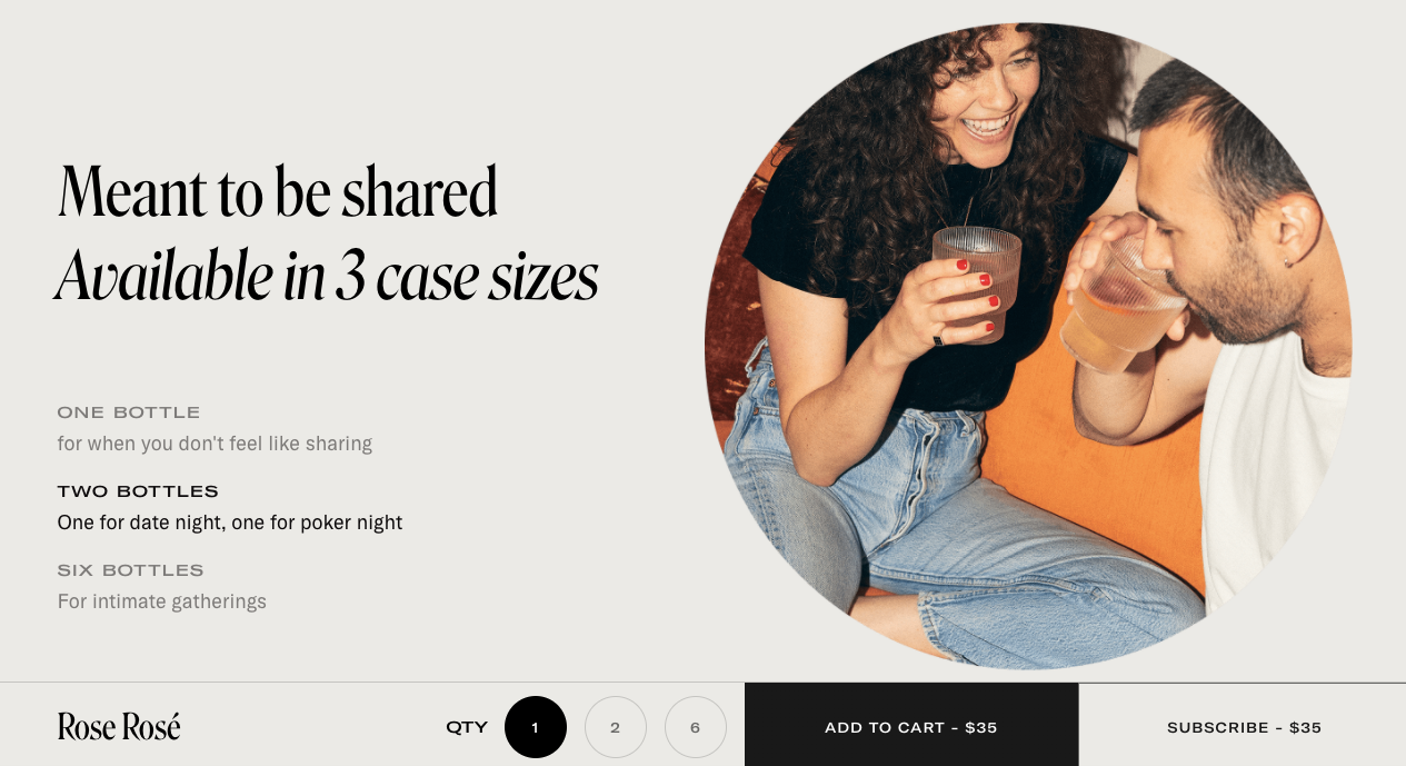
When you’re selecting the number of bottles you’d like, the descriptions change to better describe what the different options (1, 2, and 6) are meant for.
As you can see in the photo above, the description for 1 bottle is “for when you don't feel like sharing.” 2 says, “One for date night, one for poker night.” And 6 is “For intimate gatherings.”
Such an easy way to make a call about what’s right for you. And if you miss it there, further down on the page you see it laid out differently.
Even when you scroll, the ‘Add to Cart’ bar follows, making it incredibly easy to add the product to your cart no matter where you are on the page.
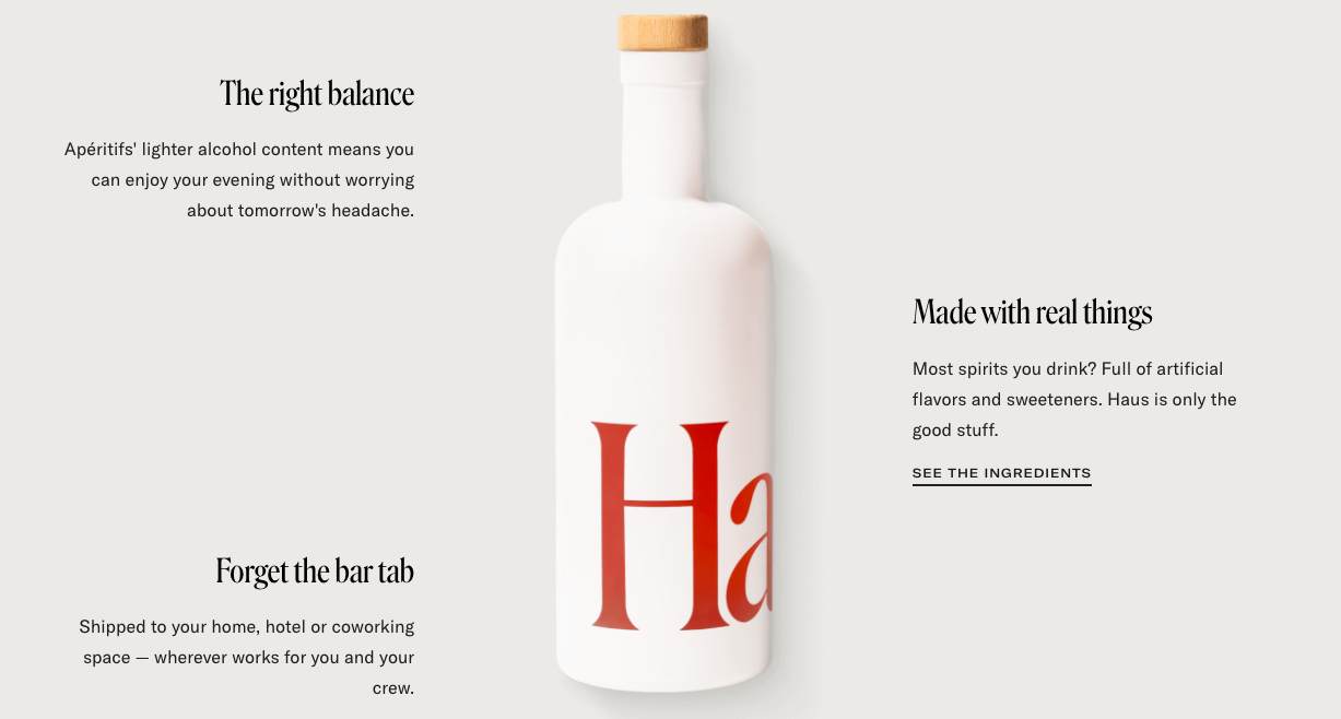
They also do a great job with education on the product pages, knowing that many first-time visitors won’t know much about what they sell.
This image makes it super clear what’s so good about Haus. 1. Less alcohol. 2. It’s made with real ingredients. 3. It comes straight to your door.
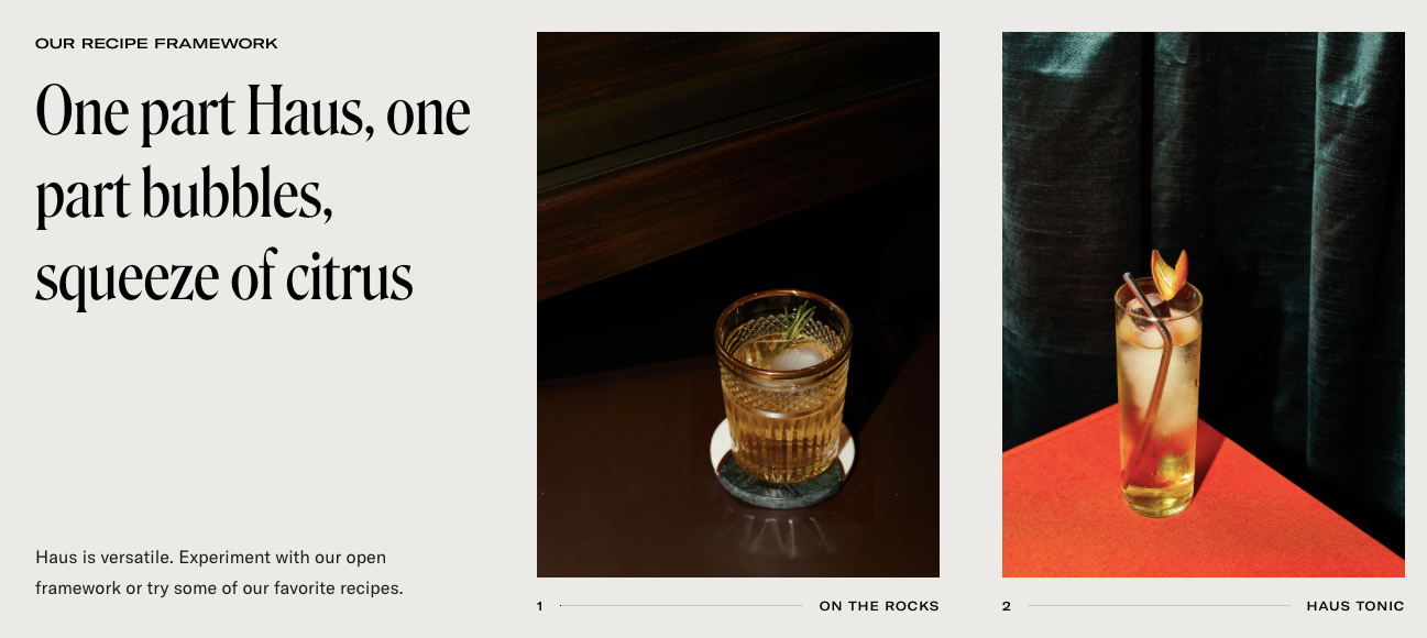
Along the same lines, they also include ways to drink Haus – on the rocks or with tonic. Both with beautiful product shots, of course.
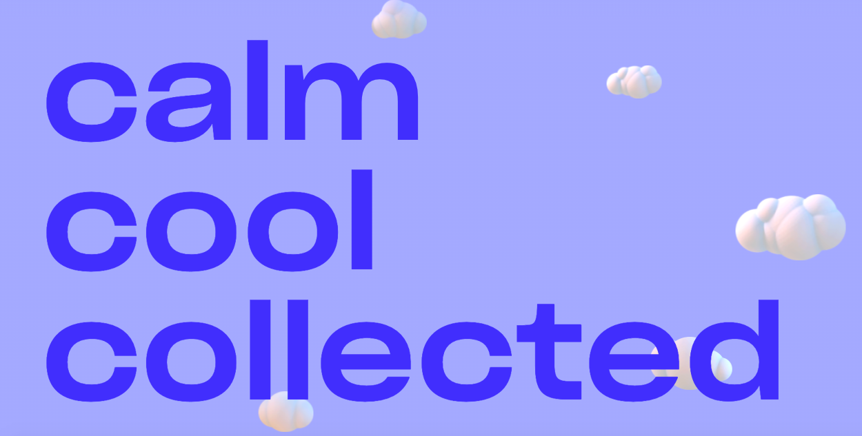
Recess
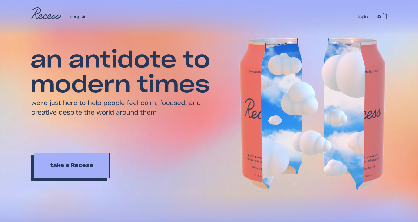
Recess’ sparkling water infused with hemp extract and adaptogens is “an antidote to modern times.” So their entire site is designed to be zen. And their mission, “to help people feel calm, focused, and creative despite the world around them,” couldn’t be more perfect for the world we’re living in right now.
Home Page
The home page is exactly what you’d imagine. An oasis-like backdrop that’s reminiscent of a sunset you’d see on an island somewhere. And I highly recommend actually going to check out their site, because they’ve incorporated a lot of motion into it that makes it super interesting. For instance the can you see on the right opens when you first get to the site and the clouds mimic the sky, slowly moving across the screen. As you continue to scroll, you’ll see that the clouds continue on the rest of the page.
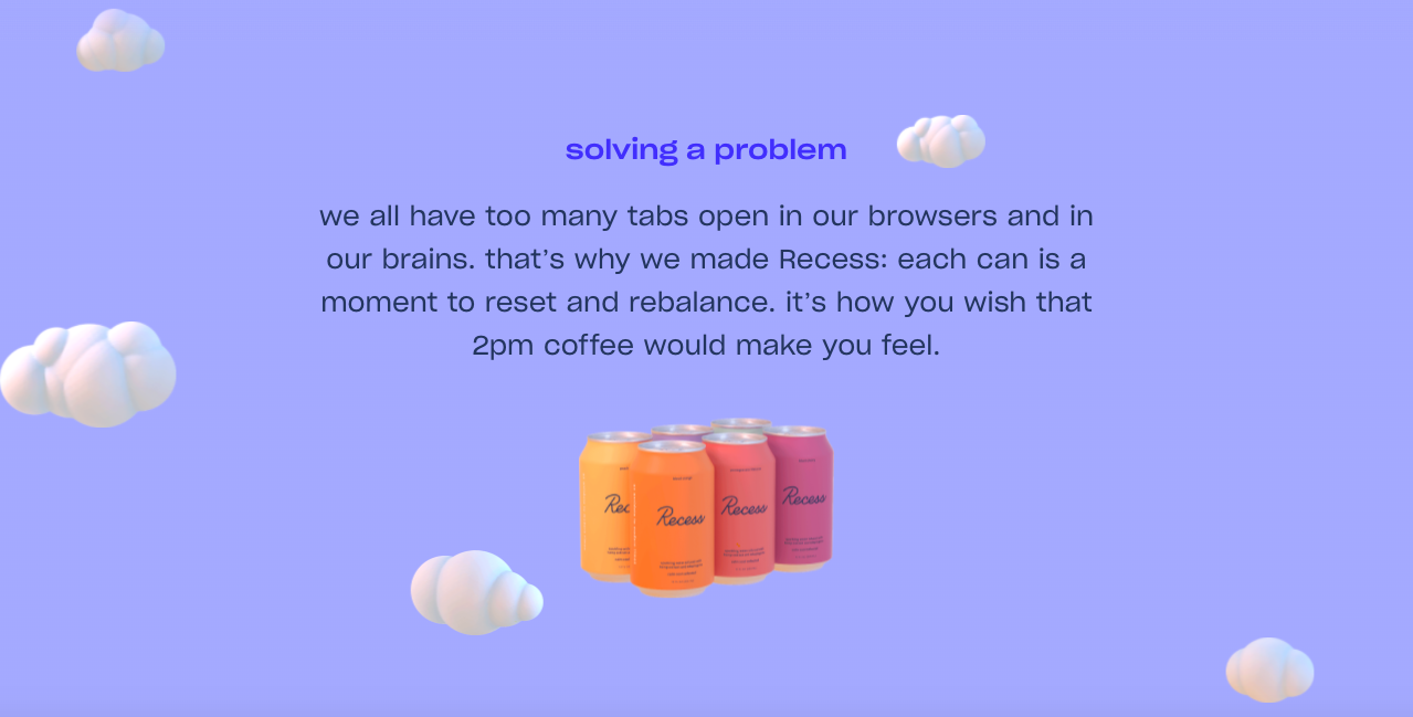
Because new visitors to the site still might not be exactly sure what Recess is all about, they continue to explain below the fold. Recess gives you the feeling “you wish that 2pm coffee would make you feel.” Even non-coffee drinkers understand what they’re getting at here.
And if you’re still not sure how their drinks are supposed to make you feel, these three words should make it really easy. This is another part of the site that you should see with your own eyes because the motion aspect is so eye catching.
But this is my favorite section of the entire site. You see the entire flavor lineup side by side, but it gets way better.
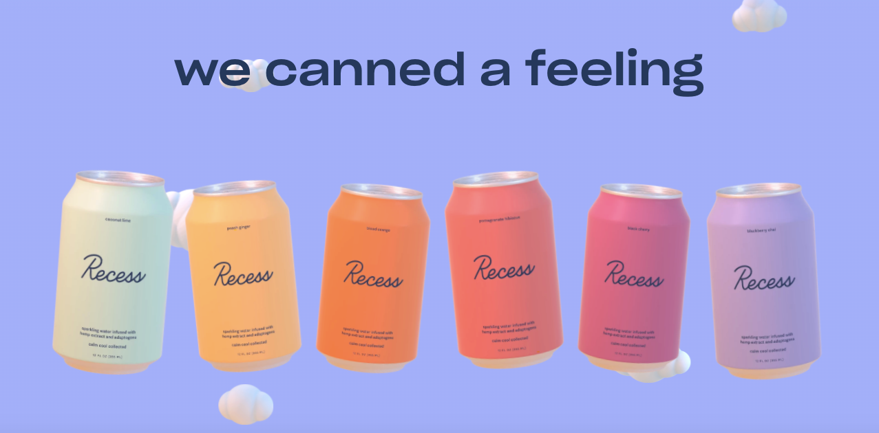
When you hover over any of the cans, the whole page is responsive and changes to a theme that makes sense for the flavor you’re looking at. So Coconut Lime (the light green can all the way to the left) looks like this:
And this is what Pomegranate Hibiscus looks like:
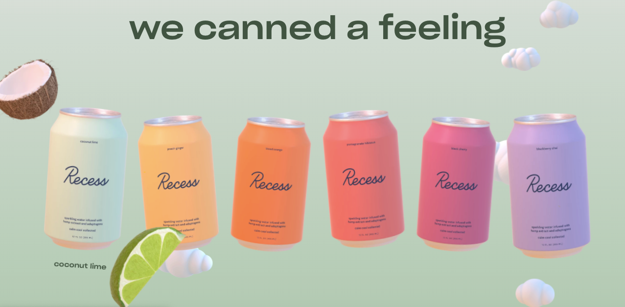
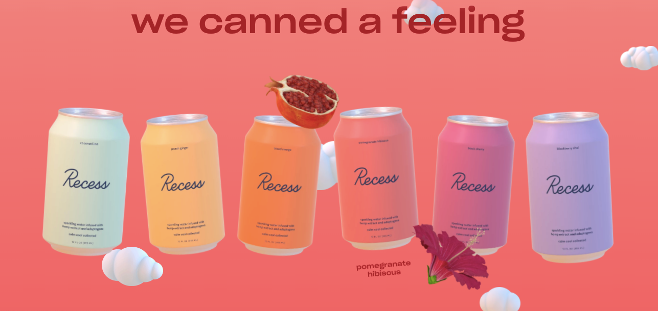
This section also makes it really simple to shop. When you click on any of the cans, you’ll go straight to the product page and can check out from there.
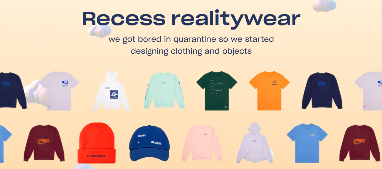
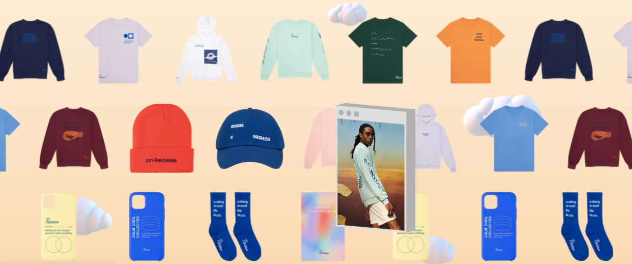
They, like everyone else in the world, had a little extra time on their hands in quarantine. So they designed a line of what they call, ‘realitywear.’
And when you hover over any of the products, a small window pops up that shows it in action.
Product Pages
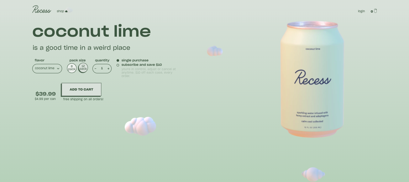
Unsurprisingly, the Recess product pages are 🔥. Just like the images on the homepage, the product pages are each designed to match the flavor you’re looking at. So let’s take a look at Coconut Lime.
They make it incredibly easy to see the price you’re paying for each can based on quantity and subscription status. So if I’m looking at the 8 pack, which is only available for a one time purchase, I’ll be paying $4.99/can. But if I subscribe, I’ll get a 12 pack every two weeks for $4.16/can.
And if you’re not familiar with Recess, you probably don’t know they have personalities for each of their flavors, which makes their social game STRONG (more on that in this post) and gives their product pages a level of depth most are lacking. So when you hover over the can, you get a sense of his or her personality.
Then you get a better description further down the page:
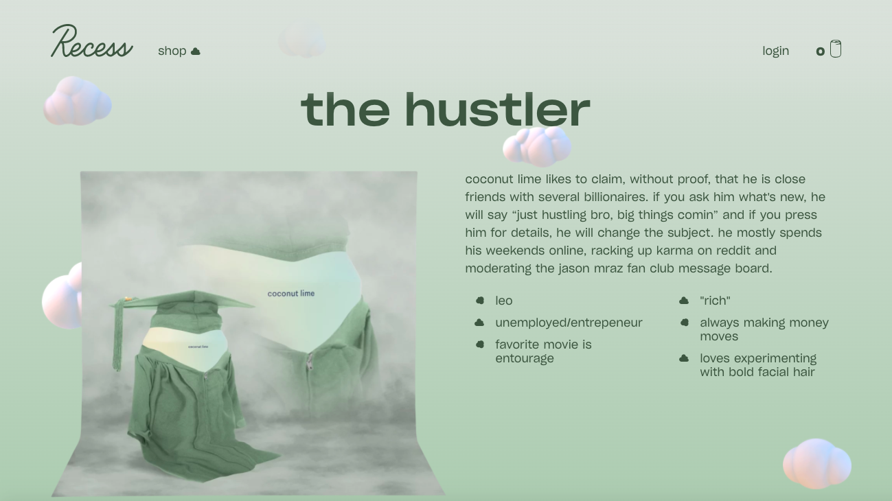
It says, “coconut lime likes to claim, without proof, that he is close friends with several billionaires. if you ask him what's new, he will say “just hustling bro, big things comin” and if you press him for details, he will change the subject. he mostly spends his weekends online, racking up karma on reddit and moderating the jason mraz fan club message board.”
Then in bullets:
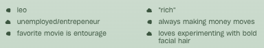
We all know someone kind of like this (whether or not we like them is a totally different story), so it makes the brand relatable and funny.
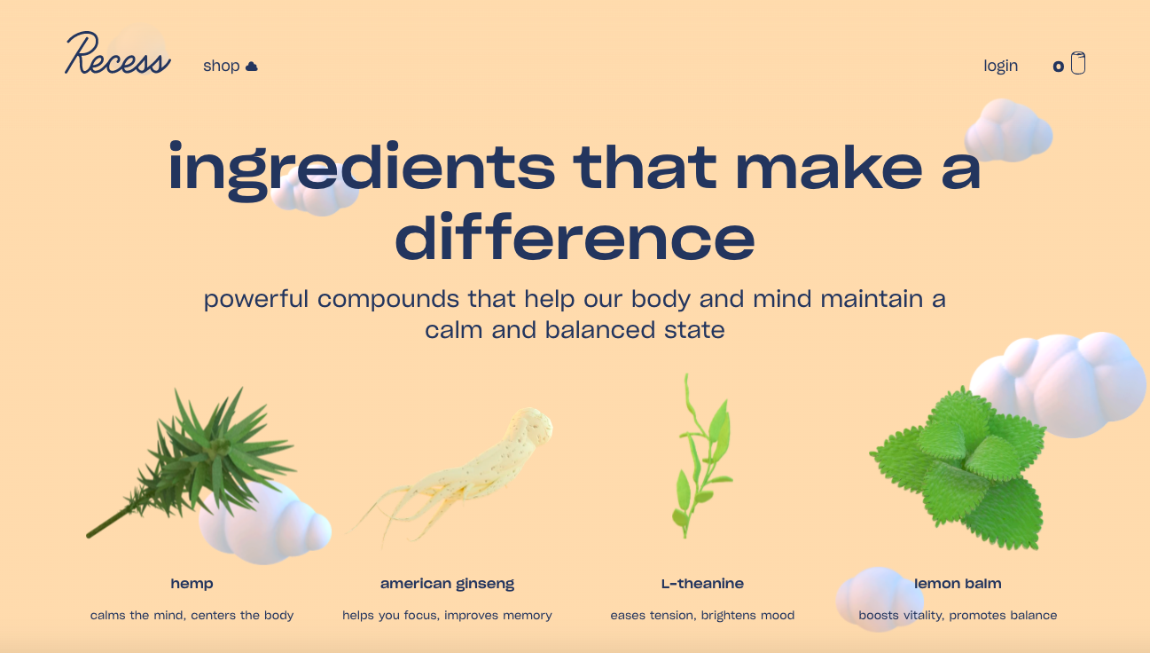
They also make the ingredients really clear in a visually appealing way for each flavor and break down what they’re good for in a way that makes sense to everyone and isn’t jargon-y at all. So the quick description for american ginseng is: “helps you focus, improves memory.”
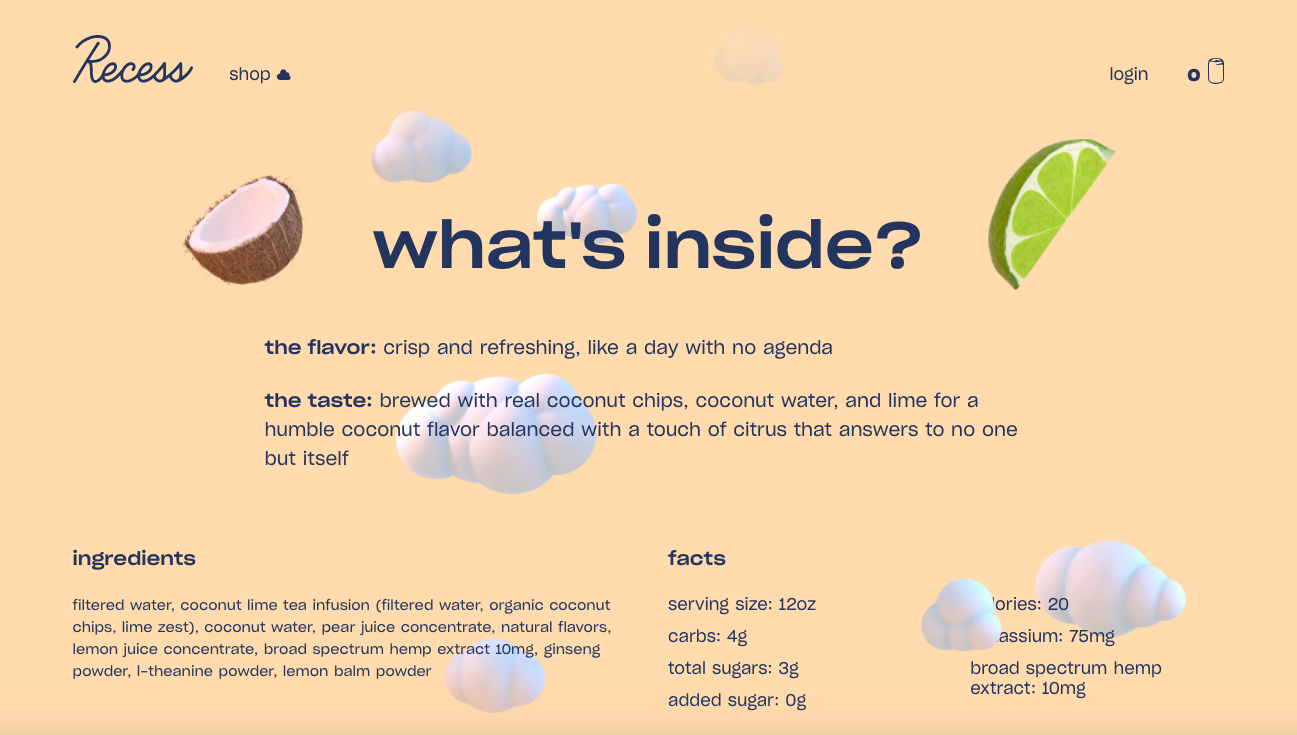
You’ll also notice that the background colors shift as you scroll. So what started as a light green, turns into a peach-y color further down.
And the description is really similar to the ingredients section: visual, not too wordy, but packed with personality.
Sunwink
Sunwink’s sparkling tonics have been a serious guilty pleasure during quarantine. I’m not getting 2 $4 coffees every day, right? So I’ve been treating myself to these bad boys. And let me tell you – they’re SO good.
Home Page
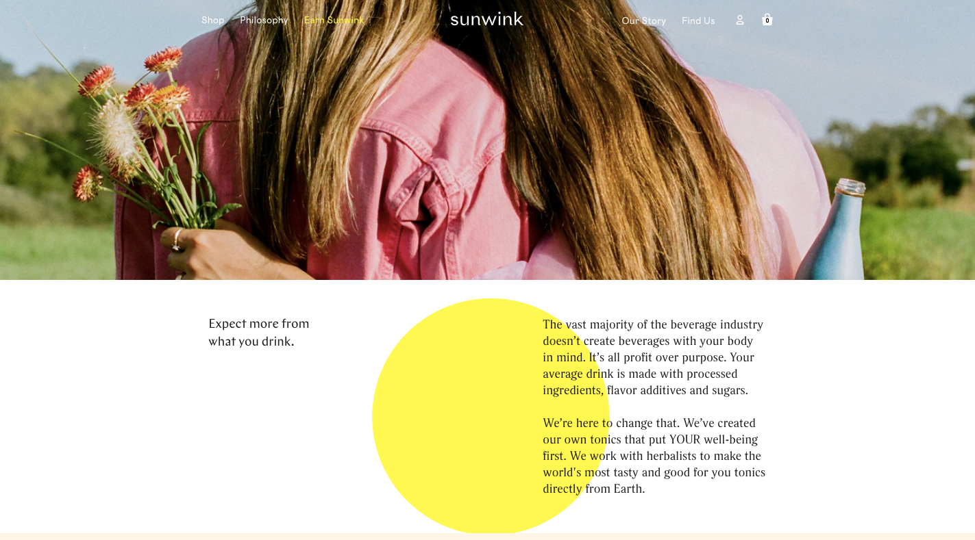
Like Recess, Sunwink’s home page does a killer job setting you up to understand what their brand is all about: bringing you ‘wellness in a bottle.’
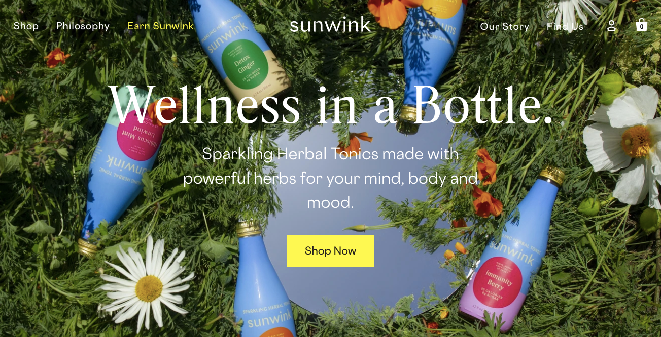
And in one scroll, you’re able to shop their products, which is great for getting visitors to product pages ASAP.
It’s also really easy to see what their products are made with.
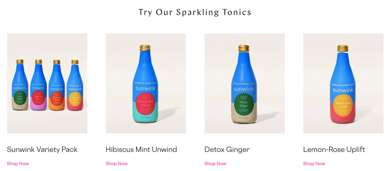
You’ll notice that their site has a lot of circles, which even carries through to the design on their labels, making it feel like a really cohesive experience across every touchpoint.
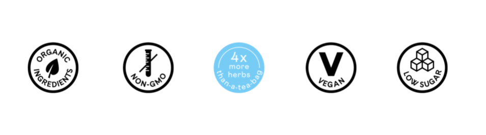
To make it even more clear that their products are made with natural ingredients, they also have this section that’s short and sweet, but gets the message across.
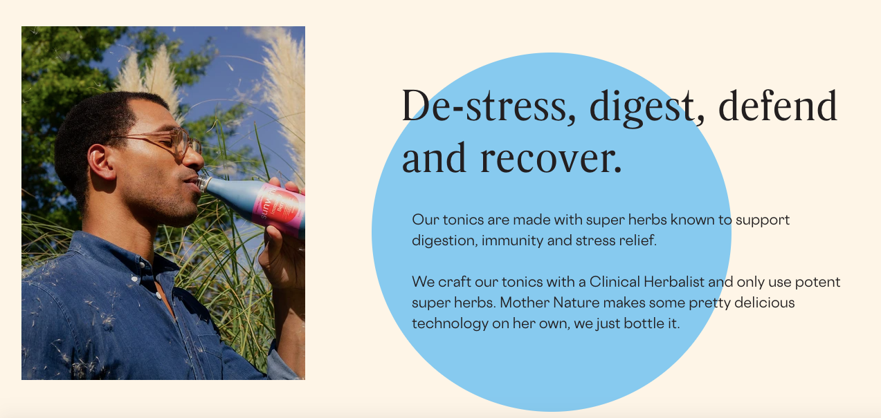
Philosophy Page
The second section of Sunwink’s navigation is dedicated to their philosophy. Clearly it’s important to them, and a huge part of why the founders created the brand, so they decided to create a page dedicated to it.
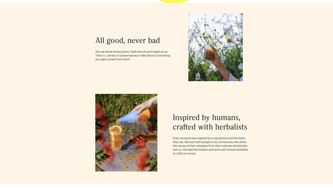
I especially like the way they position their drinks and explain how and why they’re better than traditional beverages: “The vast majority of the beverage industry doesn’t create beverages with your body in mind. It’s all profit over purpose. Your average drink is made with processed ingredients, flavor additives and sugars. We’re here to change that.”
I love the color blocking they use to break up the page and dig further into their process. And the photos are awesome. They fit the aesthetic that was used on the home page perfectly, carrying the theme through really well.
Product Pages
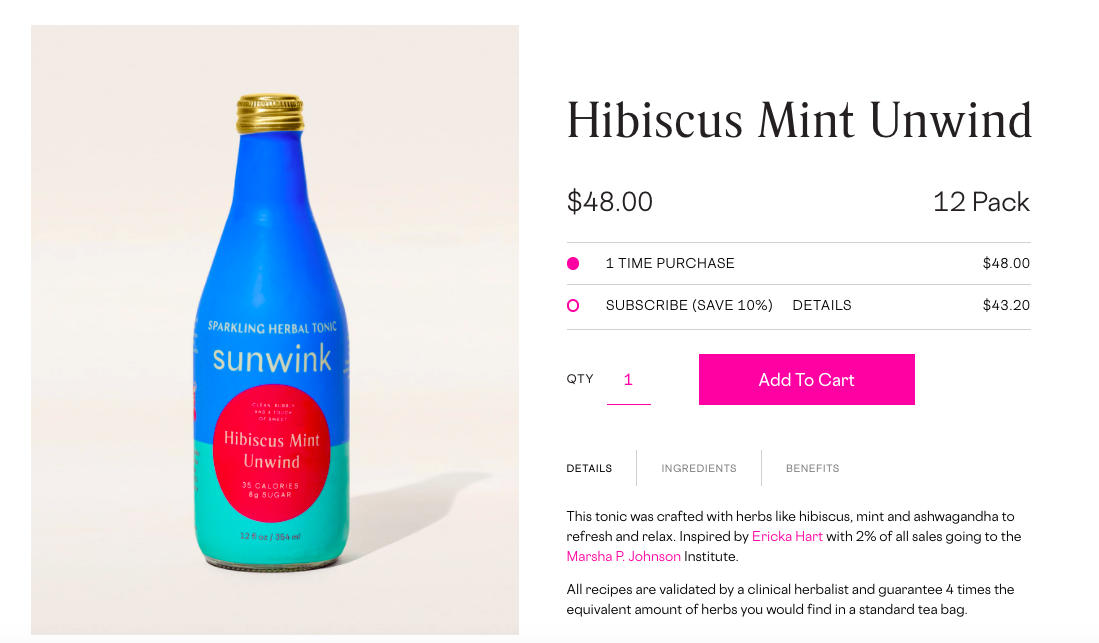
Sunwink’s product pages are relatively simple, but do a great job showcasing what makes them so good. Like Recess, they make it really easy to select a one time purchase or subscription option.
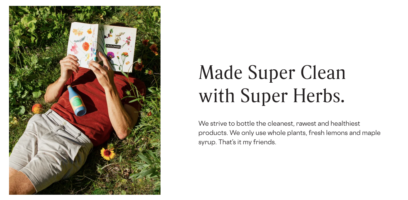
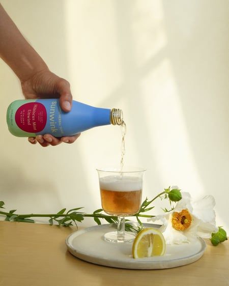
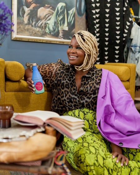
And rather than just having one image of the drink in a pretty sterile setting, they include a couple other photos that make it really easy to picture in your own life. Like this image that’s clearly staged, but doesn’t feel over-produced.
Or this one that feels like a scene from her actual life. The curtain is askew behind her, her book is open, and there are objects in the foreground that most brands intentionally remove. But this feels more real. I love it.
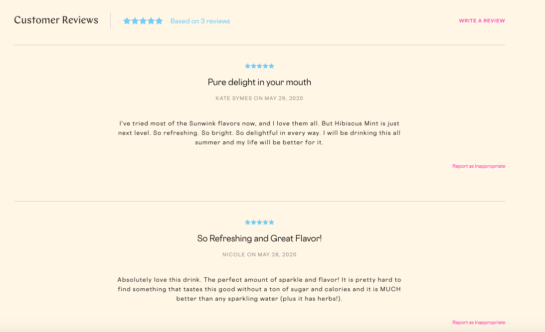
Next you get to the review section, which, like the rest of the page, is really clean and straightforward. I really like the fact that the background color changes from white to the peach color, making it stand out. The use of the bright blue and pink to add pops of color is also on point.
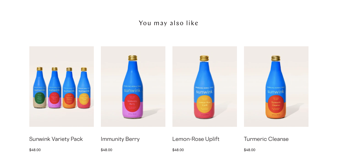
The last thing worth calling out on the product page is the section at the bottom of the page that suggests other flavors you might be interested in, making it really easy to toggle between pages.
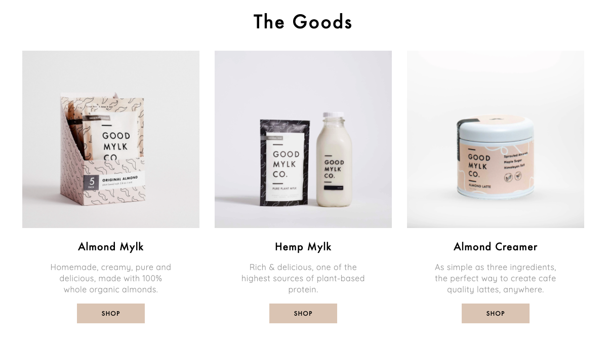
Goodmylk Co.
Goodmylk Co. makes plant-based milk products without taking any shortcuts. When Goodmylk Founder, Brooke Rewa, started experimenting with real ingredients that led to a healthier lifestyle, she wanted to share that with the world.
Home Page
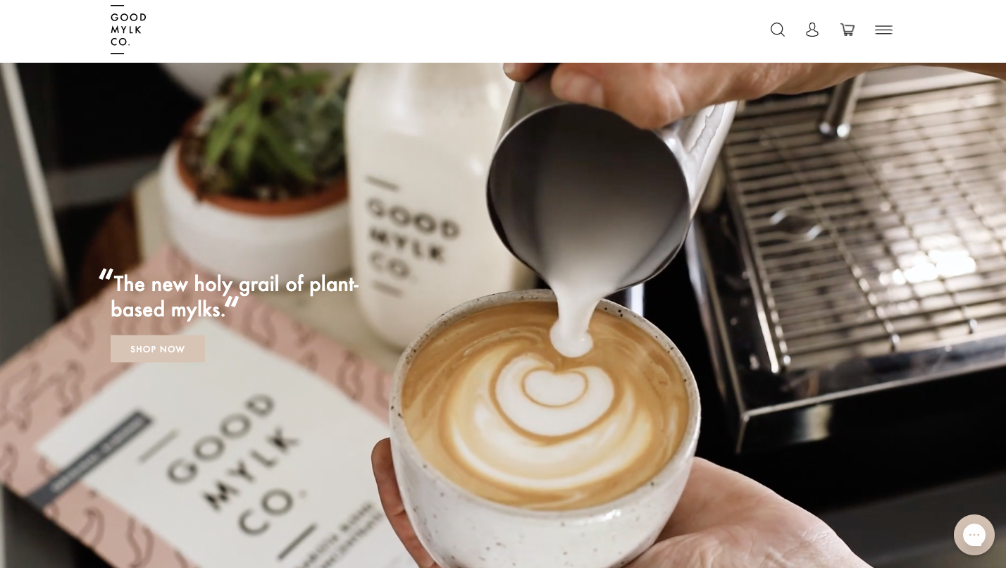
This is another one you’re going to want to see with your own eyes. The hero image is actually a video. And I promise it’ll make you want a latte. 🤤
I love that one of the first things you see is a quote. It’s not the way they see their product, but how an actual customer thinks about their brand, which is much more powerful. It’s “the new holy grail of plant-based mylks.”
It’s also selling you on a vision first, product second. Yes, you can see their product in the background, but the main focus is on the latte – something their product can certainly be used to make, but not the actual product they sell.
Like many of the other brands we’ve seen so far, they make it really easy to start shopping right on the home page.
I mean just look at their branding and packaging. The subtle mustaches, the font, colors, everything is just so good.
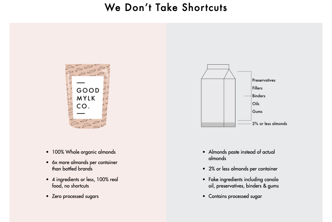
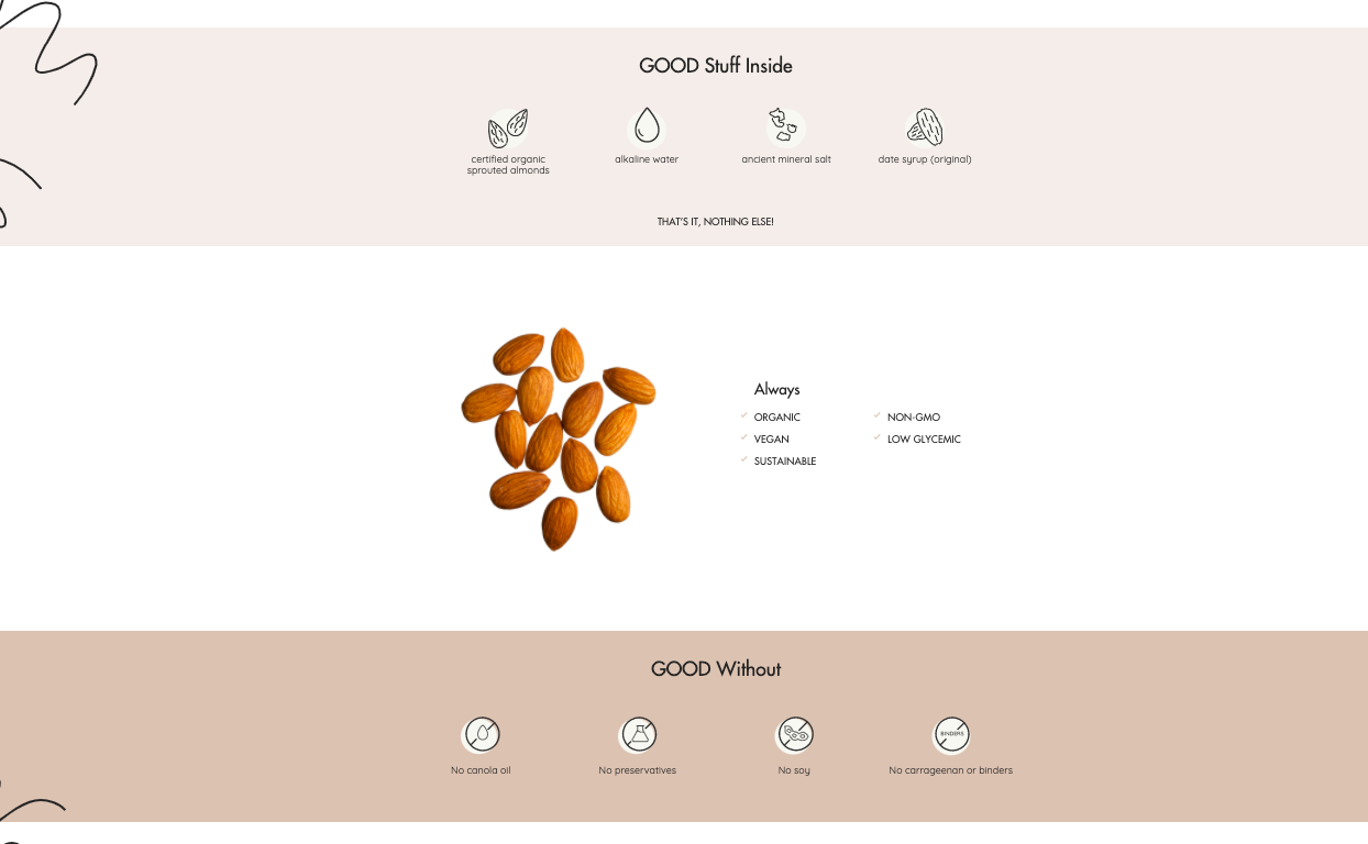
And the graphic they use to show how they’re better than the almond milks you’re used to is awesome. It’s simple but really effective. You immediately see what makes Goodmylk different. They use actual almonds, real ingredients, and no processed sugars. Makes it a really easy choice, right?
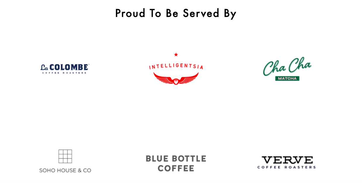
They also make it really easy to find out where you can try the product, which is a great option if you’re not ready to fully commit and can easily get to any of these places.
Product Pages
Goodmylk’s product pages are sleek and simple. And most of the information first-time buyers would be looking for can be found above the fold because of the ability to toggle between Details, Ingredients, and How To Use.
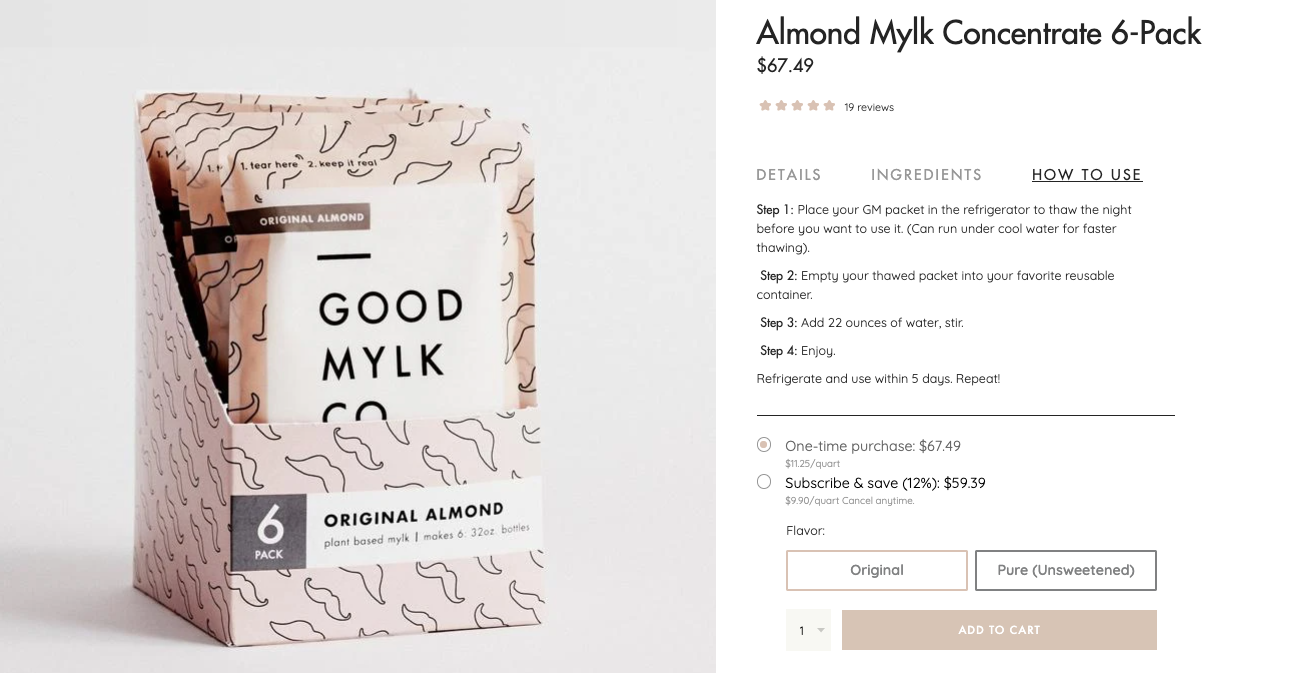
The 'How To Use' section gives a really clear set of instructions so you know exactly what you’re signing up for and not surprised when you receive a product that’s not ready to go out of the bag.
And a lot of the page as you scroll is just meant to reiterate why Goodmylk is a better choice than many of the store bought brands you’re used to.
The last element on the product page worth mentioning is this FAQ section towards the bottom.
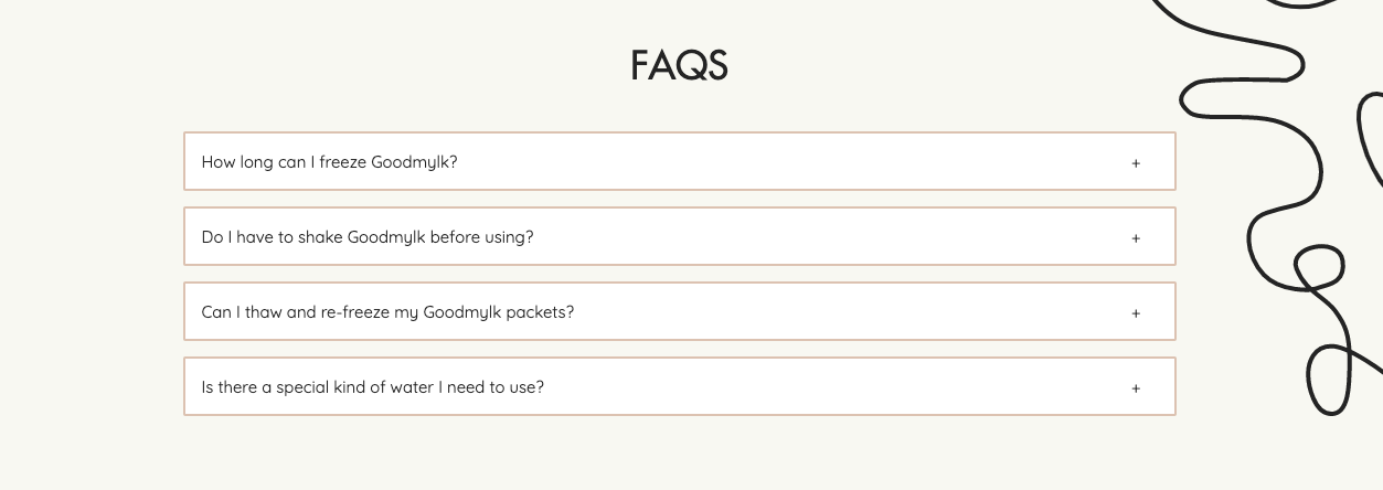
Rather than just having the frequently asked questions live on a separate page, they also have them at the bottom of the product pages which is a great experience. Definitely an easy way to repurpose information you already have.
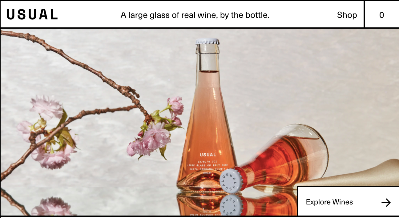
Usual Wines
Usual Wines crafts “large glasses of real wine, by the bottle.” In case that’s leaving you a little confused, they’re all about single-serving wine that’s sustainably made, without added sugars and sulfites And by the way, Usual’s sister brand, VINEBOX, also has a site worth checking out.
Home Page
Ususal’s site is definitely one of my favorites. Their product photos are gorgeous, but not overly produced, the black outlines feel really bold and break up the sections really clearly, and there’s movement to keep you engaged.
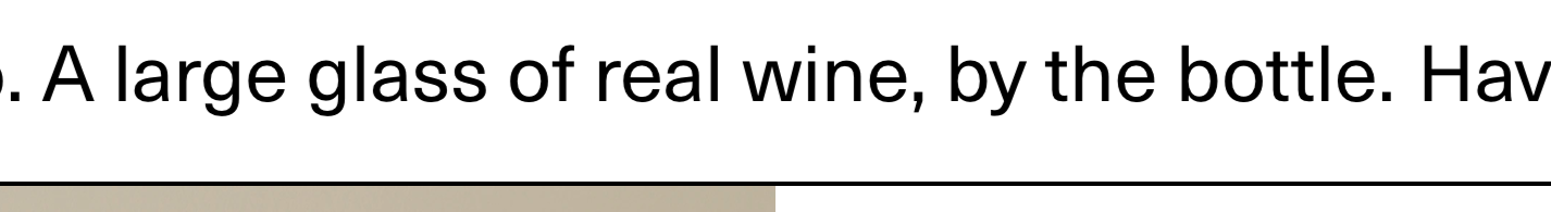
Just as you start to scroll further, you see a carousel of bold text that reads, “ A large glass of real wine, by the bottle.Have fine wine and drink it too.”
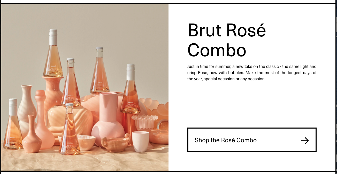
As you scroll a little further, you get to a product that makes total sense since it’s almost summertime, Rosé with bubbles.
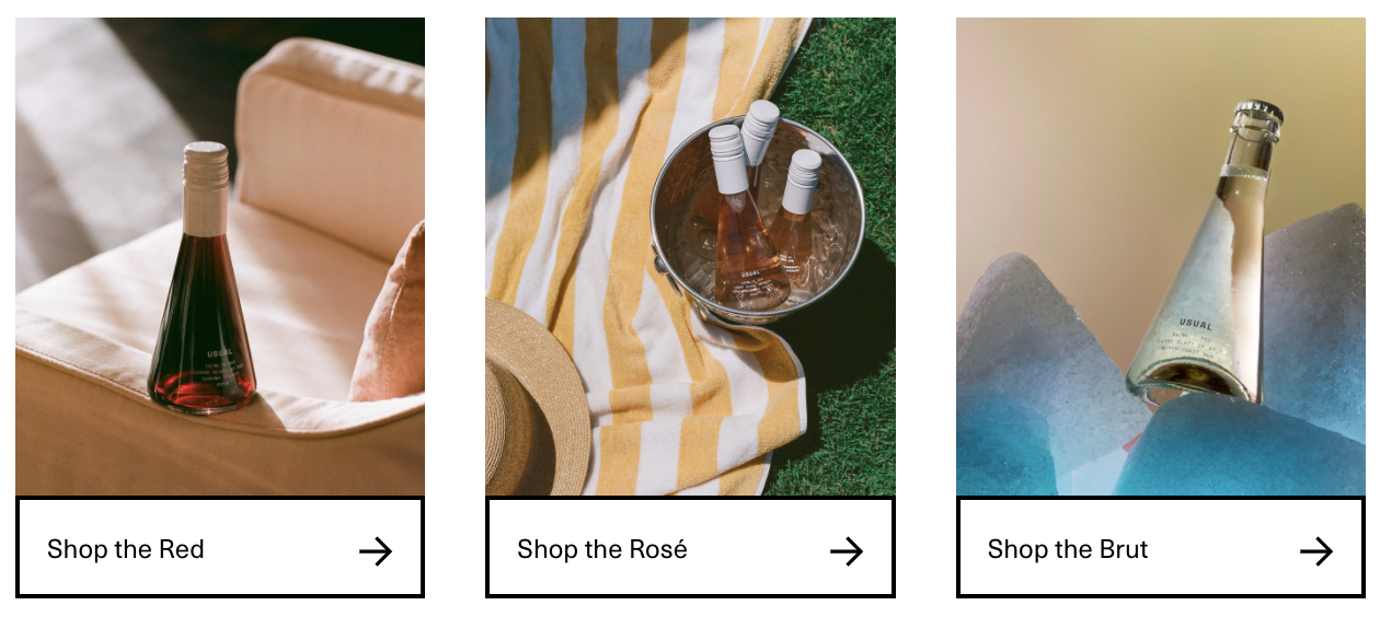
Just below that, they showcase a few more products.
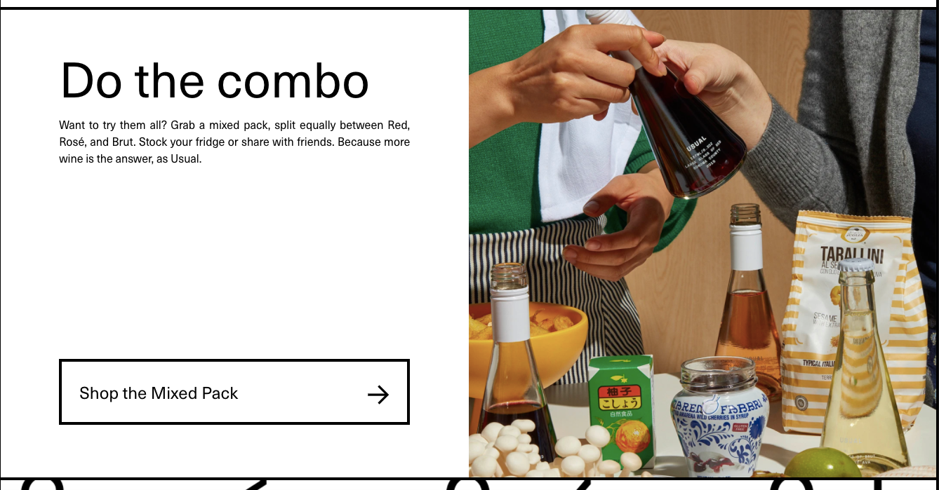
And lastly on the product front, a combo of all their products with one of my favorite photos.
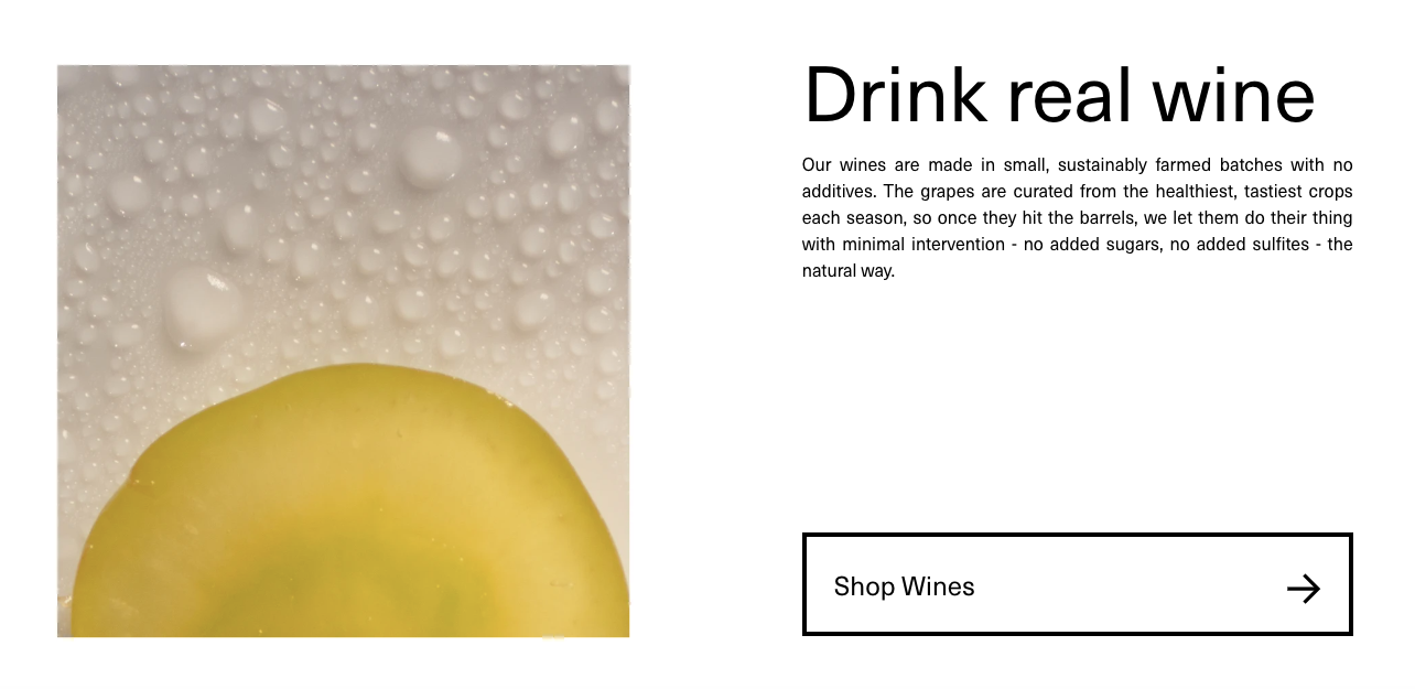
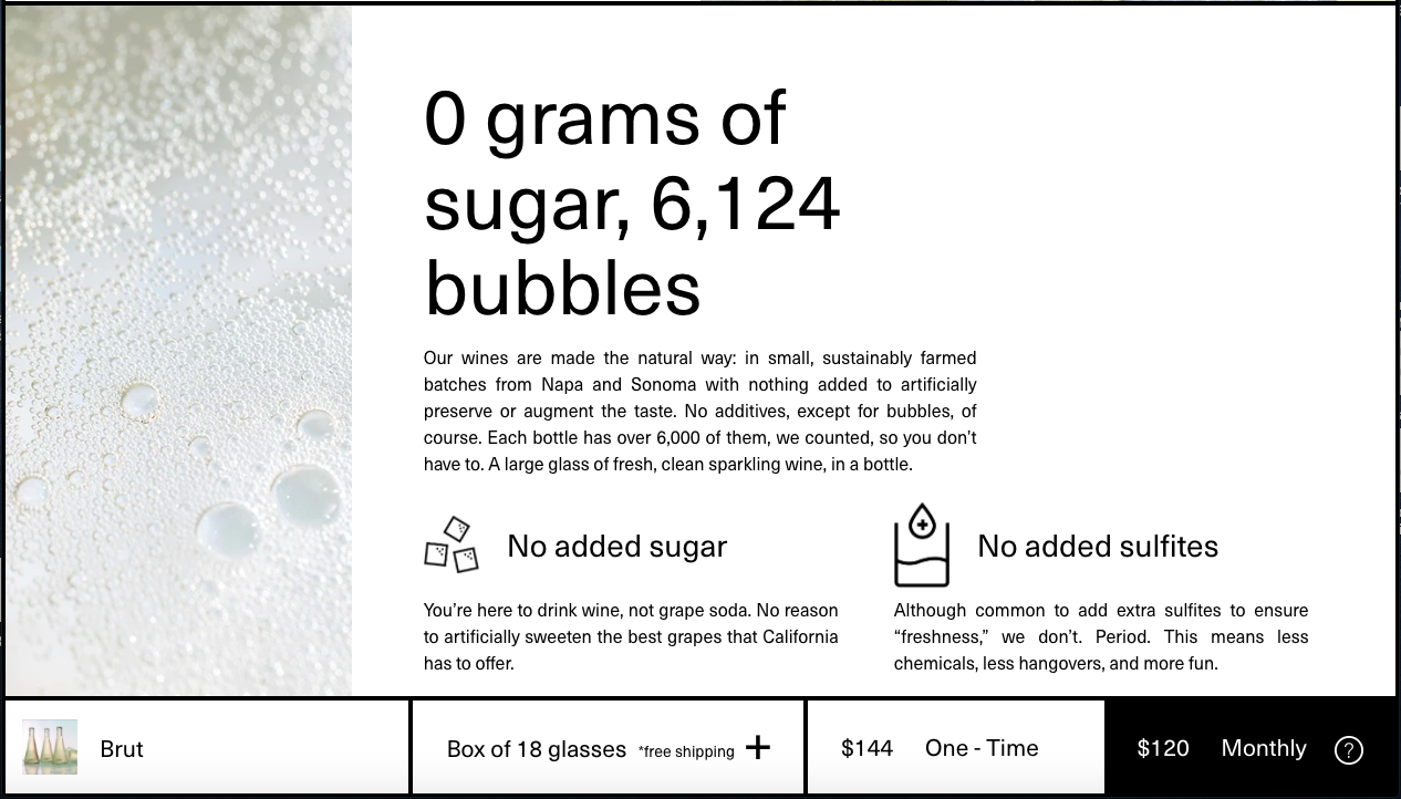
Then a little more about what their brand is really about. First, they’re made sustainably without added sugars or sulfites.
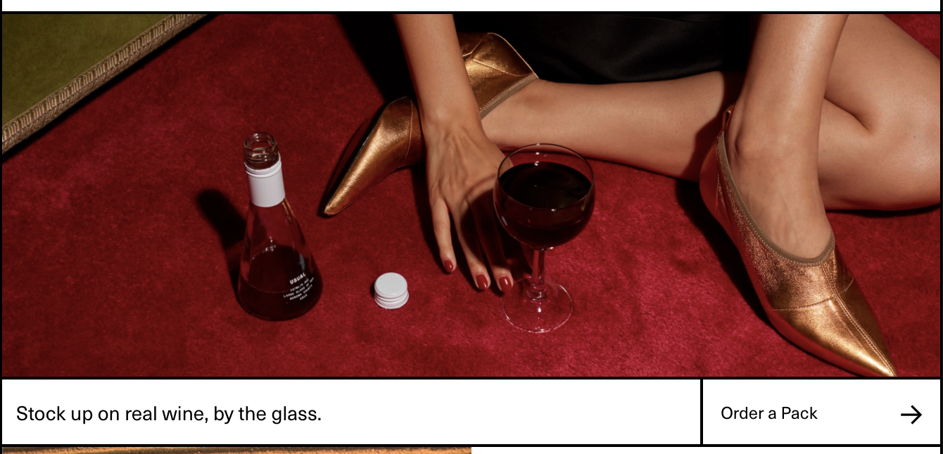
Then a product photo that is really helpful for scale (size of the bottle) and the amount of wine each bottle really has (looks like a pretty full glass and there’s still some left to be poured).
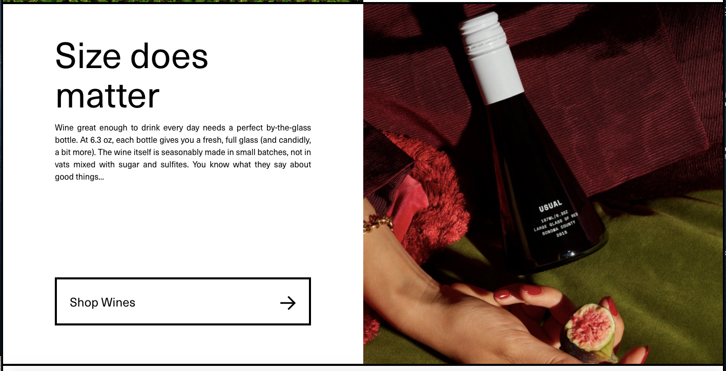
Similarly in this photo, you get a sense of scale and a little blurb with a description of the size: “At 6.3 oz, each bottle gives you a fresh, full glass (and candidly, a bit more).”
What stands out in the last few photos is the fact that there’s a CTA in every section. And even though the buttons say different things (like ‘Try It Now’ and ‘Shop Wines’), they’re all bringing you to the same place: the page with all the products.
Product Pages
Before you even get to the product page, their menu is worth digging into. Unlike many others, it takes over the entire screen and the photos are insane (and responsive to the item you hover over).
So if I hover over ‘Shop Brut,’ the image changes to reflect the product I’m curious about.
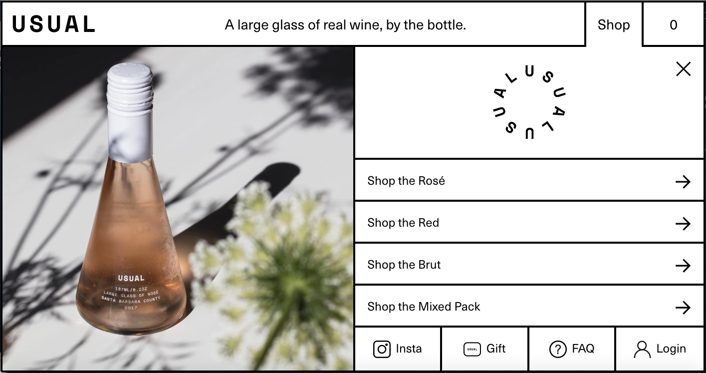
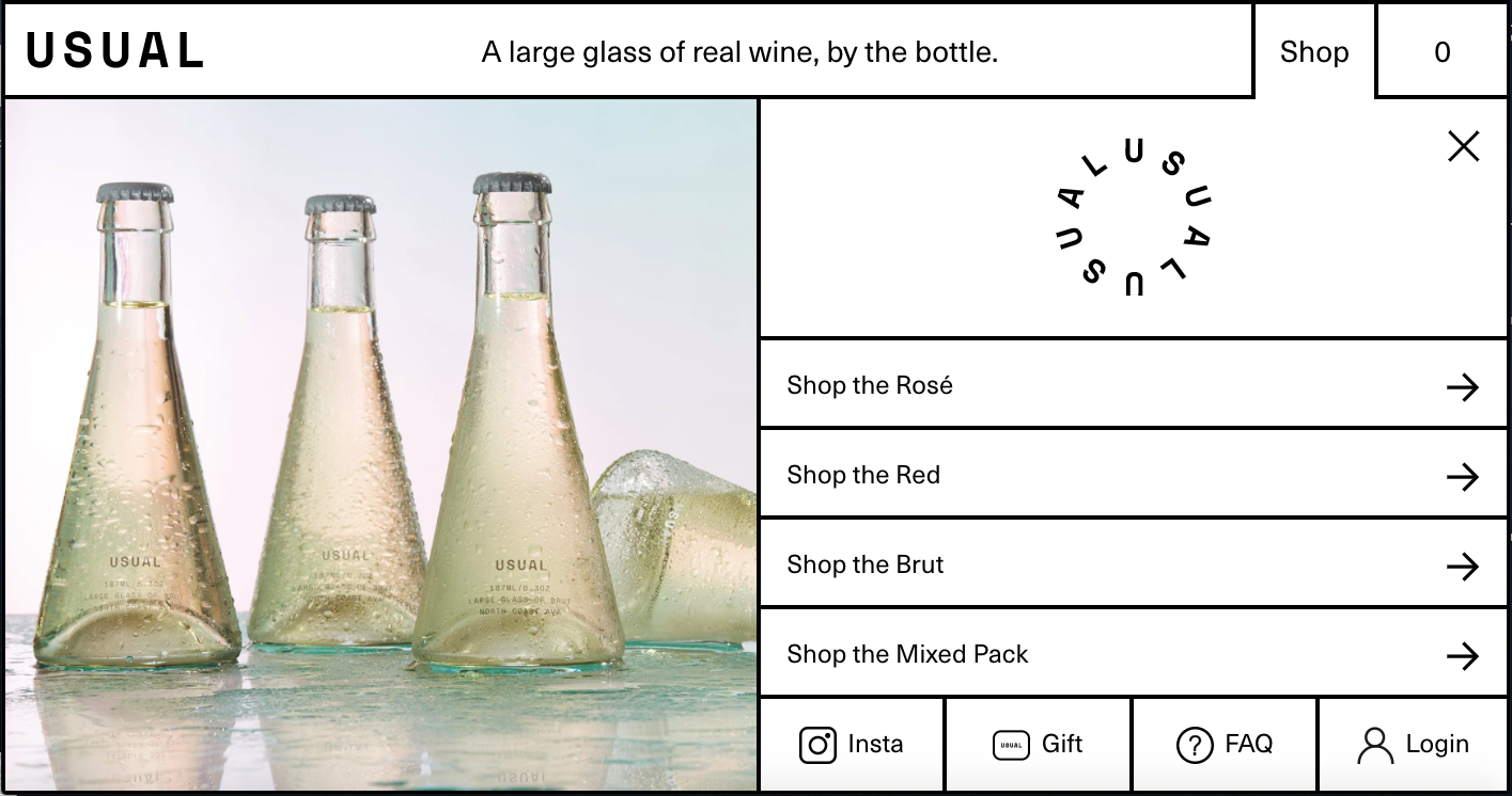
The condensation beading up on the bottles, the reflections, one bottle turned on it’s side. It’s unreal. And that’s before you even click on a specific product.
Once you’re on the actual page, it gets even better.
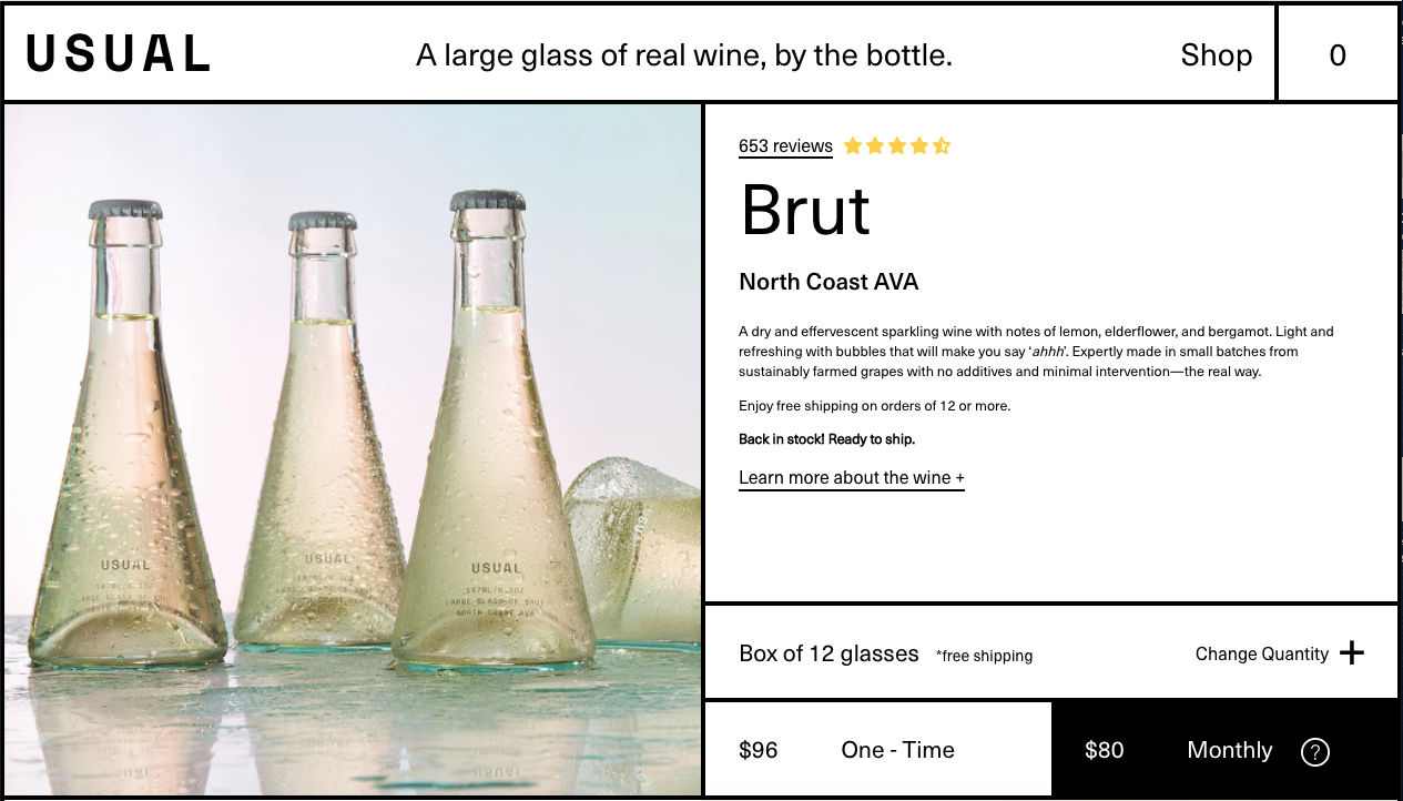
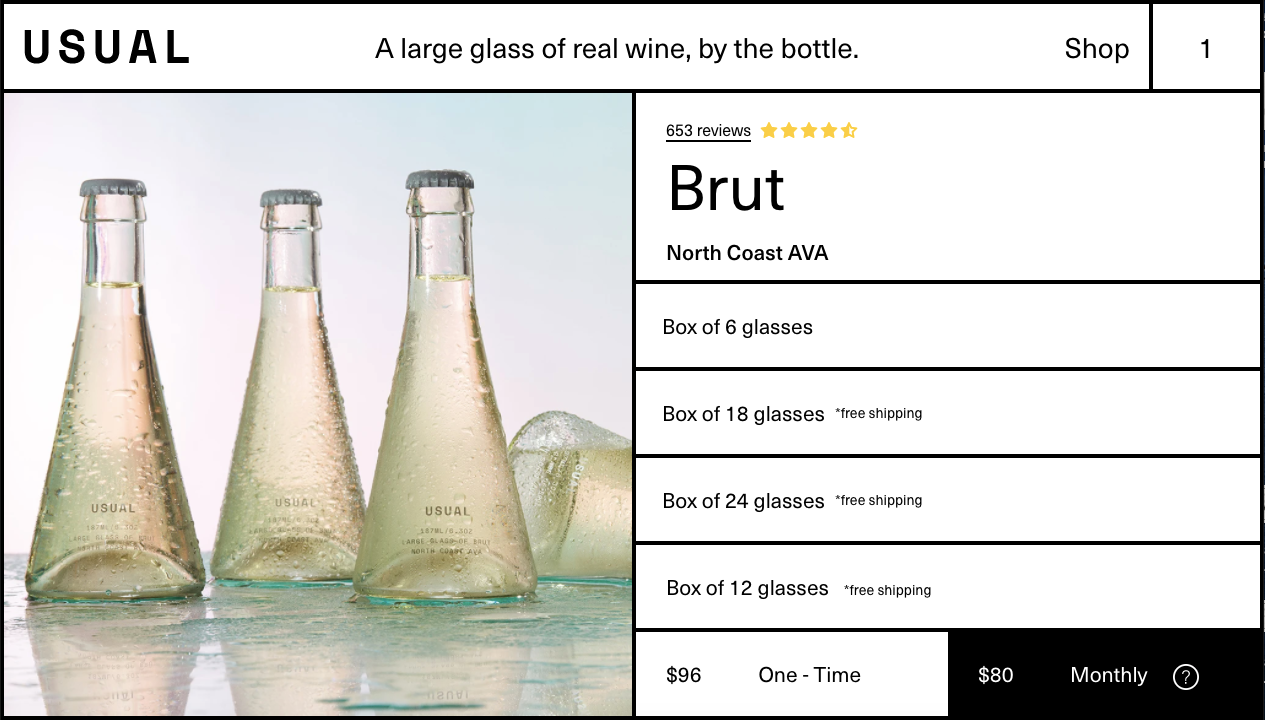
When you click ‘Change Quantity’ you’ll see the different quantity options populate where the product description used to be. It’s also really helpful to see that every option, with the exception of the box of 6 glasses, qualifies for free shipping. Without having to go to your cart or the checkout page.
Below the initial image, you see the different flavors that come through: lemon, elderflower, and bergamot, in a way that doesn’t feel overwhelming like most wine descriptions usually are.
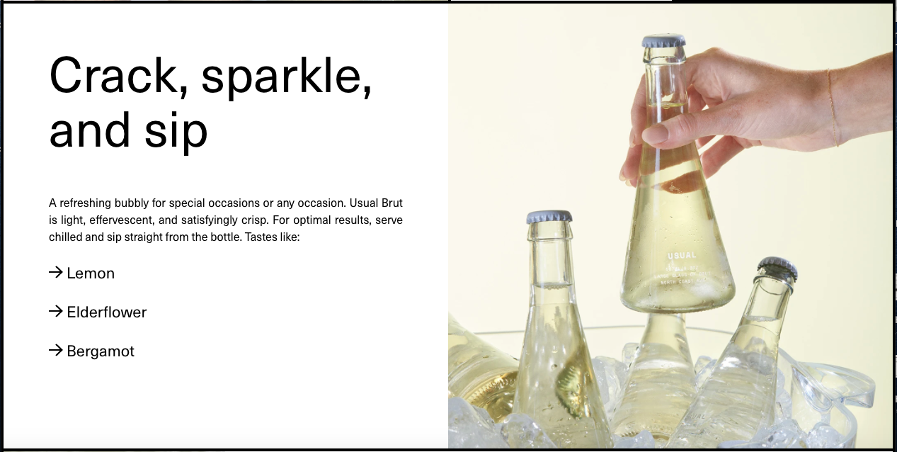
Then the number of bubbles in a single bottle (more than 6,000). Something about that makes me laugh.
And the ability to add the item to your cart and change the quantity follows as you scroll, which is a great feature.
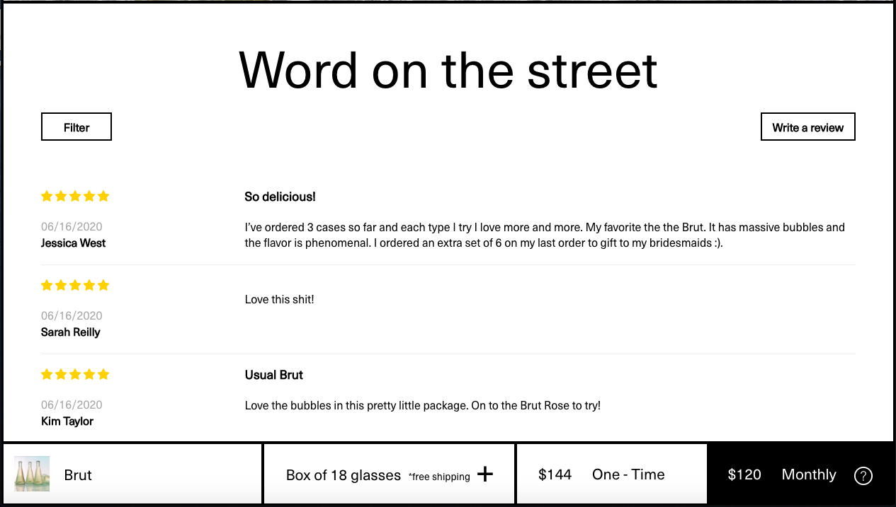
Even the language they use for reviews is clever: I love that they use ‘Word on the street,’ rather than the usual copy you see.
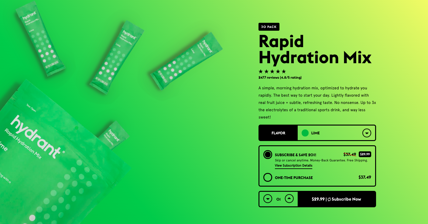
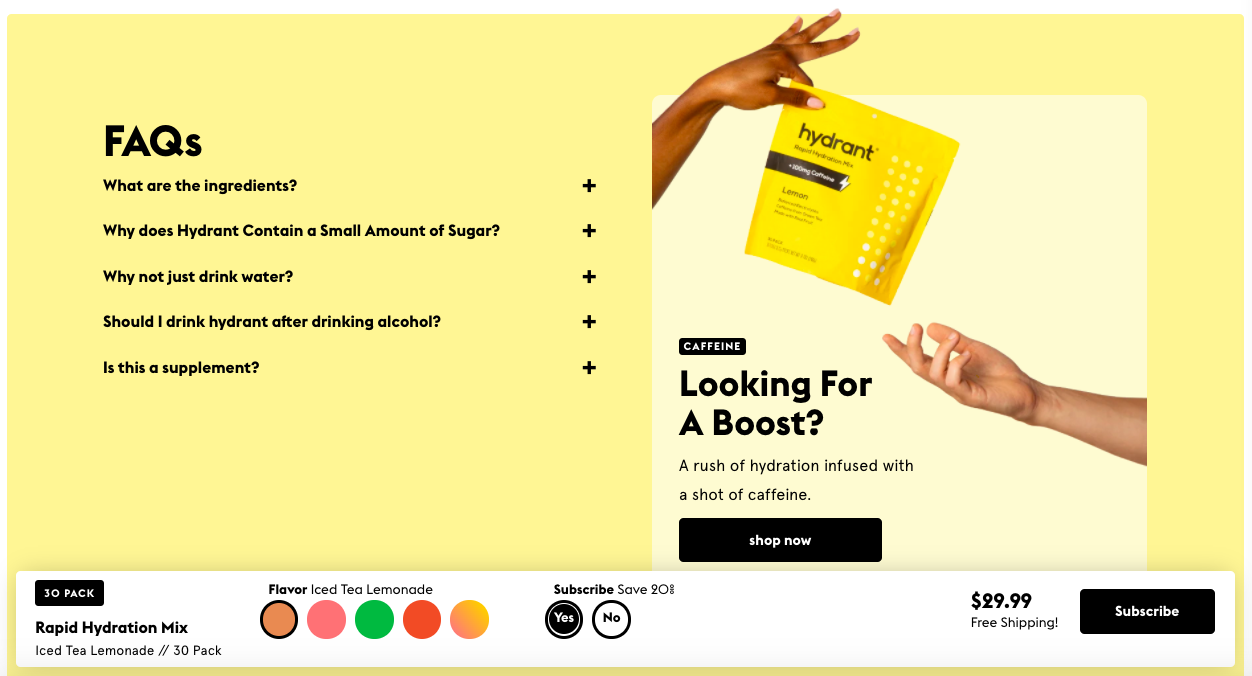
Hydrant
Hydrant is a hydration mix, created to hydrate you quickly (say that 3x fast). It dissolves in water, has up to 3x the electrolytes of traditional sports drinks, and significantly less sugar.
When coffee, energy drinks, and gallons of plain water weren’t enough, the founders came up with a better way. That’s where Hydrant comes in.
Home Page
Showing the packets at the very top of the home page makes it really clear what their product is: individual packs that you mix with water to get hydrated.
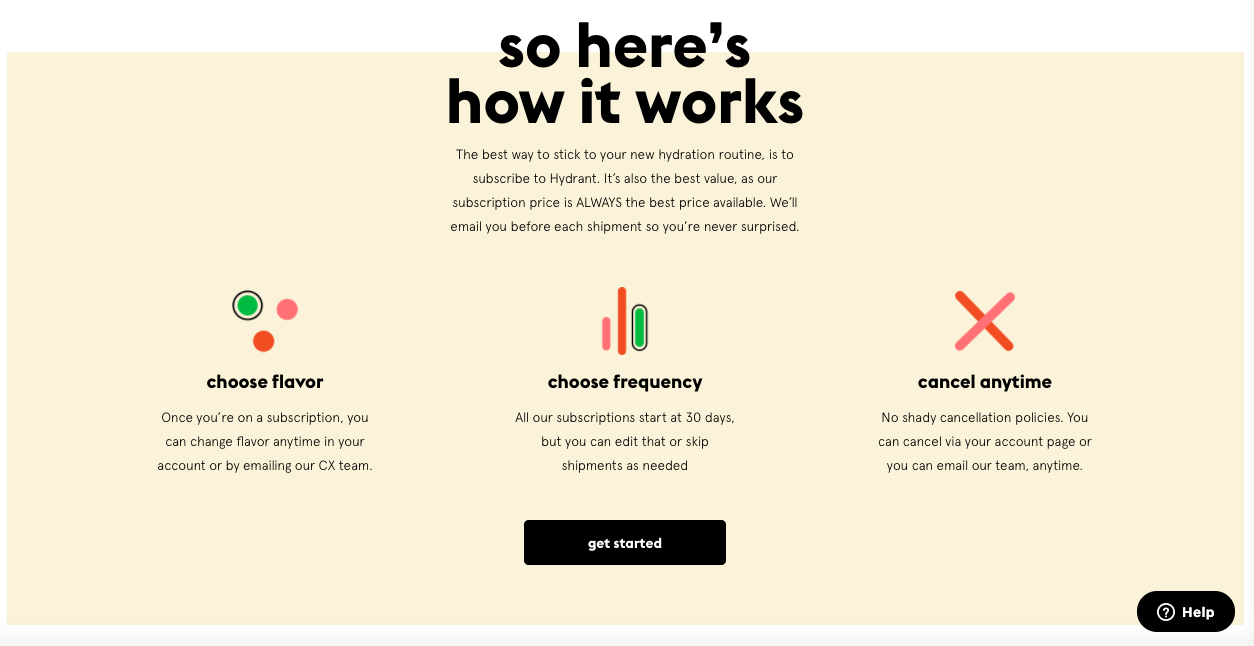
It’s also really helpful that they dedicate a section of the page to sharing how their subscription model works. 1. Select a flavor. 2. Select how often you want to receive it. And you have the freedom to cancel any time

And have resources dedicated to education.
Product Pages
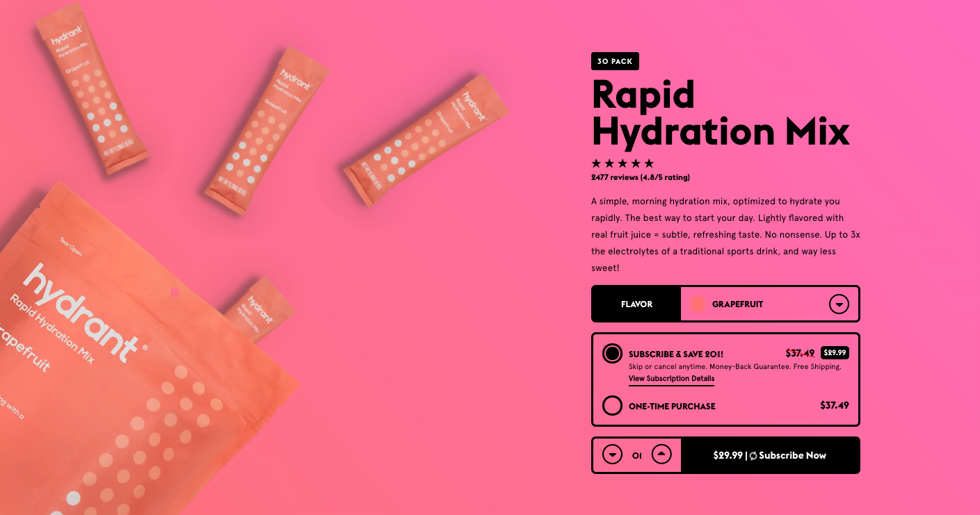
This is where Hydrant really shines. Like Recess, the theme of the page changes when you select a different flavor. Lime is, of course, green. But the gradient gives it more depth.
Same with grapefruit:
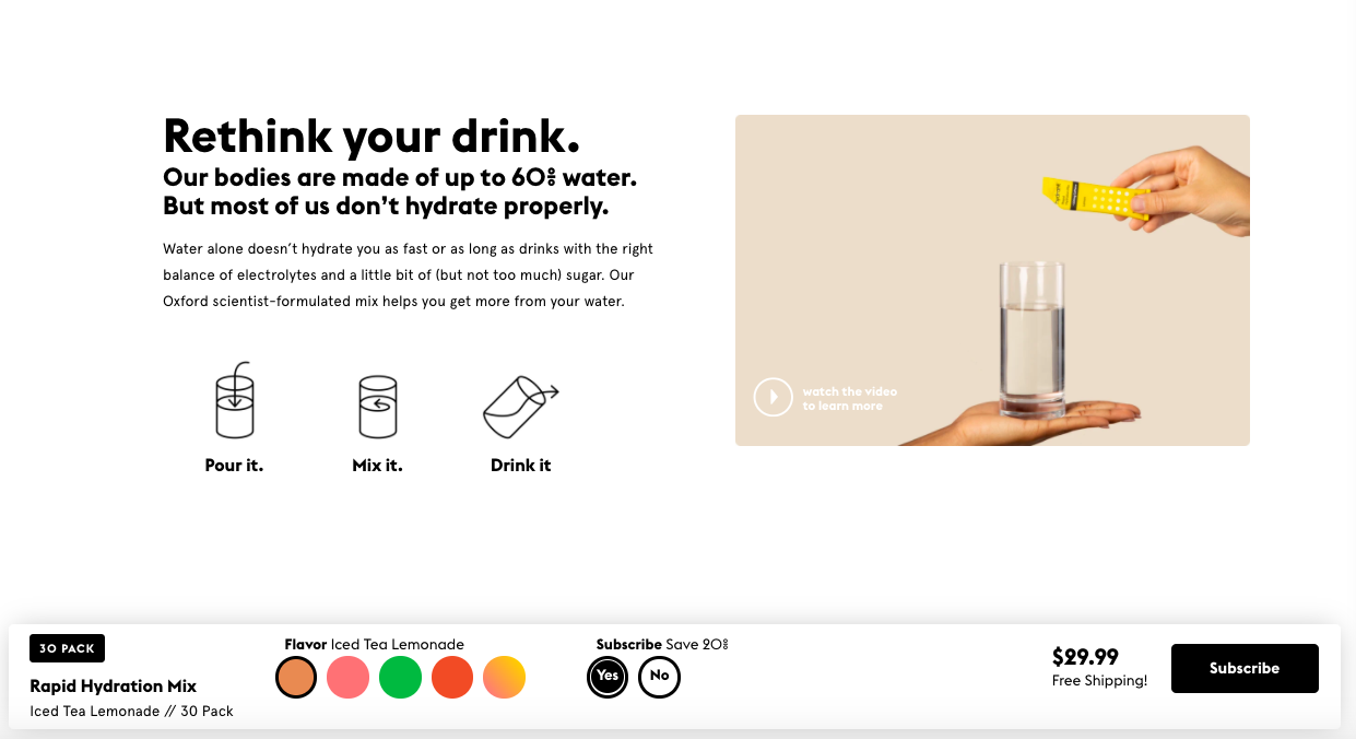
As you scroll, you’ll see how easy it is to drink Hydrant and a quick video about the science behind the product
And, like we’ve seen before, the ability to add the product to your cart follows along at the bottom of the page as you scroll.
They also have FAQs at the bottom of the page.
Hydrant also has a couple other pages worth checking out. Their quiz to help new customers find the product that’s right for them. And an entire page dedicated to reviews.
Takeaways
- Give your product photos context. Help people see themselves use your product in their day-to-day lives.
- Make your about page feel really personal.
- When it's relevant, share recipes or inspiration for using your products.
- Think about incorporating motion into your site where it makes sense.
- Change the theme of your product pages to match the product people are looking at.
- Get creative with your product pages. How can you make them stand out from the crowd?
- Carry themes across every touchpoint – from your website to your packaging.
- Use graphics to explain what makes your product stand out from the competition.
- Add relevant FAQs to product pages so people don't have to go searching for the information they're looking for.
- Incorporate CTAs as frequently as you can, but switch up the copy (even if they're ultimately sending people to the same place).
- Make it easy to add a product to your cart no matter where you scroll on a product page.
Writen by Lauren Hall

Lauren is a Brand Marketing Associate at Privy. She's the brains behind all things content. When she's offline, she's obsessing over her Bernedoodle pup, Monster, and plotting ways to being a full-time Vermonter ASAP.
You may also like to read
Learn how we responsibly build, test, and refine AI models and capabilities to ensure accuracy and domain relevancy.
10 Things To Consider When Evaluating Shopify Apps For Your Shopify Store
With 6,000+ apps in the Shopify App Store, finding the right solutions for your store can be overwhelming. Here are 10 things you need to consider before you download your next Shopify app.
Best DTC Drink Brands Using Shopify and What Makes Their Sites Great
These DTC drink brands will inspire your ecommerce site no matter what kind of products you sell. Here are some of the best Shopify stores to guide you.
The Ecommerce Brands To Copy For SMS, Email, Social And Site Design (That We Stole From Nik Sharma)
Nik Sharma shared tons of brands he loves for SMS, email, social, and overall site design. And we did a deep dive on all of them so you can steal their ideas.