
How to Optimize Your Ecommerce Homepage: 7 Must-Follow Best Practices
Your homepage is the most valuable page on your entire site. And if you're not constantly thinking about ways to improve it, you're going to miss out on subscribers and sales. Here are 7 ecommerce homepage best practices you need to know.

Written by Lauren Hall
Two-tenths of a second – that’s how long it takes someone to form their first impression of your website, according to an eye-tracking study.
For ecommerce brands, that short amount of time can determine whether a visitor becomes a lifelong customer or never returns to your site again.
That’s where your homepage design comes in.
Of all the pages on your online store, your homepage is the most valuable because it’s the first touchpoint many people have with your brand.
The user experience has to be top-notch to keep visitors engaged. Easier said than done, considering the bounce rate (the percentage of people who leave after visiting a single page) for ecommerce can be as high as 45%.
Sometimes you get so close to your brand you overlook opportunities to improve it, especially when it comes to your website.
That’s why we compiled these 7 essential tips you can implement right away to make your homepage irresistible.
Get our best content on ecommerce marketing in your inbox 2 times a week
1. Make it mobile friendly
Starting in 2014, ecommerce stores received more traffic from mobile devices than desktops, according to Shopify. And the trend is stronger than ever.
In 2021, nearly 73% of retail ecommerce sales happened on mobile devices.
Since mobile is the default for millions of shoppers, make sure your homepage UX is as clean and intuitive on a smartphone as it is on a desktop.
That means putting important elements like the cart and shop buttons in thumb-friendly positions.
Let’s look at Woah Cold Brew as an example. Here’s their homepage on desktop:
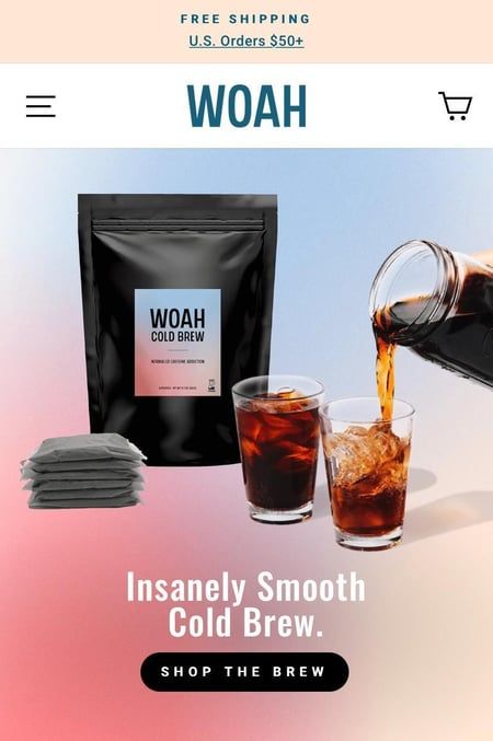
And here’s how their homepage looks on mobile:
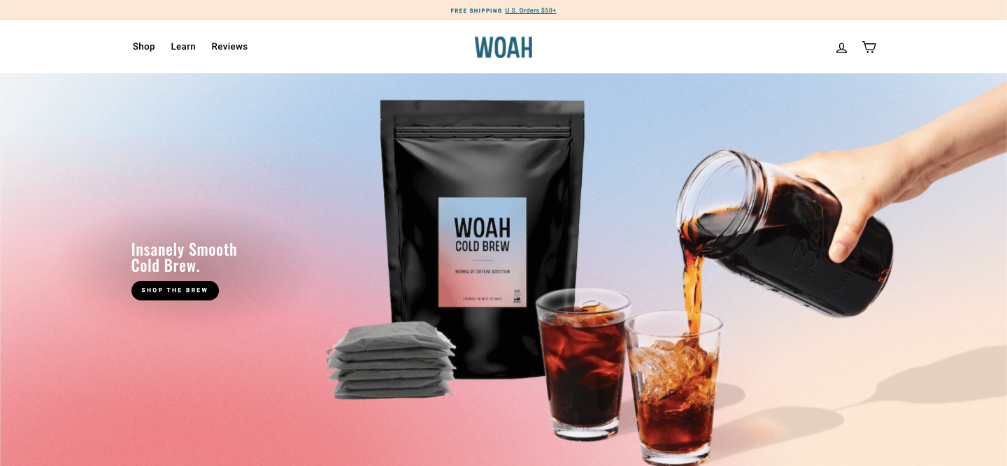
Notice how the copy and images are rearranged to fit on the smaller, vertical screen.
Most importantly, mobile users can tap cart, menu, and shop buttons without having to scroll.
2. Lead with your value proposition
You might have dazzling images on your website, but if you don’t quickly communicate what you sell and why the visitor needs it, they may never go past your homepage.
That’s why it’s crucial to lead with your proposition – a short statement that answers a simple question every customer wants to know: What’s in it for me?
Your value proposition needs to answer three questions in three sentences, max:
1. What do you sell?
2. Who is it for?
3. Why should they buy it?
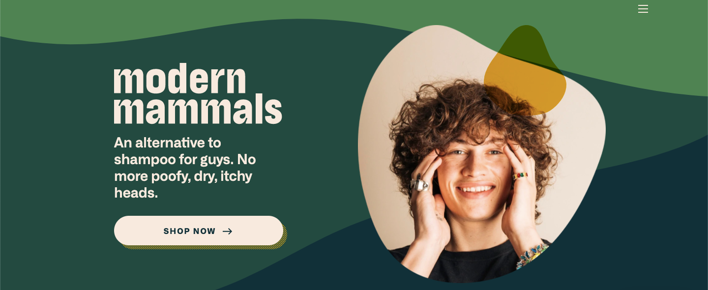
Here’s an example from Modern Mammals, a shampoo alternative:
Notice how they clearly and concisely answer those three questions. What do you sell? An alternative to shampoo. Who is it for? Guys. Why should they buy it? No more poofy, dry, itchy heads.
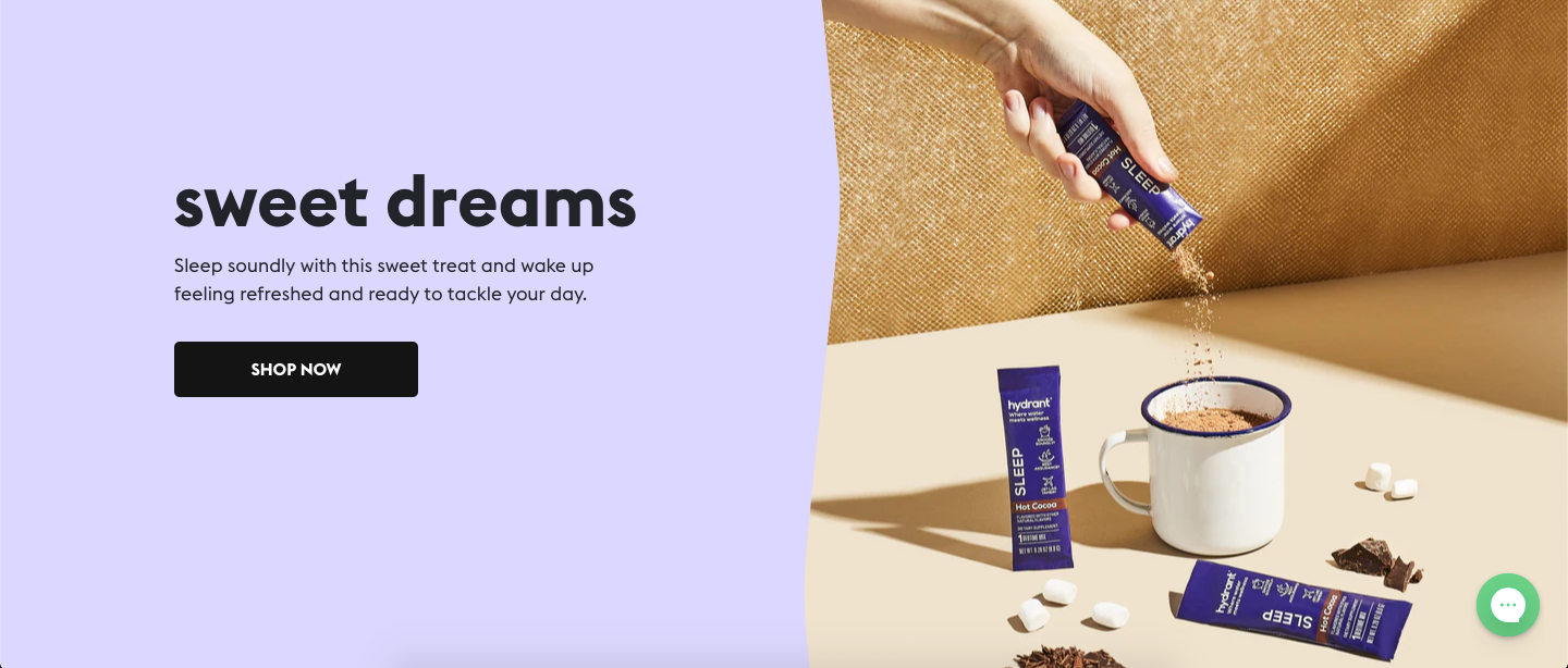
3. Make your "shop now" button pop
If someone stumbles onto your site, you want to make it as easy as possible for them to browse and buy your products immediately. A “shop now” button can be a huge help here, but if it doesn’t stand out (or worse, doesn’t exist), you’ll miss out on sales.
There are 3 elements of an effective “Shop Now” button.
- Position: Place it near the top of your homepage, ideally right below your value proposition
- Color: The button color should contrast with the background color, and the font color should contrast with the button color
- Copy: Keep your CTA simple with “Shop Now” – there’s no need to get fancy here
Check out Hydrant’s button – they nailed all 3 of those elements:
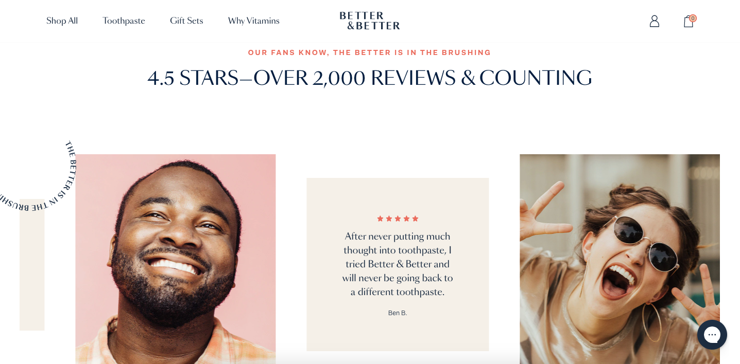
4. Add social proof
Nearly 100% of shoppers read online reviews, and 94% say reviews are the most important factor in their purchase decisions, according to a study by PowerReviews.
If you have great reviews for your product, don’t bury them on your product pages.
Add them to your homepage.
Here’s how Better & Better showcases social proof on their homepage:
There are a few details worth calling out here. For starters, the sheer volume of reviews (2,000+ with an average of 4.5 stars) indicates they have lots of happy customers – this puts newcomers’ minds at ease.
Below, there’s a rotating carousel of reviews, including the number of stars, the full text, and the customer’s name to add an extra layer of authenticity.
Even if you only have a few raving reviews so far, don’t hesitate to display them on your homepage.
Don’t have any yet? Now's the perfect time to start asking.
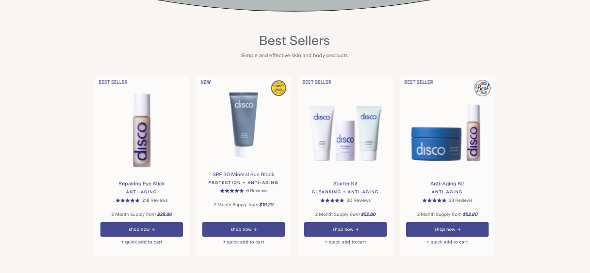
5. Display your best sellers
When someone visits your online store for the first time, they’re probably not familiar with your product collection.
That’s why it’s beneficial to call out 3-4 of your top-selling products on your homepage.
This is a quick hack to speed up the acclimation process and nudge your visitors towards a quick purchase.
Here’s a great example from Disco, a DTC skincare brand.
Beyond simply labeling these items as “best sellers,” Disco includes the number of reviews, price, and a buy button for each one.
A bestseller display should go “below the fold” – meaning it’s not visible until the visitor scrolls down a bit. (Remember, you’re saving the most valuable real estate for your value proposition and customer reviews).
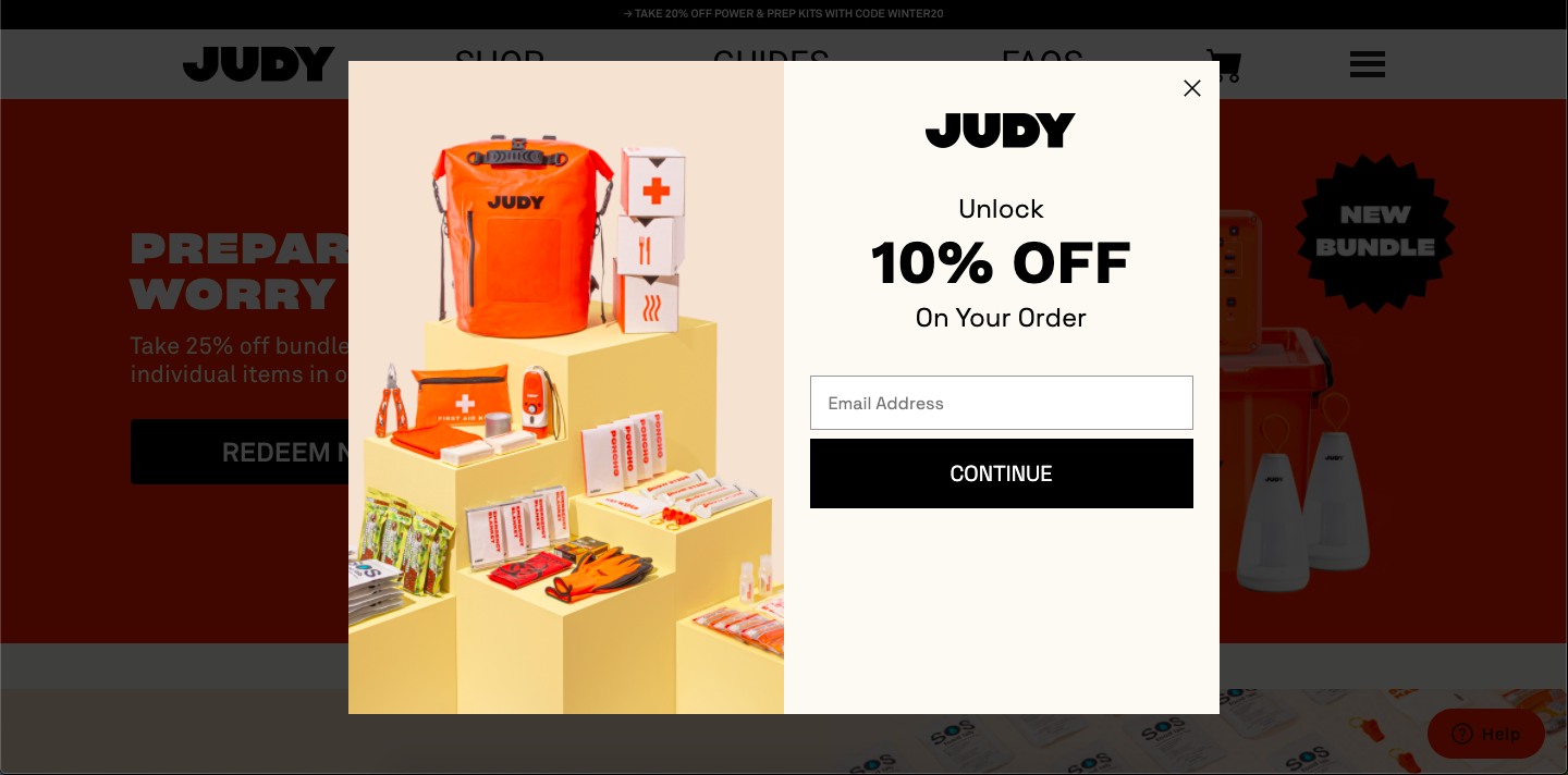
6. Create a welcome popup
The vast majority of people won’t buy anything the first time they stumble onto your online store. They might even be comparing you to a competitor.
But don’t let that discourage you. There’s an easy way to make the most of these first-time visits: create a welcome popup.
A welcome popup is a message that greets someone shortly after they land on your site with the goal of capturing their contact information in exchange for a discount or other incentive.
Getting shoppers’ contact info is a big deal in ecommerce because you can engage with them even if they don’t return to your site organically. In fact, we’ve found that each email address you collect is worth $15.
Your welcome popup needs 3 main components:
- A square or vertical shape so it displays well on mobile devices
- It appears after at least 5 seconds or after a visitor scrolls 75% of the way down your homepage (otherwise, the popup can feel too aggressive)
- There’s a clear, compelling incentive, like a 10% discount, free shipping, or exclusive content
Here’s a simple, effective welcome popup from JUDY:
Some ecommerce merchants worry that a popup might annoy visitors. That’s certainly possible if it’s pushy, doesn’t have any incentives, and is poorly designed.
But if you follow the guidelines above, a welcome popup can be something shoppers are actually glad to see.
And you can get started with Privy for FREE today to start designing your own welcome popup so you can convert first-time visitors into subscribers ASAP.
7. Speed up your page load time
Your homepage load time has a direct impact on your brand’s conversion rate. If it takes too long, your visitors will bounce.
In fact, a one-second delay in mobile load times can impact conversions by up to 20%, according to Google.
To test your online store’s page speed, use Google’s PageSpeed Insights tool, which lets you test any URL on your site for free. (For reference, Google recommends a load time of 5 seconds or less on mobile devices).
If your load time is taking longer than you’d like, here are a few tips to speed it up:
- Reduce your images’ file sizes
- Eliminate unnecessary redirects
- Minimize the number of apps or plugins on your site’s backend
- Enable browser caching
Get a grade for your online store
Optimizing your online store for sales and conversions can seem confusing, but a fresh pair of eyes can quickly spot what’s working (and what isn’t).
Don’t worry about asking your friends for help – Privy’s Shopify Store Grader has you covered.
All you need to do is enter your URL and we’ll give you a grade based on how well your site is set up to create a strong shopping experience. You’ll also receive actionable tips to improve your store.
Head over here to get your free score today.
Writen by Lauren Hall

Lauren is a Brand Marketing Associate at Privy. She's the brains behind all things content. When she's offline, she's obsessing over her Bernedoodle pup, Monster, and plotting ways to being a full-time Vermonter ASAP.
You may also like to read
Learn how we responsibly build, test, and refine AI models and capabilities to ensure accuracy and domain relevancy.
The Privy Plays Editor Just Got Better: 5 Enhancements You Need To Know About
A robust list is the foundation for all successful email and SMS marketing programs. And the all-new Privy Plays editor makes it easier than ever to design an on-brand display to grow your email and SMS lists ASAP.
How to Optimize Your Ecommerce Homepage: 7 Must-Follow Best Practices
Your homepage is the most valuable page on your entire site. And if you're not constantly thinking about ways to improve it, you're going to miss out on subscribers and sales. Here are 7 ecommerce homepage best practices you need to know.
“9 Quick Shopify Hacks to Drive More Sales This Year”
Turns out small tweaks can have a BIG impact when it comes to boosting sales for your Shopify store. Here are 9 hacks to help grow your audience and increase sales.