
4 Secrets For Building An Amazing 404 Page For Your Shopify Store (And 2 Brands To Inspire You)
404 errors aren't the end of the world for your Shopify store. But you should use them to create an awesome experience for your visitors. Here are 2 brands you can steal from.

Written by Ben Jabbawy
If you've ever seen a message on a website that says something like, "error: page not found," you've seen a 404 page.

That's what you'll come across when a page on a website doesn't exist. Maybe you typed in the wrong URL, or a link redirected you to an address that's off by one character...
It happens with every website. And it's not the end of the world.
But there's a hidden opportunity when it comes to 404 pages. And it's one that many ecommerce brands don't take advantage of.
Just think about it for a moment, though. You've worked hard to drive traffic to your store, maybe even paid a lot of money to make it happen.
Imagine that a customer comes through with a broken link or a bad address. Yes, they're on a wrong page — but they're still in your store! Can you do something, even on a 404 page, to help the customer have an awesome experience with your brand?
Actually, you can! You can design a 404 page that's engaging, functional, and proactive in moving your visitors down your sales funnel. And if you do, you'll enjoy another small but significant advantage over your competitors.
What Most DTC Sites Do
Obviously, the content on a 404 page isn't a top priority for most ecommerce brands. Still, it's surprising when you start poking around and find that many sites only do the bare minimum. That's why we investigated several stores, and here's what we discovered:
A lot of stores don't do much (if anything) to spice up their 404 page.
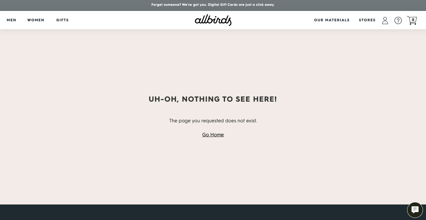
Allbirds is just one example. They include a link back to their homepage, which is great. But that's pretty much where it ends. There truly is nothing to see here.
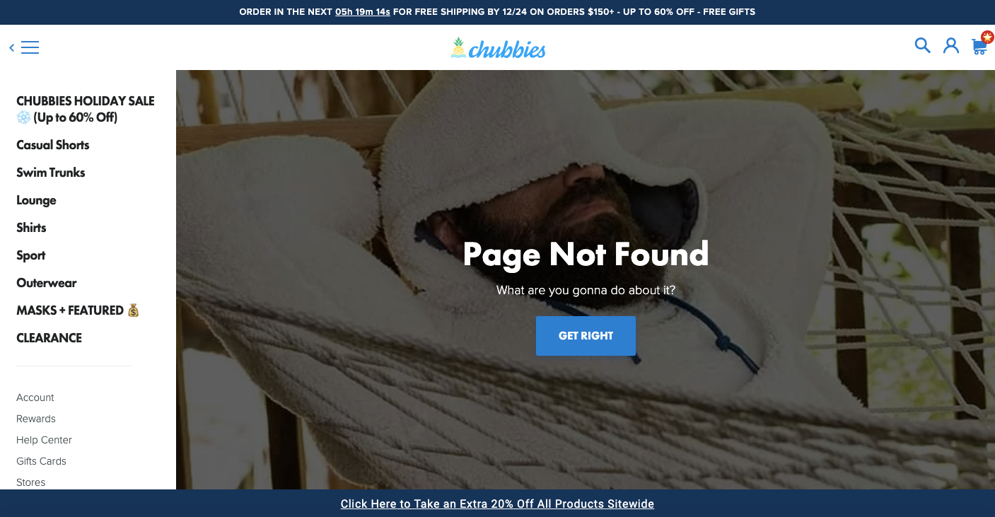
Chubbies takes things up a notch, though. It has an image of a model wearing some of their products and some clever copy.
Then there's a button that says, "Get right," and actually brings you to a collections page so you see products immediately (vs going to the homepage).
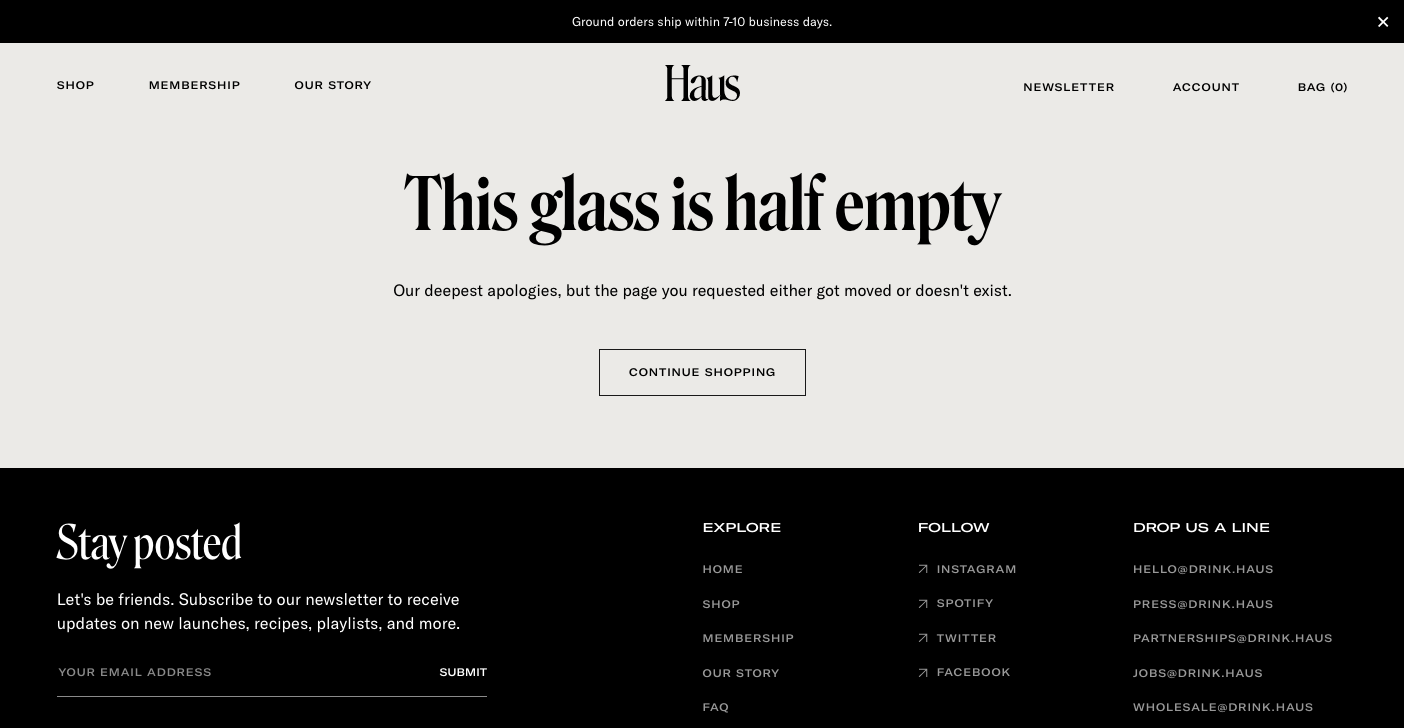
Haus, an adult beverage company, has some on-brand copy for their 404 page.
The text reads: "This glass is half empty. Our deepest apologies, but the page you requested either got moved or doesn't exist." And they also have a "Continue Shopping" button that brings you to their collections page.
All in all, most DTC brands either have nothing or next to nothing on their 404 page. In general, the most you'll find is a cute snippet of on-brand copy and a button linking back to the homepage or collections page. True, it gets the job done — but it really doesn't add very much to the customer experience.
So let's talk about a couple of companies that went above and beyond when it comes to their 404 page.
Get our best content on ecommerce marketing in your inbox 2 times a week
2 Brands that Have Killer 404 Pages
1. Boom by Cindy Joseph
Ecommerce expert, Ezra Firestone, has an excellent reputation as a marketer, and his company BOOM! by Cindy Joseph proves why.
Even the 404 page is exceptional. Here's what it looks like:
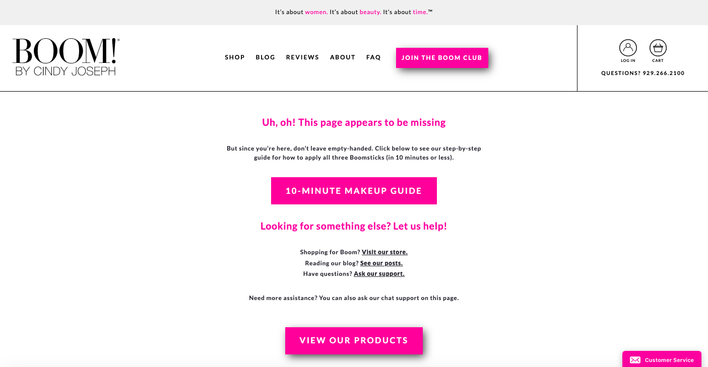
It starts off with, "Uh, oh! This page appears to be missing. But since you're here, don't leave empty-handed. Click below to see our step-by-step guide for how to apply all three Boomsticks (in 10 minutes or less)."
Then it brings you to an in-depth tutorial that is super valuable - especially for new visitors.
Not only does it have straightforward, persuasive copy; it also has several links to URLs like product collections, the company blog, and customer reviews. It even has a tab for support chat at the bottom of the page!
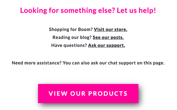
It's a solid 404 page from a savvy marketer. And how easy would that be for you to recreate for your brand? I'm guessing pretty straightforward.
2. Shinestys
The clothing brand's 404 page definitely stands out from the crowd. At the top it has the usual "404" text, but then it says: "Every time someone finds this page, our IT guy gets a lashing... and he's been VERY naughty."
Underneath that text is a picture of a man with reflective sunglasses and a mullet...then there's a scoreboard of "lashes" which is stuck at 69. Totally different approach, but it gets your attention, right?
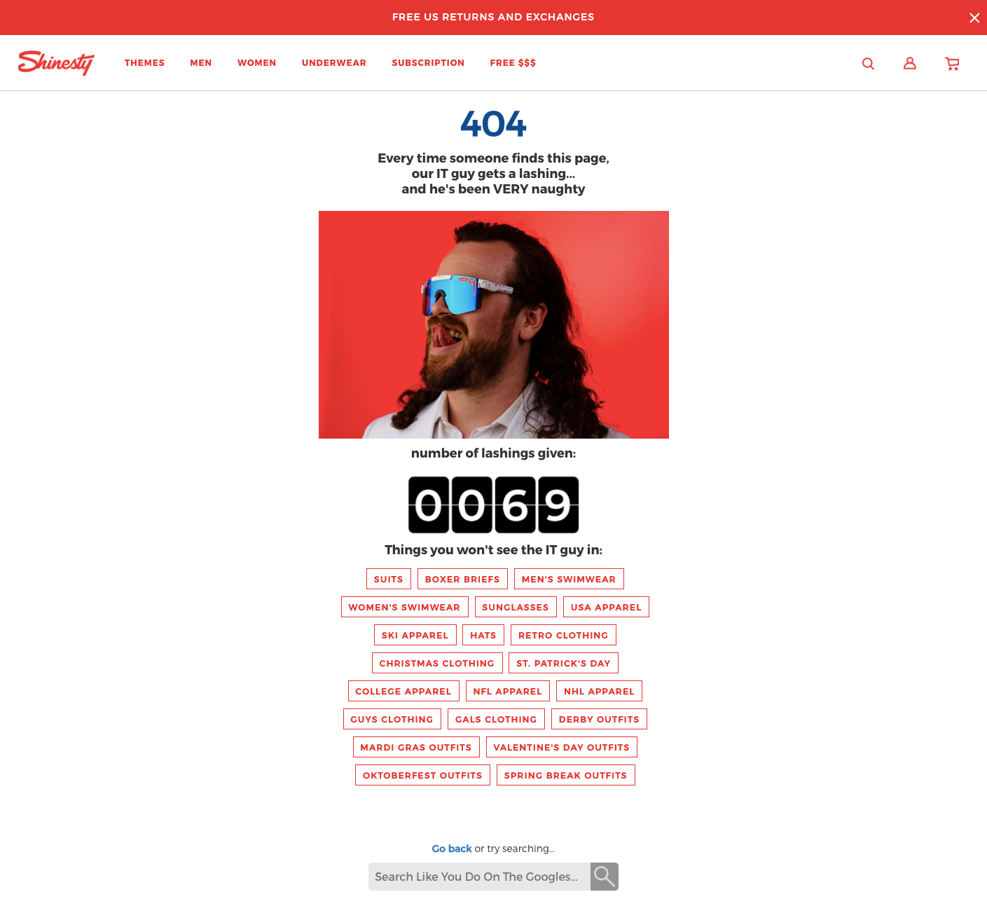
Apart from all the on-brand shenanigans, Shinesty also includes buttons that link out to different product collections on their site and a search bar.
From a marketing perspective, this 404 page is really, really well done. True, you don't need to inject humor into your 404 page (although it may help). But if your 404 page really grabs the visitor's attention, then they may decide to click around and see what your brand's all about.
How to Build Your Own Killer 404 Page
There's no one right way to build a 404 page that keeps visitors on your site. But if you're just starting out, here are 4 tips that should inform your approach:
1. Obviously you need to let the visitor know that the page wasn't found. But don't settle for the default copy; make sure your text is on-brand and relatable. After all, your 404 page is another touch point that can showcase your brand voice, and you need to treat it that way.
2. Give your visitors some visual cues. For instance, visually point them to check out a different area of the site, like your homepage, or maybe a certain product collection.
3. Include a search bar. It will remove a lot of the friction the visitor may feel after landing on the wrong page.
4. If you have a live chat widget throughout your site (and hopefully you do), make sure to include it here as well.
There you go: nothing too complicated. Of course, you can always add some extra layers after you cover the basics. But here's the bottom line: your 404 page can be a golden opportunity to engage with your visitors. Don't waste it. Maximize its potential, and you'll see some good results — even from traffic that goes astray.
Writen by Ben Jabbawy

Go getter and ecommerce extraordinaire Ben Jabbawy is the founder and CEO of Privy. His passion for entrepreneurship has helped him empower and inspire hundreds of thousands of small to medium sized business for nearly a decade and he's not stopping now!
You may also like to read
Learn how we responsibly build, test, and refine AI models and capabilities to ensure accuracy and domain relevancy.
Privy 3.0: More Than Popups. How Privy Helps Independent Shopify Stores Win.
Think you know Privy? Think again. Privy 3.0 is here. And it’s WAY more than popups. Intuitive, powerful email and SMS marketing. Here's what we're up to.
Create authentic urgency and exclusivity with locked website launches
A locked website launch is a highly effective way to create exclusivity and drive urgency with your email & SMS subscribers. Get tips on how you can try this play in 3 simple steps.
The Two-Way Email Marketing Strategy
Building authentic relationships through your email marketing is the best way to ensure your subscriber base remains engaged over time. Learn how to build a conversational email strategy today.