Email Sandwich Basics: Headers and Footers
Email Sandwich Basics: Headers and Footers

Written by Meg Johnson
Emails are like a sandwich. The contents don’t work well together when there aren’t two stable, delicious ingredients to hold it all together. In any email, your header and footer are your bread, and your body text, images, and links are the sandwich toppings. Let’s talk about how to make some good bread that will get people to want to take a bite of your tasty content.
Headers 101
No matter your what you sell, your header image should have a few things:
- Your logo
- Your brand colors and fonts
- Your business or newsletter name
When making an email header, consider making at least two versions; one design to use for generic emails, and maybe a couple others themed around special promotions or email series you are running. Although these headers may be featuring different content, don’t let the themes make you lose sight of your brand.
Themed Headers (Free downloads)
Before we buckle down on consistency in our brand marketing, let’s talk about a few different header themes you can use.
Let’s start from the beginning of your relationship with your email list, the welcome email. You want to thank your subscriber for joining your list and also give them a taste of your brand’s colors and voice.


Our final email touchpoint we’ll discuss are for the coupon delivery and coupon reminder emails. This type of header image should evoke excitement and urgency. Using bright colors and friendly language, you can capture your viewers attention and make them excited to redeem their offer.
An easy way to make a message seem urgent is by typing it in all caps. People mostly read this as shouting and will immediately feel the enthusiasm in your email’s voice. With that said, do not make everything in all caps, as you might just scare your viewer away. Instead, type a short phrase or single word like “DON’T MISS OUT!” or “HURRY!”. That way they get your sense of urgency without feeling like they’re being yelled at.

Finally, you don’t want to hype your viewer up and then give them nowhere to go, harness that excitement and drive them to your site right away! Remember to always include the coupon code in the body of your email and a call to action button or link that drives the viewer directly to your site.
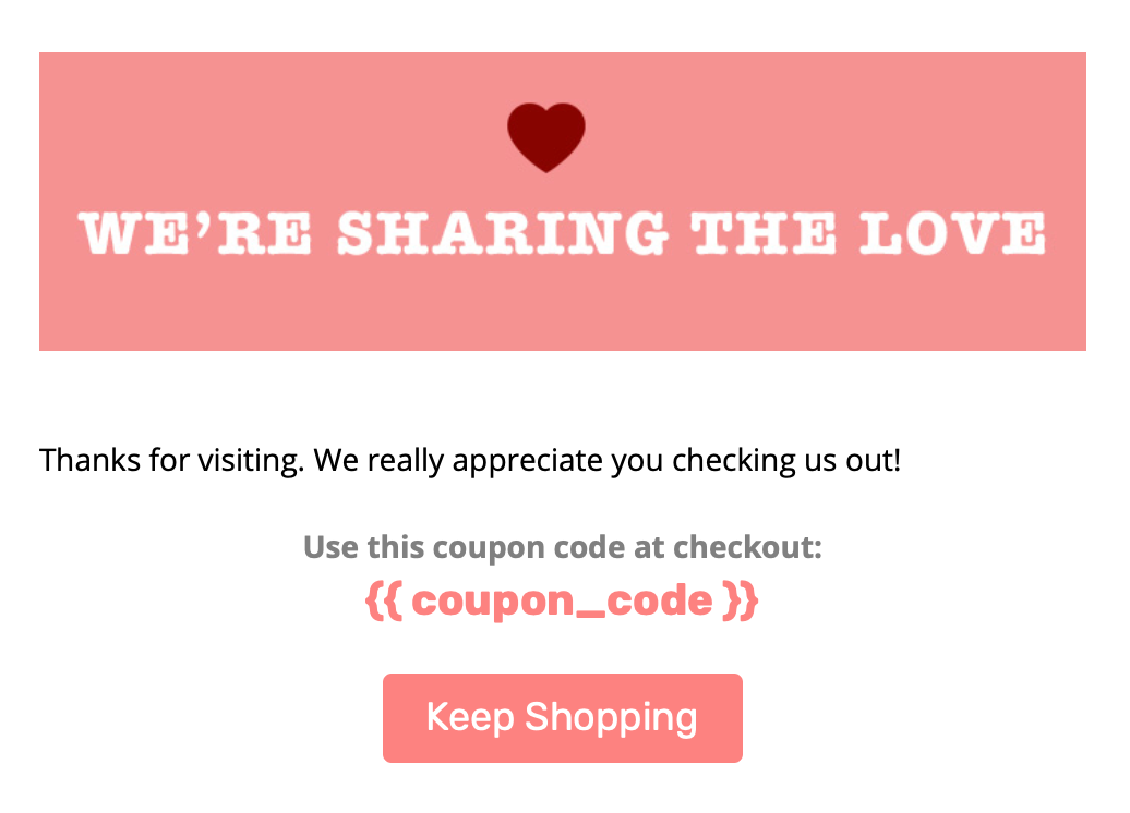
Feel free to download any of these header images here. Although these were created in photoshop, you can also make make simple, delightful email headers in Privy’s drag and drop email designer.
How to Use Header Images in Privy
If you’re using a pre-made image vs. building the header in Privy’s designer, you can simply add a single element row to the top of your email, add an image block, upload your image, and adjust the padding accordingly. If this is your first time using our drag and drop email builder, check out my blog post on how to design beautiful emails in Privy.
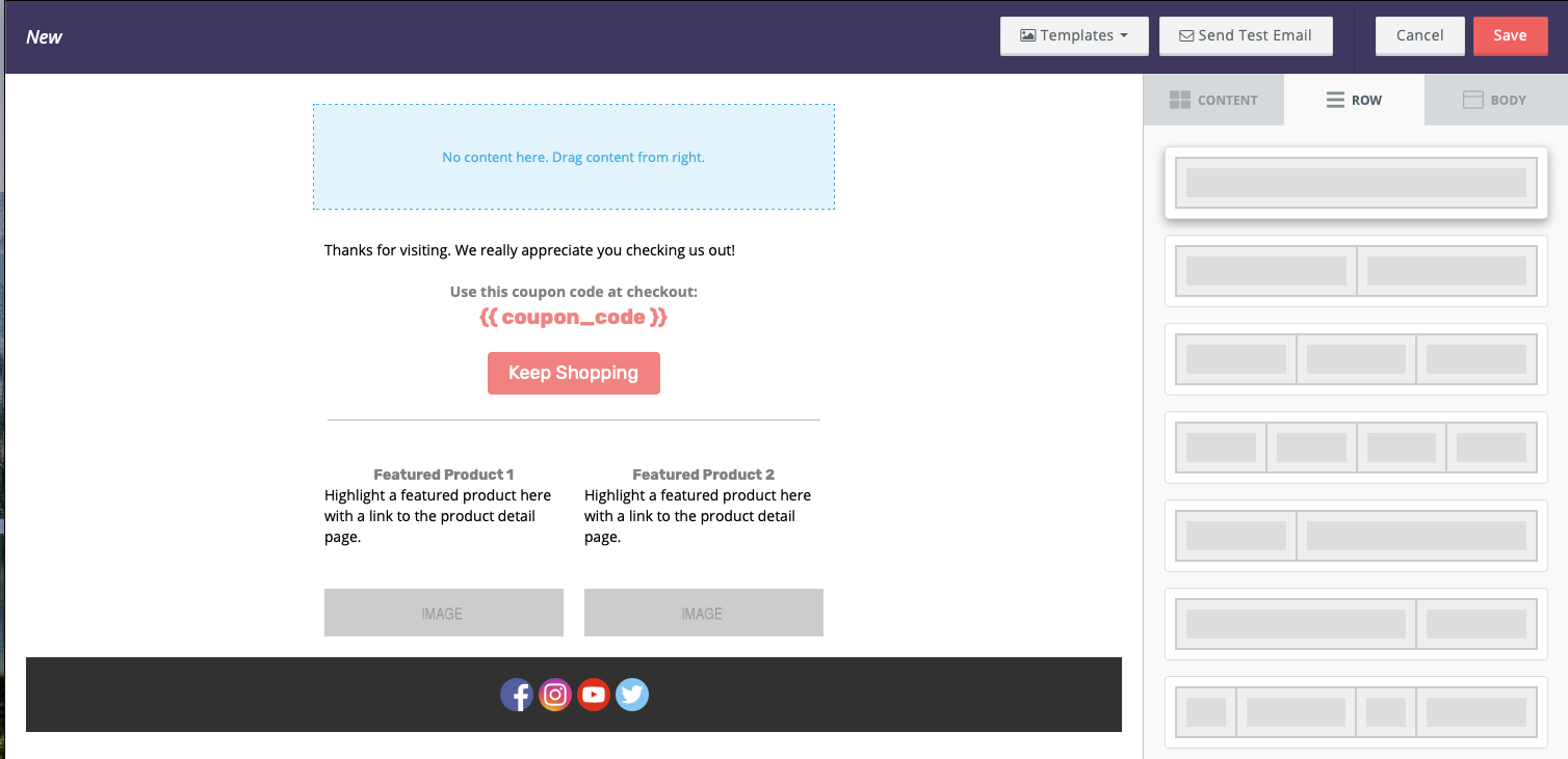
If you’re creating your own header in Privy, you’ll want to plan what you’re going to include in your header. If you’re doing a generic header with just a logo and email series name, grab the 2 section row that has a small block and a longer block, it looks like this:
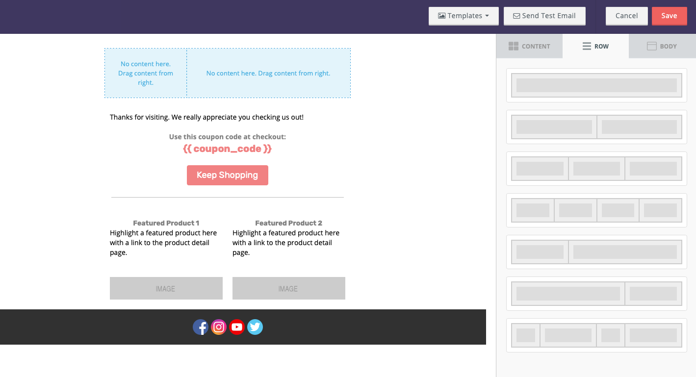
Then you can add an image block into the small section where you’ll import your logo, and then add a text block to the larger portion where you’ll write your company name or email series title. You can also change the background color of the row to further separate it from the rest of the email. When you’re done it could look something like this:
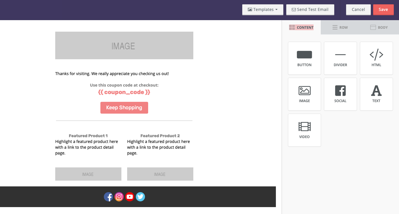
If you’re having trouble working with the padding of the objects, you can click the “More Options” switch and alter the padding from each side.
Another popular layout for headers uses the 3 section row. This layout is great for uploading your logo in the middle and leaving the two sides empty giving room for your logo to shine. You can also add a single section row underneath that is great for company slogans, the name of your company (if not already in the logo), or email series title. This is what it could look like:
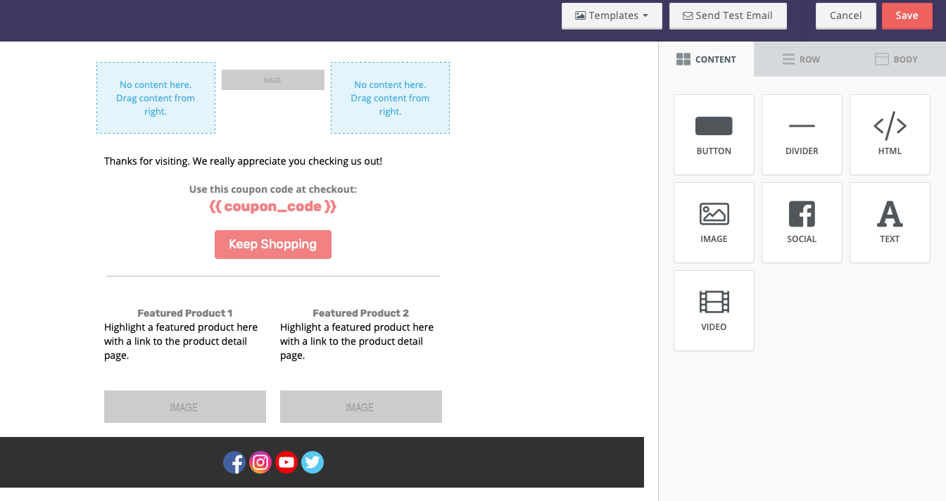
Whether you’re making your own header images and uploading them or creating your headers in Privy, there are a ton of creative possibilities when it comes to our drag and drop email builder. If you’re a HTML expert and want a little more control, you can always switch to our HTML email builder by clicking the reset template button to the left of the save button.
Footers 101
Now, we aren’t doing that open sandwich BS, we need that second piece of bread, aka, the footer! (Yes, I will take all the carbs thank you) Here is what you should have in your footer:
- Contact information
- Additional Links
- Fine print
Let’s break these sections down. For your contact information you want to at the very least include a link back to your site and your contact email address. If you’re a physical business it’s important that you update your address in the account settings section as it’s a legal requirement, and you always want your contact information to be up to date.
Some common links found in footers are social media links, a sign up link, and/or a link to update their profile on your site. You can find free social media icons to use here. Another helpful link for viewers is a “View in browser” link. That way if elements aren’t loading properly in their email app, they can view it better in another application.
Fine print includes a number of things, the most important to the viewer being text describing why they’re receiving this email in the first place. Other helpful information for the viewer would be offer details pertaining to whatever promotion is mentioned in the email. The last couple items you should have in your footer would be a copyright and privacy policy links.
Designing Your Footer in Privy
Since we have a lot of different things to link to, it’s best to build your footer natively in Privy. Start this by adding a few rows to the bottom of your email. In my example, I used a single column row, a four column row, and then another single column row. Then, I added text elements to the two single column rows and image elements to the four column sections. I used the text above the image to give context to my social media icons, and the text below the icons for the rest of my fine print.
Once you’ve uploaded your social icons, be sure to link them to the respective channels by going to the right side panel and adding a click through link. The key to having a successful footer is keeping it subtle and simple. Stylistically, you’ll want to let your header and body text take the show by keeping your footer in greyscale and using smaller text. Here is an example with some of the elements we just discussed:

In our case, I used a dark grey background to help separate it from the rest of the email and kept social media icons in color to help them stand out from its background. Then I linked them to each of our social accounts.
DAMN! Now That’s a Good Sandwich
Once you’ve picked (or made) the best bread and filled it with amazing contents, you’ve got a damn good sandwich! (or email in this metaphor). If you’re looking for more resources about our email designer feel free to head to help.privy.com or hit us up in chat, we’re happy to help! All this talk about sandwiches is making me hungry, I gotta go eat a real sandwich STAT. Until next time, happy creating!
Writen by Meg Johnson

Armed with a degree from MassArt, a passion for avocados, and a \"I'm going to crush this attitude,\" Meg elevates Privy's approach to brand, design, video and most importantly, fun.
You may also like to read
Learn how we responsibly build, test, and refine AI models and capabilities to ensure accuracy and domain relevancy.
Privy’s Email Automation Playbook: Ready-to-Use Formulas To Steal (Even If You're Not An Expert)
Want to bring in sales for your store 24/7? Here's what you need to know to activate the 4 most important email automations for your store ASAP.
Every Shopify Store Should Be Sending These 18 Types Of Newsletters (With 245+ Examples From Real Brands)
Consistency is key for building a successful email marketing calendar. But what exactly should you be sending? Here are 245+ examples and 18 types of emails to steal.
How to Create a Stunning Email With Privy: 15+ Design Tips and Best Practices
A well-designed email is key to communicating with your audience, building engagement and trust, and driving sales. Learn these 15+ tips and tricks for creating beautiful and effective emails in Privy.
